Edraw.AI User Guides
Settings of a Chart
These tools help you customize and refine your diagram charts in Edraw.AI to make them clear and effective. You can choose the type of diagram, manage data, and tailor the style for better visuals. They also let you adjust labels like legends and data tags, and format the axes to present your data accurately.
Step ❶
Select the graph or chart from the editing canvas.
Step ❷
Customize the look of the chart using the tools in the floating toolbar.
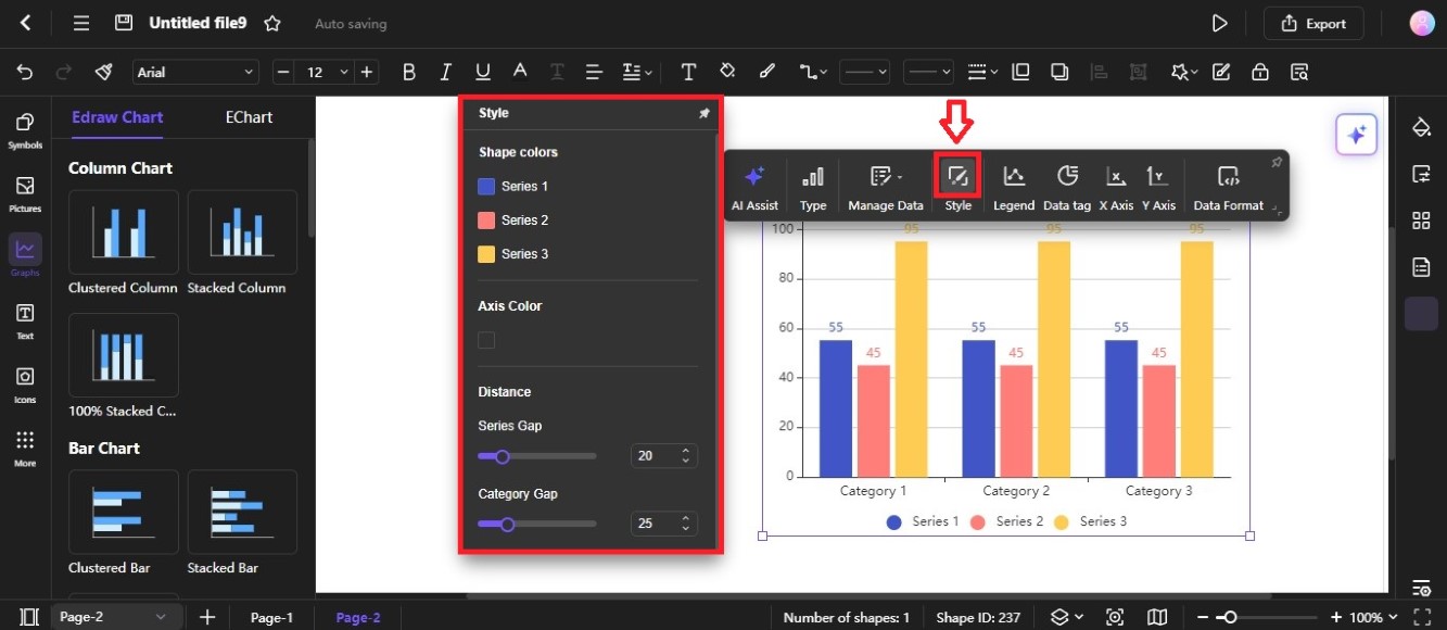
Style
Click the Style icon from the floating toolbar to open the Style menu.
- Shape colors: This section allows you to customize the colors used for different data series within your chart. Click on the colored squares to select a different color for each series.
- Axis Color: This option allows you to change the color of the axes (x-axis and y-axis) in your chart. Click the box, then select a color from the color picker.
- Series Gap: Use the Series Gap slider or input stepper in the Distance section to control the spacing between data points within each series. A higher value means more space between points, while a lower value means less space.
- Category Gap: This function controls the spacing between categories along the x-axis. You can adjust the value using the slider or input stepper.
Legend
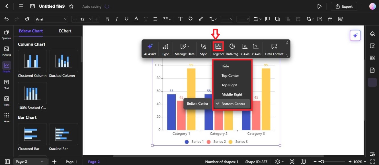
Click the Legend icon from the floating toolbar, then choose where to place the legends. They explain what each color represents in the chart. You can select Hide, Top Center, Top Right, and more positions.
Data Tag
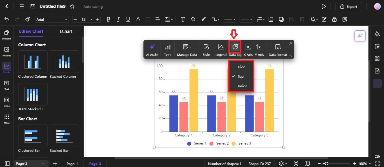
The Data tag refers to the numbers displayed on top of each bar in the chart. These numbers represent the values for the corresponding data points.
Here's what each option does:
- Hide: This option will remove the data tags from the chart, making the chart less cluttered.
- Top: This is the default option. It places the data tags on top of the bars.
- Inside: This option places the data tags inside the bars, which can be helpful for charts with small bars or when you want to avoid overlapping data tags.
X Axis

The X Axis menu provides settings to customize the appearance of the horizontal axis in your chart. Let's break down the options:
- Display coordinate axis: Toggles the visibility of the x-axis labels.
- Show Scale: Determines whether to display scale along the x-axis.
- Label Orientation: By default, it is set as Automatic. Select an option from the Label Orientation dropdown list to adjust based on the available space.
- Name: Sets the text label for the X-axis.
- Name Position: Specifies where the label should appear (at the end or center of the axis).
- Show Split: If enabled, a vertical line can be added to visually separate the X-axis into sections.
Y Axis
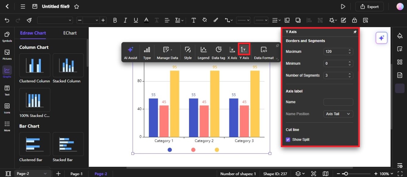
The Y Axis menu allows you to customize the vertical axis, which represents the values or measurements being compared. Here's a breakdown of the options in the image:
- Display coordinate axis: Toggles the visibility of the labels along the Y-axis.
- Show Scale: Determines whether to display scale on the Y-axis.
- Tag Position: Place the axis labels in the corresponding bars. You can select from hide, high, or low in the Tag Position dropdown list.
- Borders and Segments Maximum: Sets the maximum value displayed on the Y-axis.
- Borders and Segments Minimum: Sets the minimum value displayed on the Y-axis.
- Number of Segments: Specifies the number of divisions along the Y-axis.
- Name: Sets the text label for the Y-axis.
- Name Position: Specifies where the label should appear.
- Show Split: Select the Show Split checkbox to show the cut lines in the chart.
Data Format
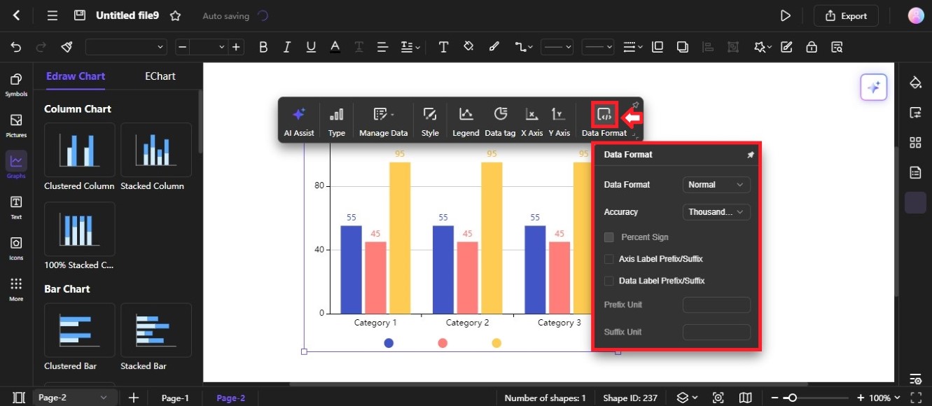
The Data Format menu provides options to customize the formatting of data labels and values in the chart.
- Data Format: The default format for numbers is Normal. You can also select.
- Delimiter or Abbreviation from the Date Format dropdown list.
- Accuracy: May include different levels of accuracy, such as tenths, hundreds, thousandths, and more.
- Percent Sign: When selected, add a percent sign (%) to the data.
- Axis Label Prefix/Suffix: When checked, you can add a prefix and/or suffix to the labels on the Y axis.
- Data Label Prefix/Suffix: When selected, you can add a prefix and/or suffix to individual data labels.
- Prefix Unit: Enter the desired prefix for axis labels or data labels.
- Suffix Unit: Enter the desired suffix for axis labels or data labels.