PowerPoint is a valuable tool for creating diagrams, but mastering its steps and techniques is essential to stand out during the creation process. When used correctly, its various functionalities can result in a perfectly polished diagram.
Personally, I appreciate PowerPoint's features for creating pie charts, such as 3D options, Chart Elements, and more. These tools help me present pie charts effectively at my professional meetings. If you're also looking to create pie charts that represent data clearly and in a visually appealing way, this article is for you.
Here, I’ve outlined simple steps for creating a professional diagram using PowerPoint. For those seeking an easier approach, I've also described an alternative, Edraw.Ai, which allows you to create professional pie charts with just a few clicks.
In this article
Method 1: How to Make a Basic Pie Chart in PowerPoint
A basic pie chart creation process involves the following 4 steps:
Step 1: Open a Template
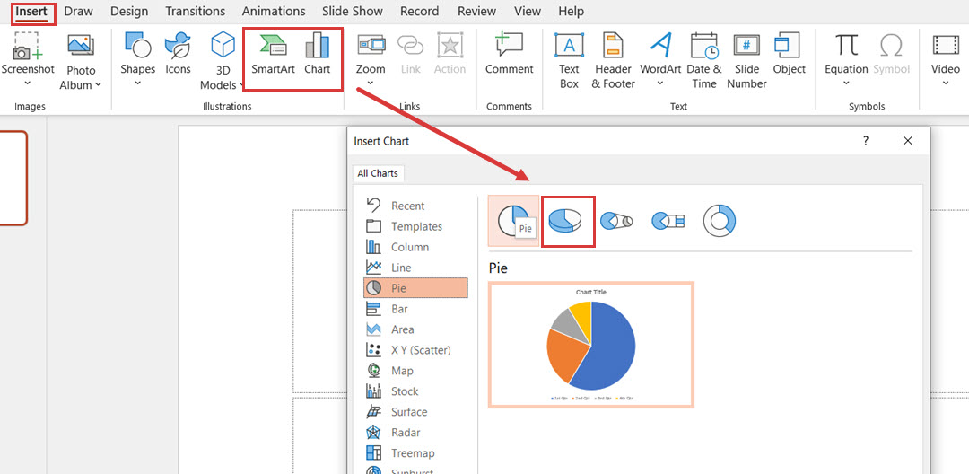
PowerPoint offers various pie chart templates that you can use to create a simple diagram with a few clicks. These templates are available within the SmartArt or Chart feature that you can access in the following ways:
From the navigation bar, click Insert and click SmartArt or Chart.

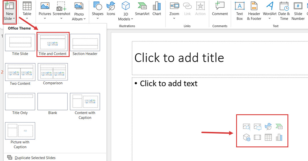
Click New Slide and select the one with Title and Content– the quick options for diagrams will be in the middle of the slide.
Step 2: Change Style
The template you choose from SmartArt or Chart is basic; you can edit its shape and color scheme to align it with your purpose.
Style change:
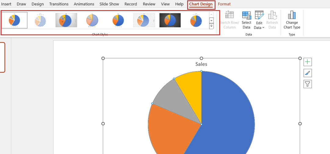
Click the pie chart diagram on the slide, and from the Chart Design options, select the chart style that best suits your project.
Color change:
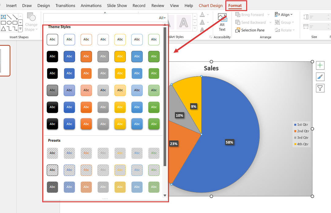
To change the color, click the Format option from the top navigation menu and select the color scheme available from the options.
3D options:
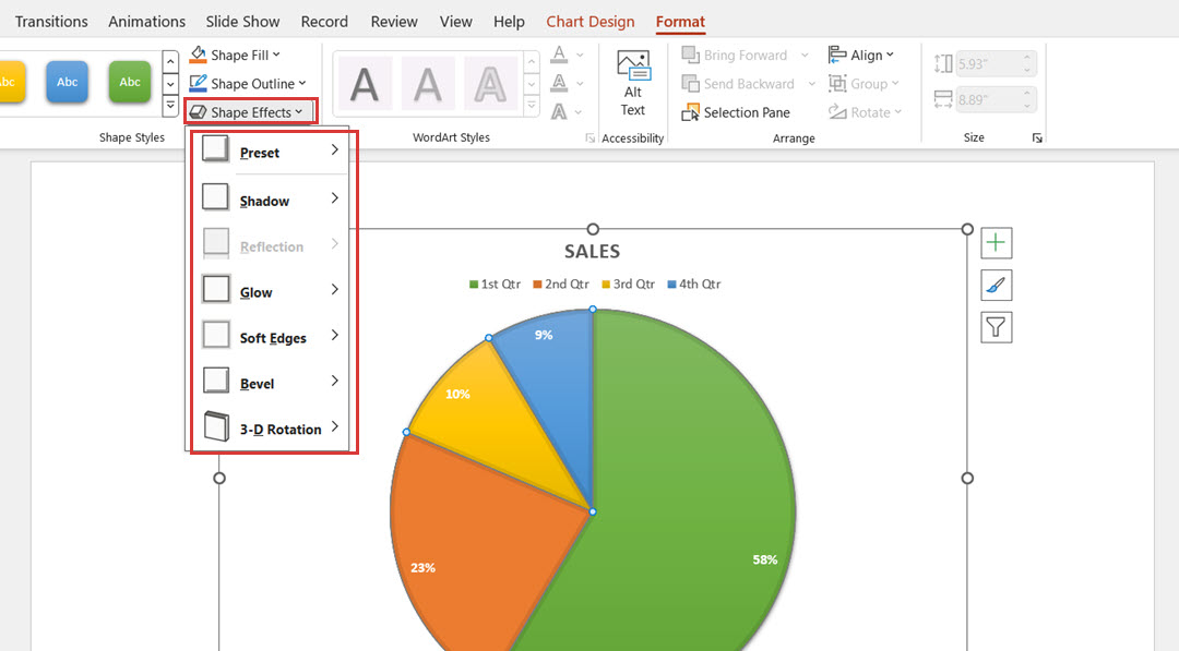
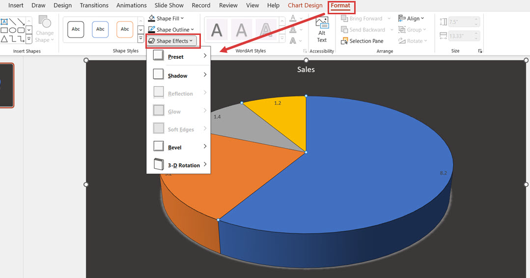
To change the diagram layout to 3D, click the pie chart and play around with the options under Shape Effects.
Step 3: Change Shapes
PowerPoint also allows you to change the shapes of pie charts by adding or removing slices to accommodate your data in the diagram better.
Add a Slice:
To add a new slice to your existing diagram, copy an already available slice and press Ctrl+V.
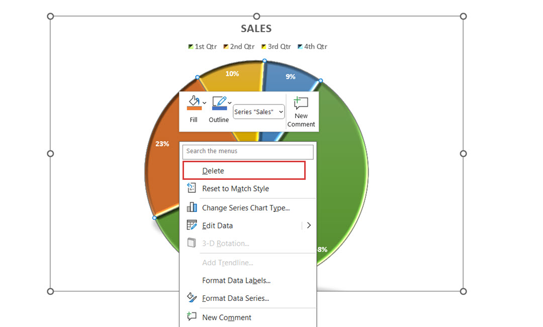
Remove a Slice:
Right-click on the slice you want to remove from the diagram, and click Delete.
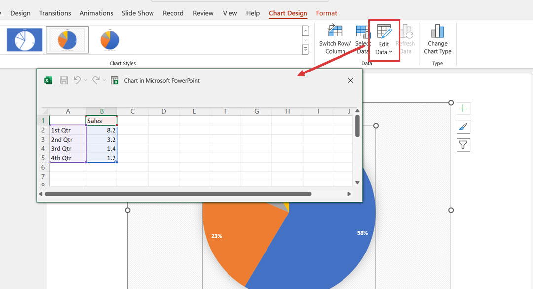
Step 4: Edit Text/Data
Edit text: Add your project data into the Excel sheet sample data. Minimize or close the Excel program, and whenever you update this data or change it in Excel, it will be reflected in your pie chart.
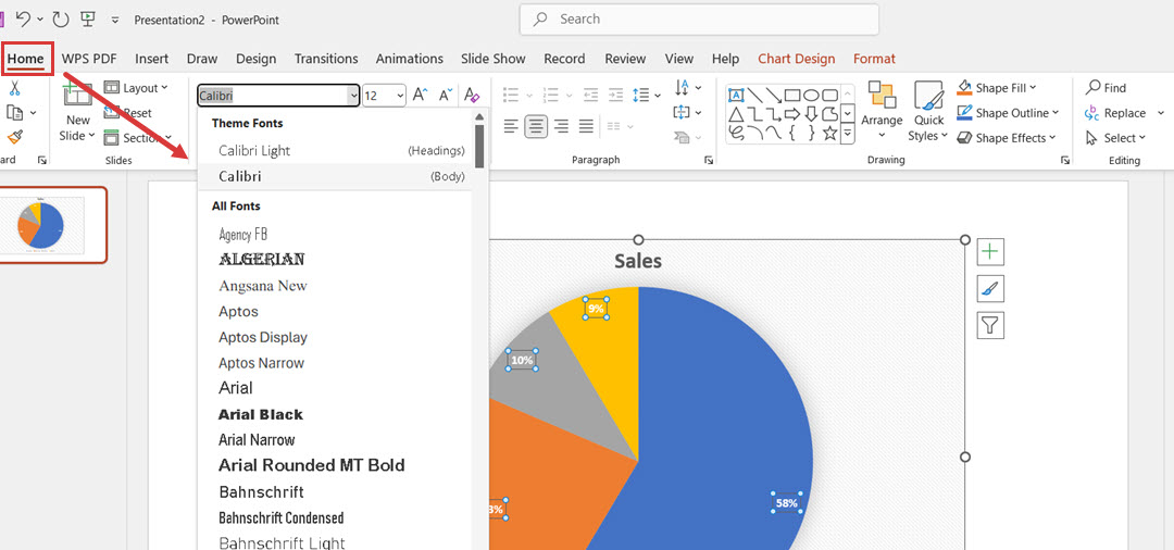
Fonts:
To delete, move, or change the font and color, select the text and use the Home tab at the top of the screen. Choose from the list of fonts you want to use.
Method 2: How to Make a Professional Pie Chart in Powerpoint
Step 1: Insert a Pie Chart
Open your PowerPoint presentation and insert a Pie chart from SmartArt or Chart. For a more professional look, select a 3D pie chart.
Step 2: Edit Data
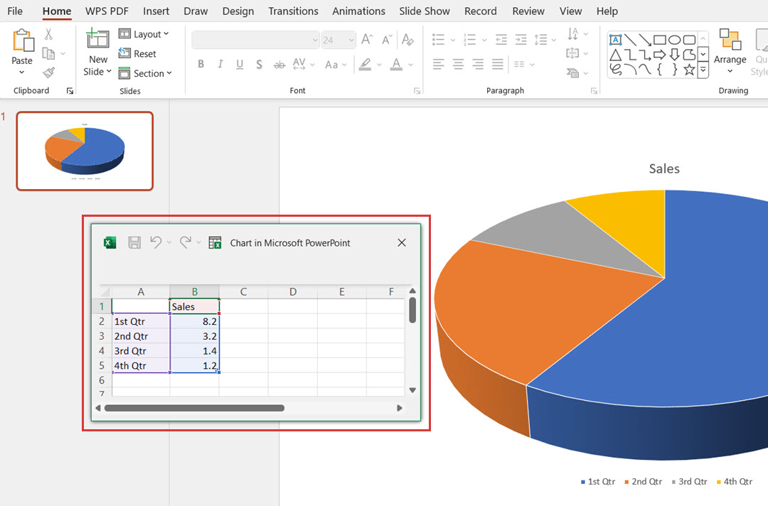
Update the data in the Excel sheet attached to the diagram. You can replace data in each column and row to match your project details.
Step 3: Use Chart Elements
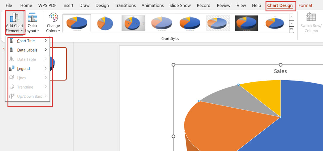
To make your diagram look professional, use the Chart Elements option. To view options under this feature, click Chart Design on the top navigation menu and navigate to Add Chart Elements.
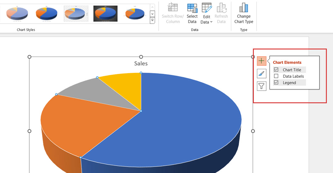
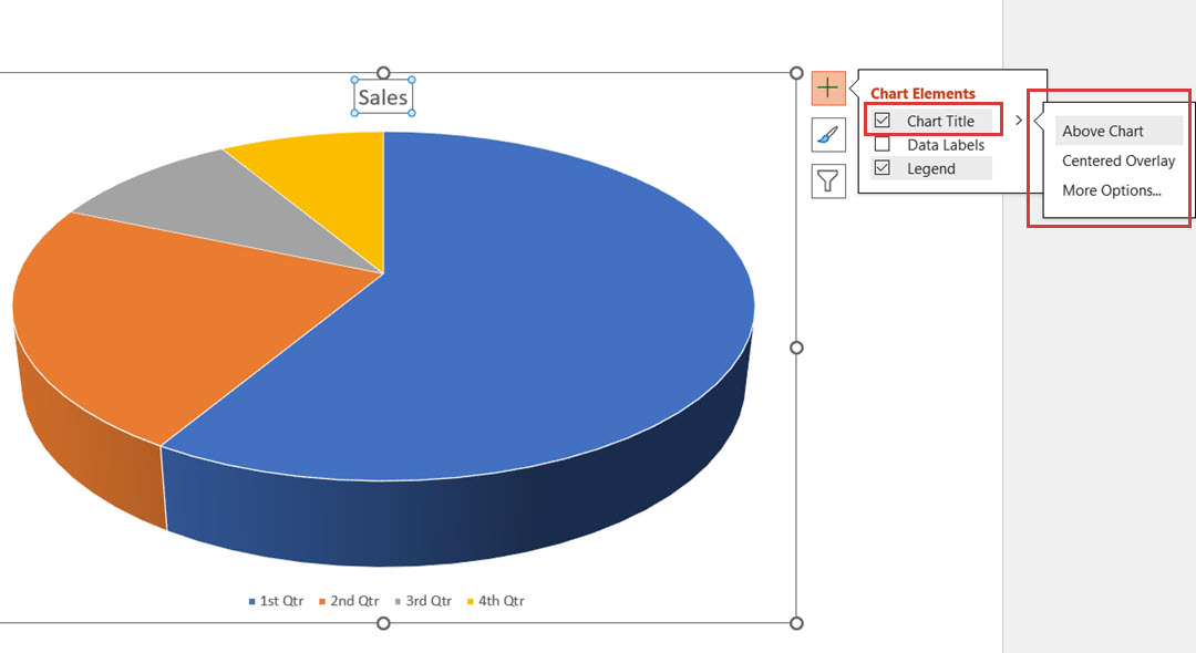
Alternatively, you can use the quick access option for chart elements–click on the diagram, then click the + icon and select from the options.
Update the title:
Click the Chart Title option and update the diagram title from the left panel.
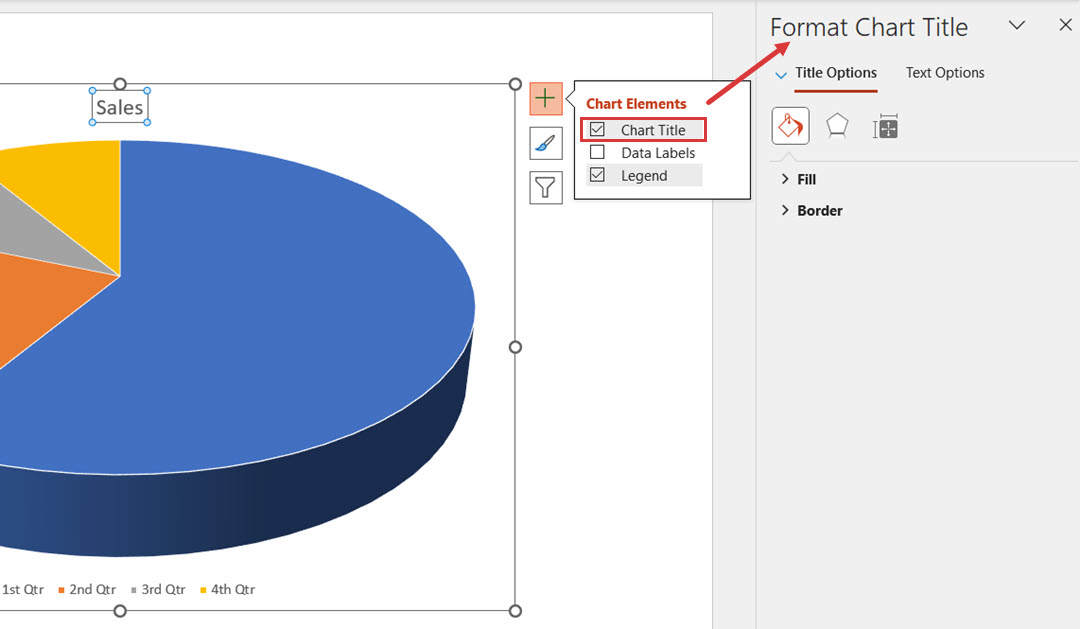
For a quick update, click on the Chart Title option and change the positioning to Above Chart, Centered Overlay, or click on More Options to select from others.
Update data labels and diagram legends:
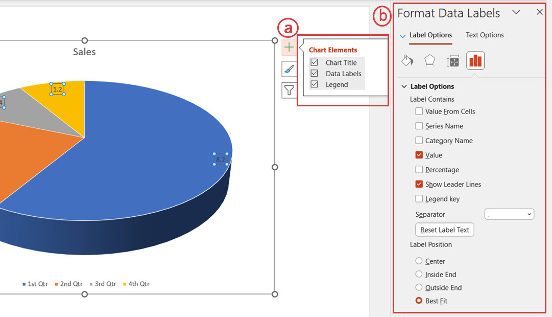
Similarly, you can update the data labels and diagram legends from the left panel or from quick edit options.
Step 4: Update Color and Style
Once you are done updating the data, change the color and style of the diagram. To do this, click on the diagram and click Format, and you’ll see the formatting options.
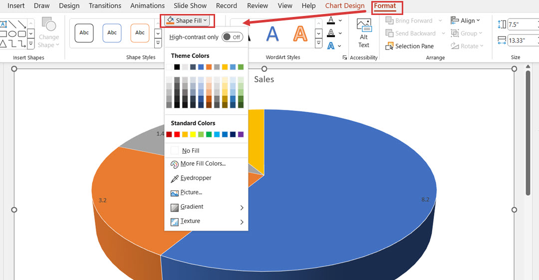
Choose the Shape Outline option to add an outline. Add a darker outline to add volume to your diagram.
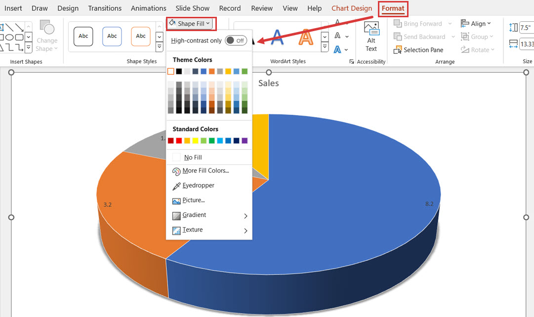
Use the Shape Effects option to add more depth to a diagram. You can add Levels, Shadow, 3-D Rotation effects, etc.
Method 3: How to Easily Make a Better Pie Chart with Edraw.AI
The traditional method of creating pie charts in PowerPoint can be time-consuming. In today’s AI-driven world, why waste that time when Edraw.AI enables you to create professional-looking diagrams in just a few clicks?
Edraw.AI is a free, cloud-based software designed for effortless diagram creation. It offers a vast selection of templates for quick drag-and-drop functionality.
With its intuitive interface, AI-powered features, and customizable options, Edraw.AI ensures your diagrams look polished and professional.
Steps to Make a Pie Chart in Edraw.AI
Step 1:
Log into Edraw.AI using your social media or Wondershare account credentials. On the Home page, click AI Drawing.

Step 2:
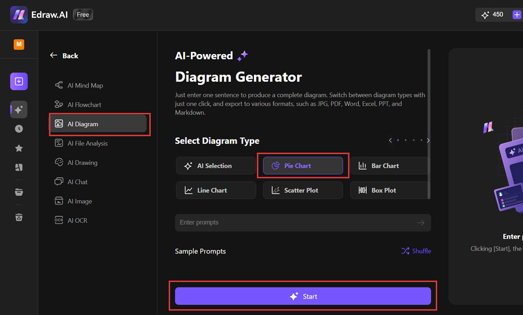
Select Pie Chart from the available options, enter the prompt for AI, and click Start.
Step 3:
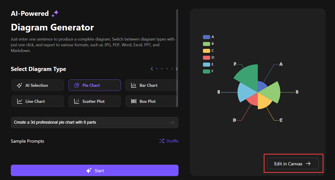
Edraw.AI creates a professional-looking diagram according to your prompt. Click Edit in Canvas to update the diagram and make changes as required.
Step 4:
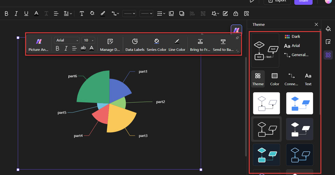
Once on the canvas, you can start customizing your pie chart by updating colors, data, and the layout.
Step 5:
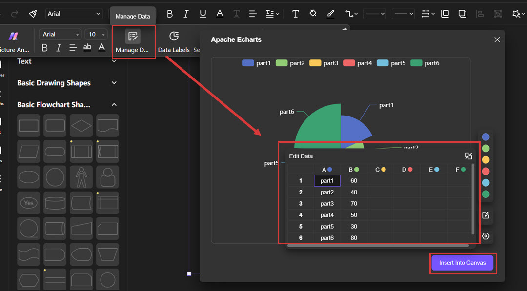
To update the data on your pie chart, click Manage Data from the floating bar and replace your data in the Edit Data section. Once you’re done updating your data, click Insert in Canvas, and the data will be updated in your diagram.
Step 6:
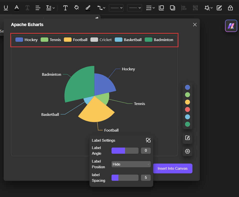
To remove a data label from the chart, click on the specific data label you want to remove and hit Insert Into Canvas–this wipes off the data label from the diagram.
Step 7:
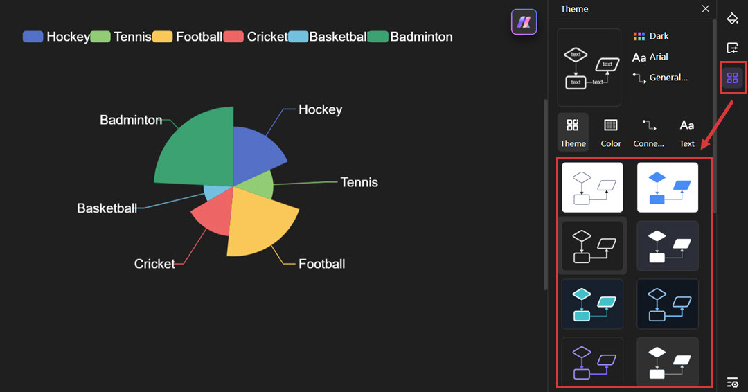
To edit the theme/layout of your diagram, click the Theme icon from the right-hand side menu and choose from the many options available.
Once you’re done making all the changes in your diagram and satisfied with the final look, you can export it and use it in your PowerPoint slide.
How to Add the Pie Chart in PowerPoint?
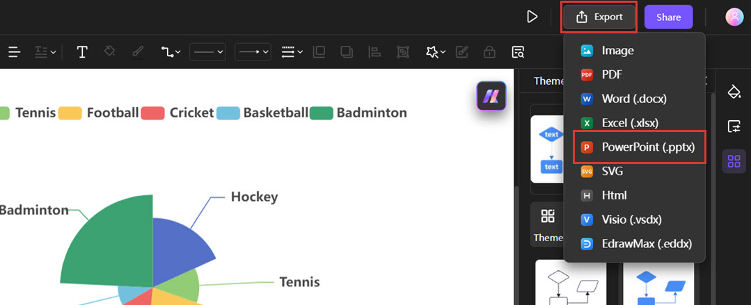
To use your Edraw.AI diagram in PowerPoint head to the top navigation, click Export on the top left, choose PowerPoint to export the chart as a .pptx file, or choose PNG to get the image.
After exporting the diagram, go to the slide where you want to add this, click Insert, and then select the option Picture or Object to load your chart file.
Conclusion
Making a pie chart can be useful when explaining data to another person or during a presentation. Some basic operations and options let you format the chart and make it look polished and professional.
For more functionalities and ease of use, you can ensure that you use Edraw.AI. This tool will enable one to produce high-quality charts in the form of pie charts within the shortest possible time, regardless of whether one is experienced in presenting.
By following this guide, you will easily learn how to create engaging and professionally-looking pie charts by applying the PowerPoint tools and tips and Edraw.AI solutions. This contributes to the impressive character of your presentations and makes them engaging for the audience!


