Radar charts are often overlooked in PowerPoint. I’ve found them to be a helpful way to display complex data. They help you highlight patterns and comparisons that might go unnoticed in other charts.
Initially, I struggled with creating them. The multiple menus were confusing, and entering data was tricky. But, after a little practice, I learned how to create a radar chart in PowerPoint easily.
So, in this guide, I'll provide easy steps, covering everything from basics to professional level. Let’s begin.
In this article
How to Make a Basic Radar Chart in PowerPoint?
A radar chart displays several variables, using axes that start at the same point. It helps you compare data side by side. It can improve both personal and professional presentations. PowerPoint makes it easy to create one using its built-in radar chart feature. Follow these steps to create a basic radar chart.
Step 1: Insert Radar Chart
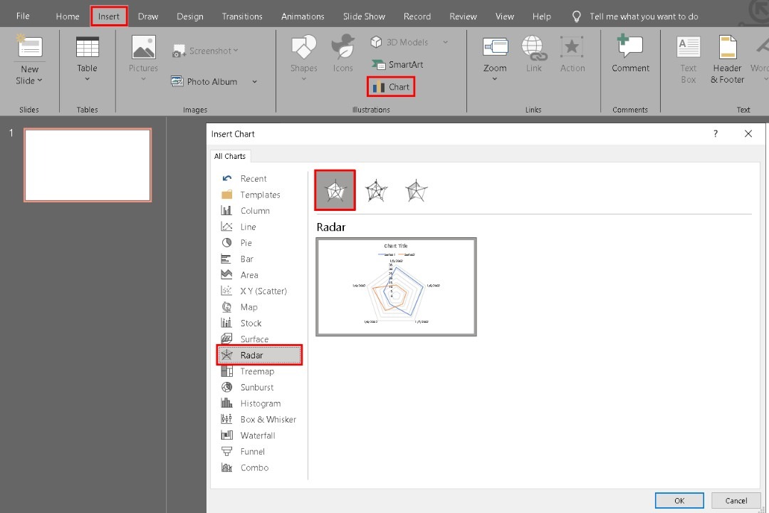
Open PowerPoint and create a new slide. Go to the Insert tab in the ribbon and hit the Chart button.
Click Radar with the other chart types from the Insert Chart dialog box. You’ll see three variants: Radar, Radar with Markers, and Filled Radar. To make a basic radar chart, pick Radar and press OK to insert it into your slide.
Step 2: Enter Your Data
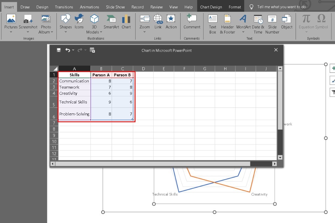
After you insert the radar chart, a spreadsheet window will pop up. This is where you’ll enter your data. PowerPoint provides sample data that you can replace with your data to show the required categories.
Enlist the categories you want for your radar diagram in the first column. For example, you might add Communication, Teamwork, Creativity, and Technical Skills to compare different skills.
In the second column, input values for each category. You can scale as per your requirements. When done, close the spreadsheet.
Step 3: Start Customizing
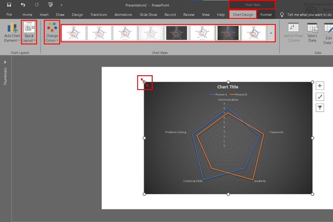
Select the chart and use the corners or edges to resize it.
Its drag-and-drop feature lets you position the chart in the center of the slide or wherever you need it.
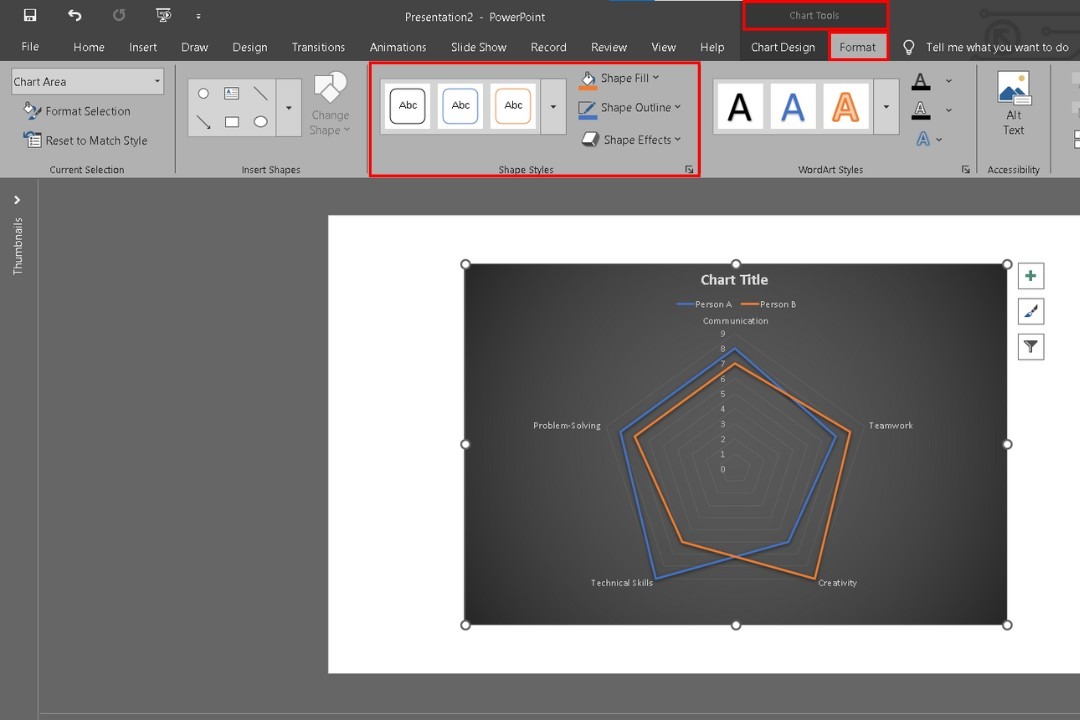
You can reformat your radar chart to enhance its appearance. Click on the chart, and the Chart Tools will appear in the ribbon. Here, you'll find two tabs: Design and Format.
In the Design tab, click on Chart Styles to see various predefined styles. Choose one that fits your presentation’s theme.
The format tab allows for more detailed customization. Click on Shape Fill to change the colors of the radar areas. You can adjust the fill colors of the chart, the outline, and the effects if required.
Step 4: Add Data Labels and Personalize It
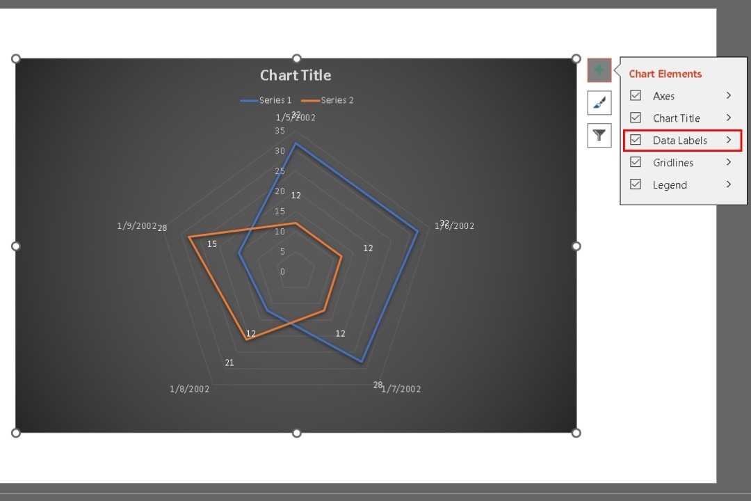
Adding data labels helps clarify what each point on the radar chart represents. To add these, click on the chart, and go to the Chart Elements button, the + sign next to the chart. Check the box for Data Labels if required. It will display the values next to each axis of the radar chart.
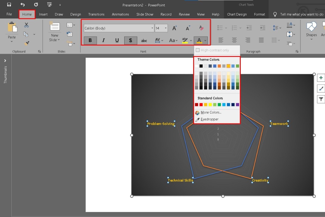
To ensure your chart looks polished, fine-tune various elements. You can change the labels' font size, color, style, etc., by selecting them and modifying them from the Home tab.
They all will be customized simultaneously when you do one. Consider using contrasting colors for the data labels and chart areas to enhance readability.
Moreover, you can right-click on any item to customize these things from the popup menu.
Finally, when done, save your presentation and you’re good to go.
How to Create a Professional Radar Chart in Microsoft PowerPoint?
Step 1: Insert a Radar Chart
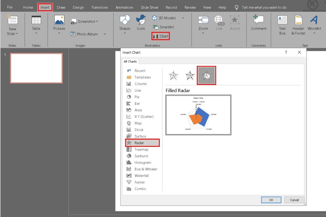
On your blank slide, go to the Insert tab, click Chart, and select Radar. For a professional look, choose Filled Radar.
Step 2: Enter Your Data
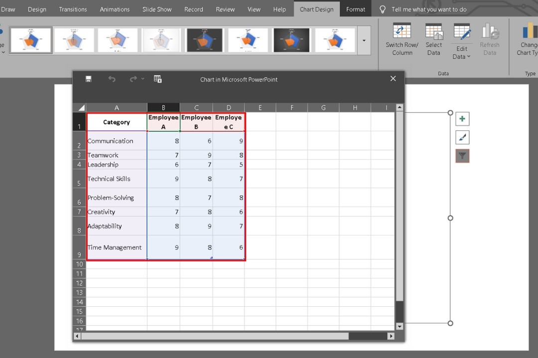
An Excel sheet will appear with placeholder data when you click ok to create the chart. Replace it with your own, such as categories like Communication or Teamwork. Close the sheet when done.
Step 3: Resize and Position the Chart
After closing the sheet, you’ll see your chart on the slide. Click and drag the chart’s corners to resize.
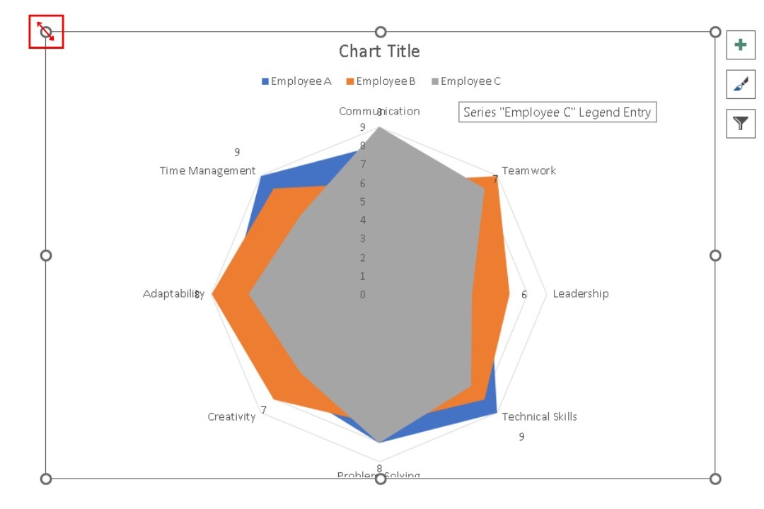
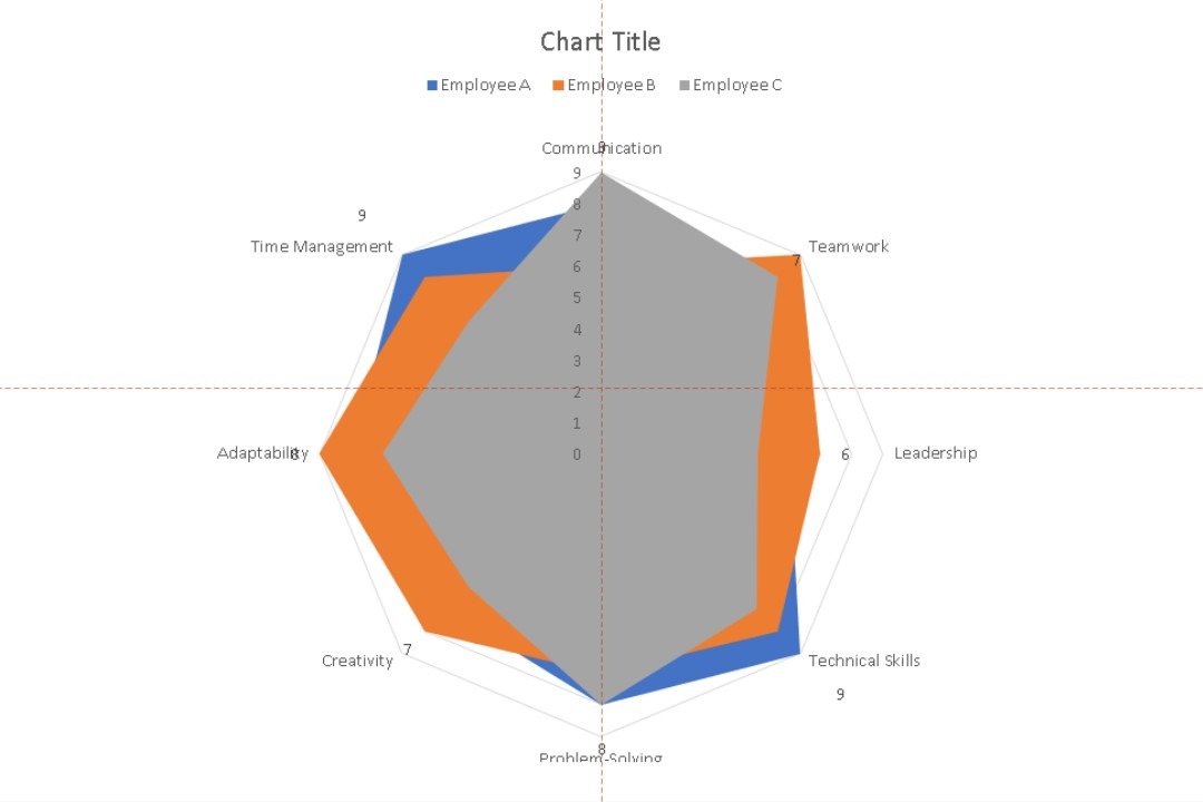
Position it centrally or as required.
Step 4: Customize the Chart Design
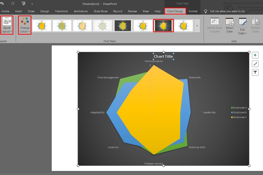
Click the chart to activate Chart Tools in the ribbon. Under the Chart Design tab, select a layout from the quick layout options and pick a style that aligns with your theme.
Use contrasting colors from Change Color for better readability.
Step 5: Reformat Chart Elements
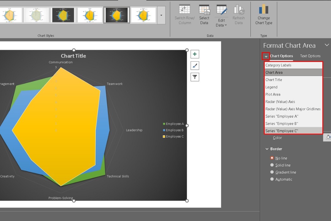
Click the Format Chart Area option from the right-click menu on the chart.
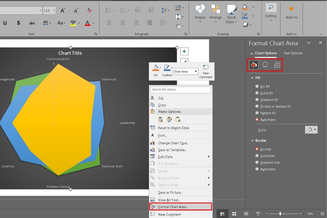
From the drop-down menu, adjust the color, transparency, border, size, and effects of different chart elements.
Reduce grid line opacity if they are too prominent, or remove them for a cleaner look.
Step 6: Modify the Axis Options
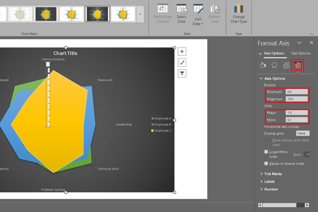
From the Axis Options, set the minimum and maximum bounds and major and minor units.
Step 7: Add Data Labels
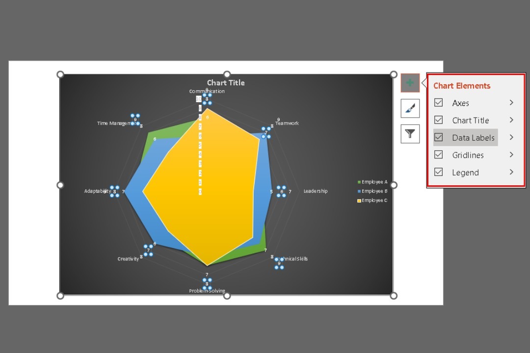
Go to Chart Elements (click the + icon next to the chart) and check Data Labels.
Step 8: Insert a Chart Title
Double-click the title and type in a relevant title like "Performance Comparison Across Key Skills".
Step 9: Incorporate Visuals
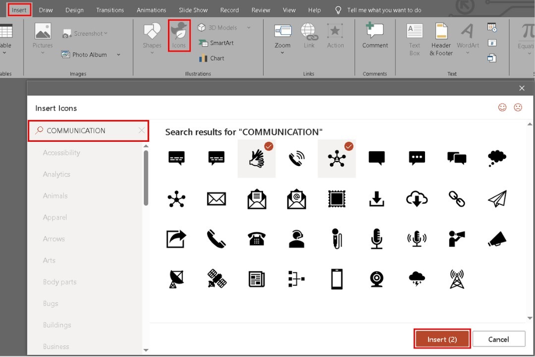
If needed, go to the Insert tab and add relevant icons or images to provide additional context. Use the search bar to find specific ones.
Step 10: Change the Font Style and Size
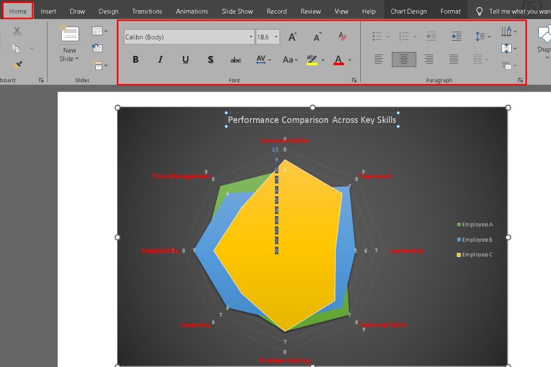
Select the title, axis labels, and data labels one by one. Modify the font style, size, and color from the Home tab.
Step 11: Edit the Legend
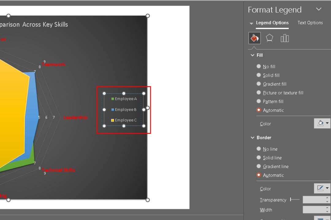
Move the legend to a more suitable position. Adjust its font and color from the Home tab. Use the right-side menu to customize their fill colors and borders.
Step 12: Customize Slide Background
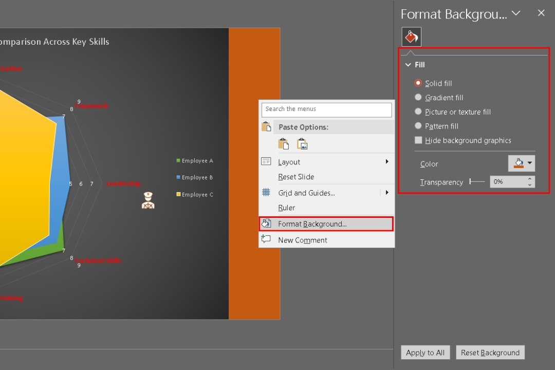
Right-click on the slide background and go to the format background from the menu that appeared. Change the background from the Format Background options.
Step 13: Review and Tweak the Layout
Ensure everything is clear, the design is balanced, and the data is accurate. Make final adjustments for clarity.
Step 14: Save as a Template
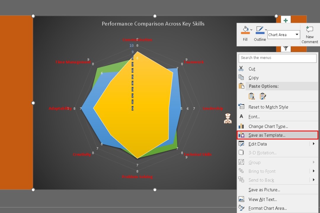
Right-click on it and select Save as Template for future use.
That's how you create a professional radar chart that stands out and effectively conveys your data.
Best Practices for Making a Perfect Radar Chart Diagram
When you make diagrams in PowerPoint, focus on clarity and effective communication. Here are some key tips to improve your radar charts:
- Simplify Complexity: Keep your data presentation clear. Remove any unnecessary elements and keep enough white space around the elements to reduce visual clutter.
- Use Consistent Color Schemes: Stick to a color palette of three main colors. Assign one color to each category and use different shades for variety. This helps in making comparisons straightforward.
- Align Text and Visuals: Ensure your labels, titles, and legends are properly aligned. It prevents confusion and gives your chart a polished appearance.
- Keep Fonts Simple: Choose clean, sans-serif fonts like Arial or Calibri. Use consistent font sizes for titles and labels to maintain uniformity.
- Prioritize Clarity Over Decoration: Avoid flashy design elements like 3D effects. Aim for a minimalist approach that highlights the data.
- Highlight Key Data: Emphasize important information using bold colors or larger fonts. Be selective to keep the chart clear.
- Test for Accessibility: Make sure your chart is accessible. Use color-blind-friendly palettes and easy-to-read fonts. Utilize PowerPoint’s accessibility checker for assistance.
These are just a few tips; keep practicing, and soon you'll create charts and diagrams like a pro in no time.
How to Make a Radar Chart with Edraw.AI
Once you understand the basics of radar charts in PowerPoint, you might want to explore other tools with advanced features. Edraw.AI is worth considering. This online tool helps create diverse types of diagrams and charts.
Unlike PowerPoint, which focuses on presentations, Edraw.AI includes several AI tools and templates. Creating complex diagrams like radar charts, mind maps, and flowcharts becomes a breeze with it.

How to Make a Radar Chart in Edraw.ai Using a Template?
Step 1: Get Started With a Template
Open Edraw.ai and log in or sign up with your Wondershare ID or social media credentials.
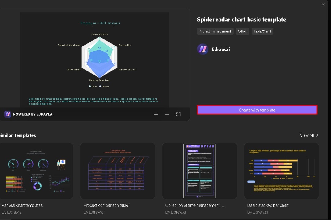
In the left-side menu, go to the Templates to search for Radar and choose a suitable one.

Click Create with template to load it into the editor with placeholder data ready for customization.
Step 2: Customize the Data
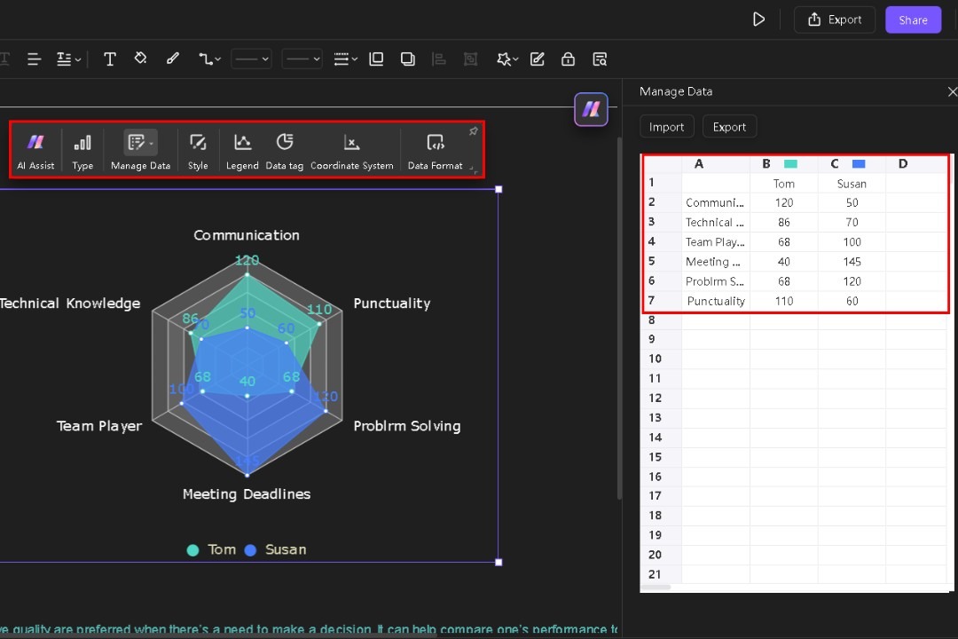
Select the chart and a popup menu will appear. In the Manage Data button, edit each cell to modify the existing data.
Use options, like AI Assist, Style, Legend, and Data Tag to personalize your chart. You can change colors, fonts, and data markers to fit your presentation style.
Customize elements like the axis labels and data points for formatting and styling options.
Step 3: Personalize It
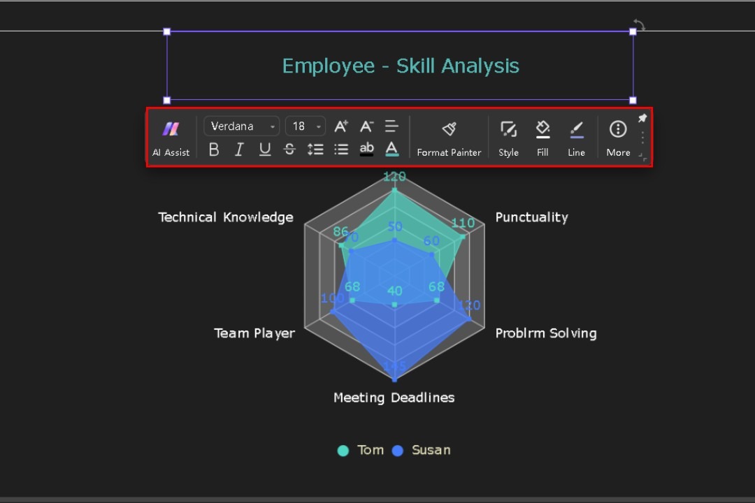
Click the title text to personalize it from the new pop-up menu. Customize the font size, style, color, etc. according to your preferences.
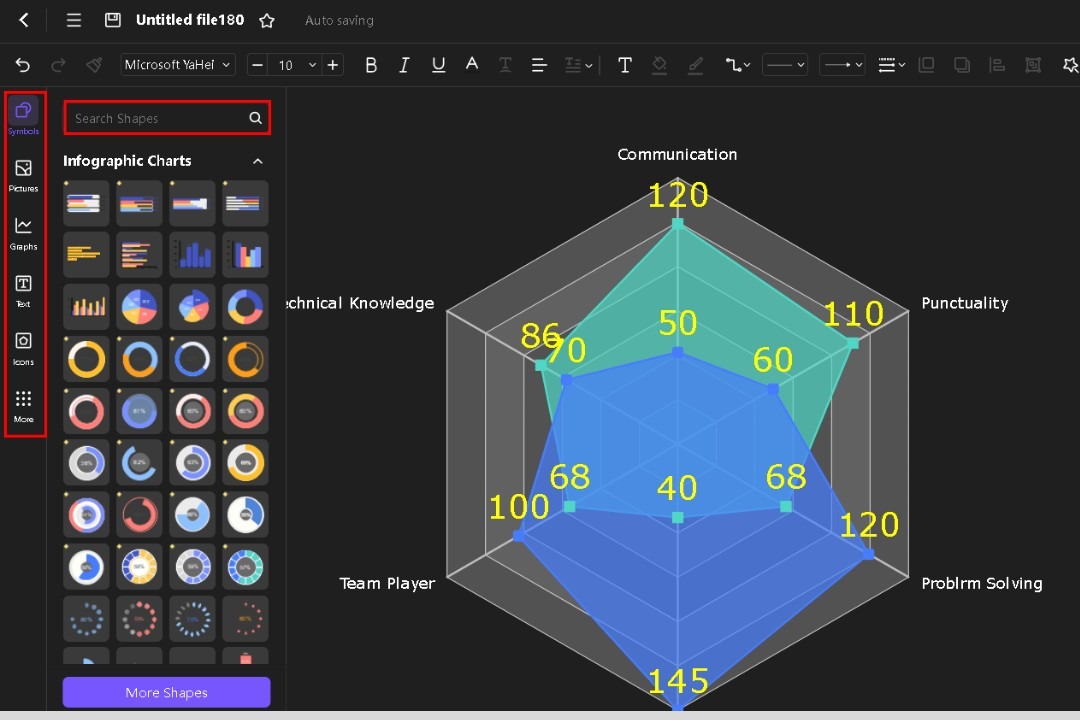
Use the left-side menu to add symbols if required. You can use the search bar to find specific icons and shapes.
Step 4: Export It in PPT
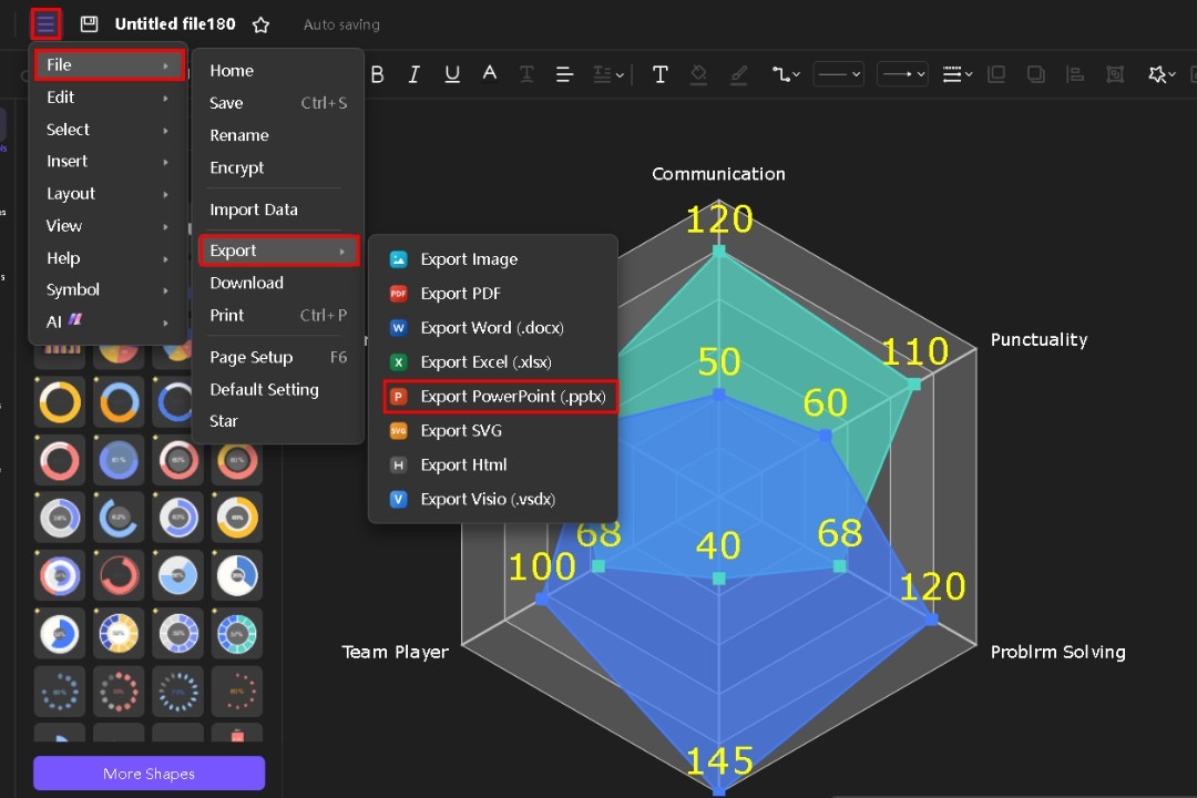
Check for accuracy and clarity. Once satisfied, click File in the 3 lines menu and then go to Export. Choose your format, as PowerPoint (PPT) for easy integration into your slides.
FAQ
-
What is PowerPoint radar?
PowerPoint radar charts display multivariate data in a two-dimensional chart. They organize values around a central point, helping compare data across different categories. -
How to read a radar chart?
Identify the axes representing categories. Compare the data points and observe the shape they form. A larger shape indicates stronger performance across categories. -
What are radar charts best used for?
Radar charts help you compare performance metrics across categories, track progress, and visualize relationships. It makes them useful for team reviews, project assessments, and survey results. -
What are the disadvantages of a radar chart?
Radar charts can become cluttered with too many variables and may not convey precise values. They can also mislead if data isn't normalized or scales vary greatly. -
What are the features of a radar chart?
A radar chart features axes that radiate from a central point, each representing a category. Data points are plotted along these axes and connected to form a shape, representing overall performance.


