Excel is one of the best tools for making histograms to visualize data distribution, and I’ve tested several ways. From simple chart options to more advanced features, each approach allows you to represent frequency distributions.
What I find most impressive is how Excel allows you to create accurate visualizations with minimal effort, even for beginners. Whether you use predefined bins or customize your intervals, it offers flexibility.
In this article
In this article, I’ll guide you through how to make a histogram using various methods, offering clear steps and helpful tips based on my hands-on experience.
What Is a Histogram?
A histogram displays data in intervals, known as bins, with bars representing frequency. The height of each bar indicates the count of values in its range.
It's great for spotting features like symmetry, skewness, or outliers. The bars touch each other because the data is continuous, setting histograms apart from bar charts.
They are valuable for statistical analysis and data comprehension, helping you identify patterns, trends, and variability in data.
How to Make a Histogram in Excel Using a Built-in Chart?
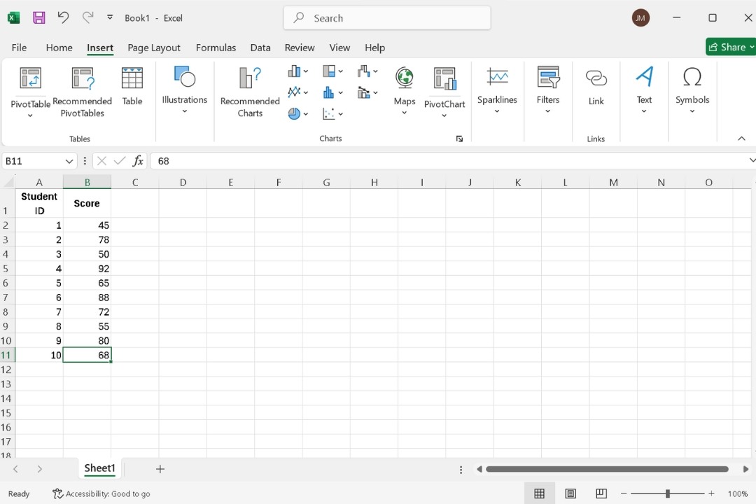
Step 1: Prepare Your Data
- Organize your data in a single column.
- Ensure it's numerical, as histograms analyze values based on intervals and frequencies.
Step 2: Create a Histogram
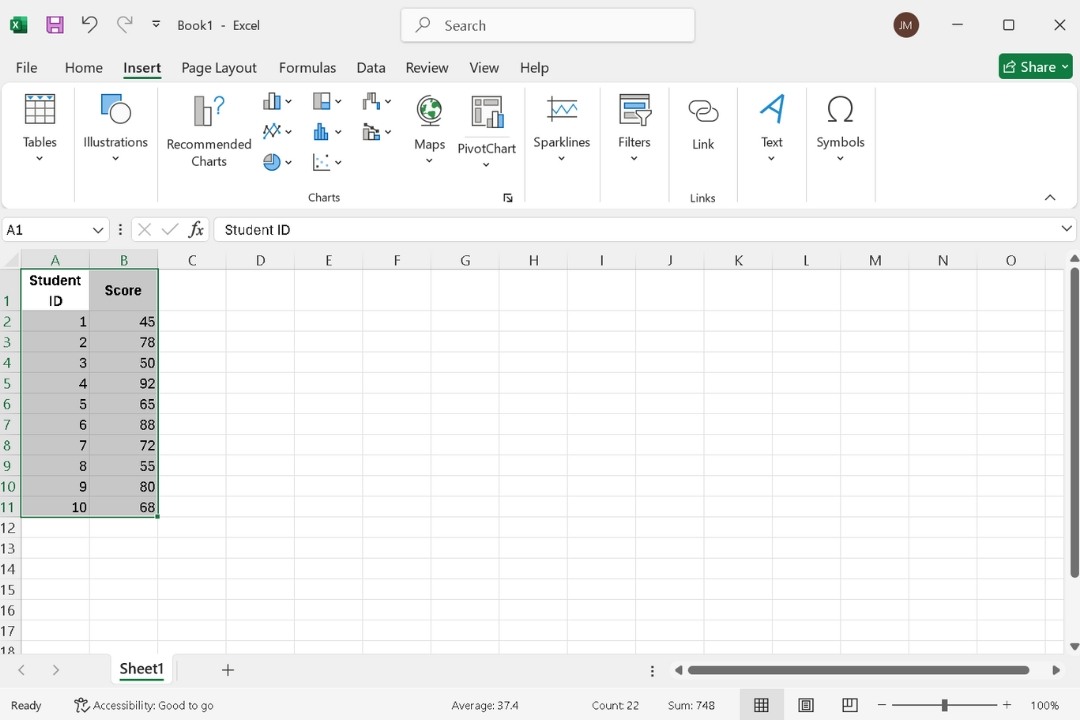
- Highlight your data range. If your data has labels, include them for clarity.
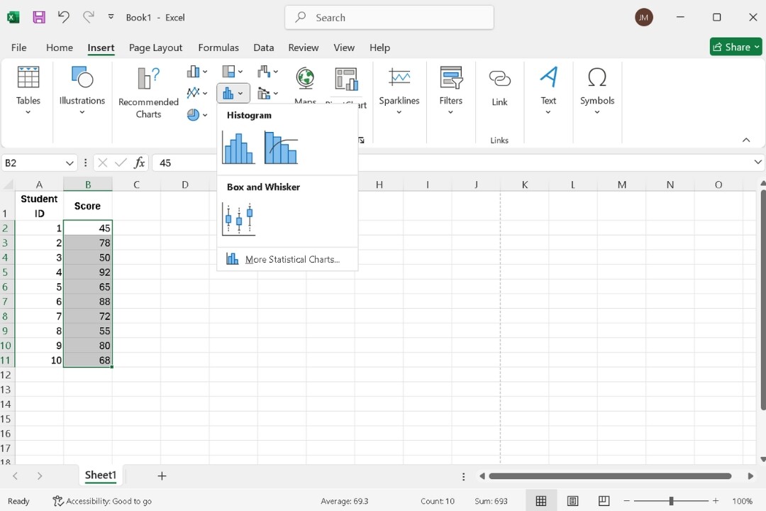
- Go to the Insert tab.
- Under the Charts group, hit the Insert Statistic Chart and pick Histogram from the options. Excel will automatically create the histogram.
Step 3: Personalize Your Histogram
- Right-click the horizontal axis and select Format Axis.
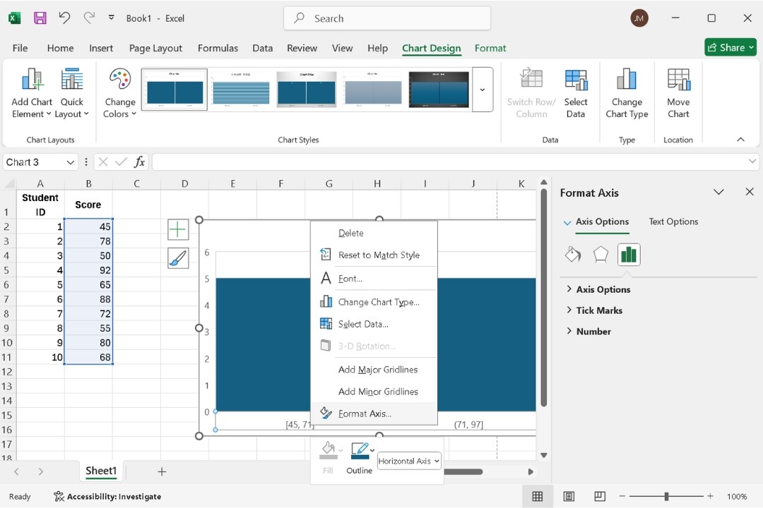
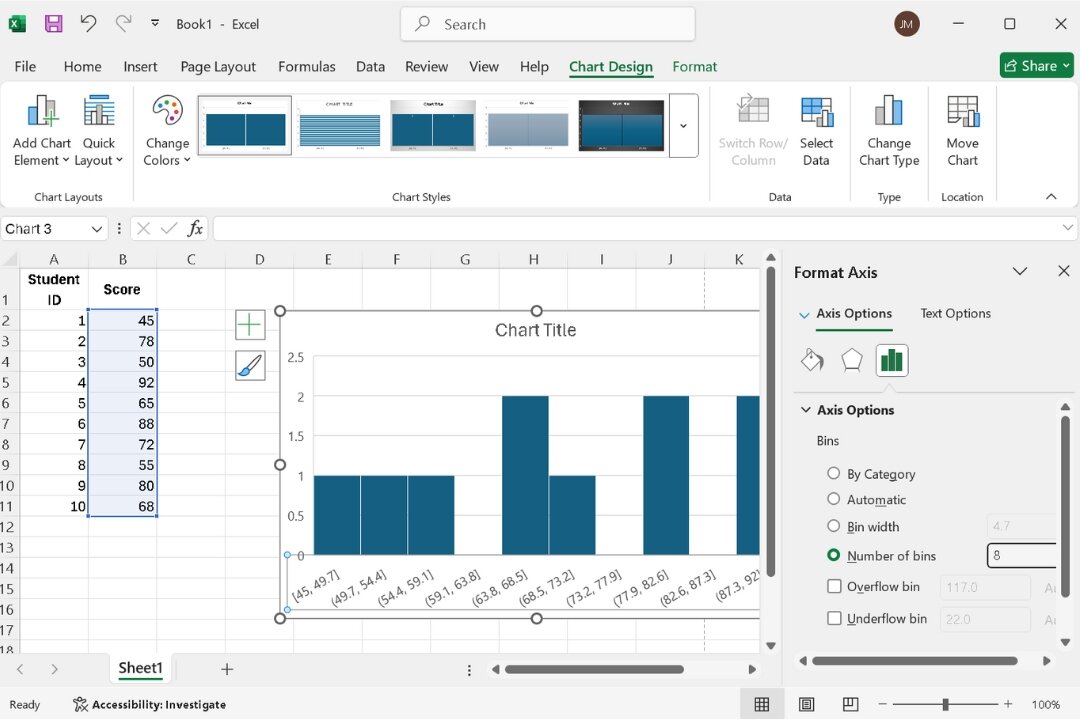
- Click Axis Options and adjust the Bin Width or Number of Bins to suit your data.
- Smaller bins give more detail, while larger ones offer a broader view.
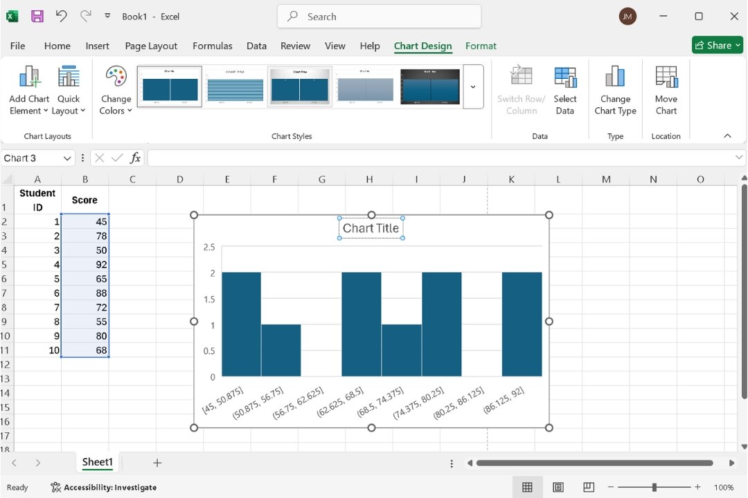
- Add a title and axis labels by clicking the chart and typing directly into the placeholders.
- Use the Home tab to adjust text styles, fonts, and colors.
- Modify colors, styles, and layout from the Chart Design tab to fit your preferences.
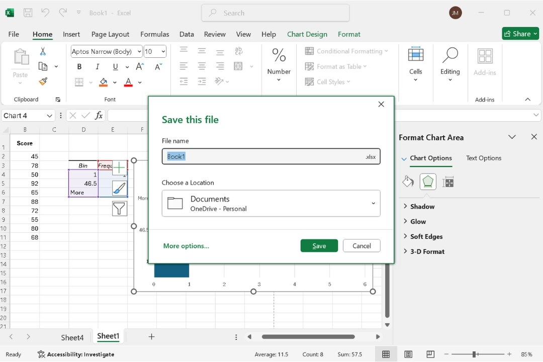
Step 4: Save Your Histogram
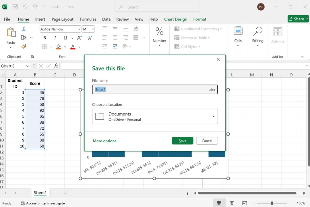
- Press Ctrl + S to start saving.
- In the Dialogue window, select a folder, add a file name, and choose a format—like .xlsx for Excel or .xls for legacy files.
- Confirm your choices by clicking Save.
How to Create a Histogram in Excel Using Data Analysis Toolpak?
The Data Analysis Toolpak makes creating histograms easy without extra functions or complex settings.
Step 1: Activate the Data Analysis Toolpak
First, ensure the Toolpak is activated:
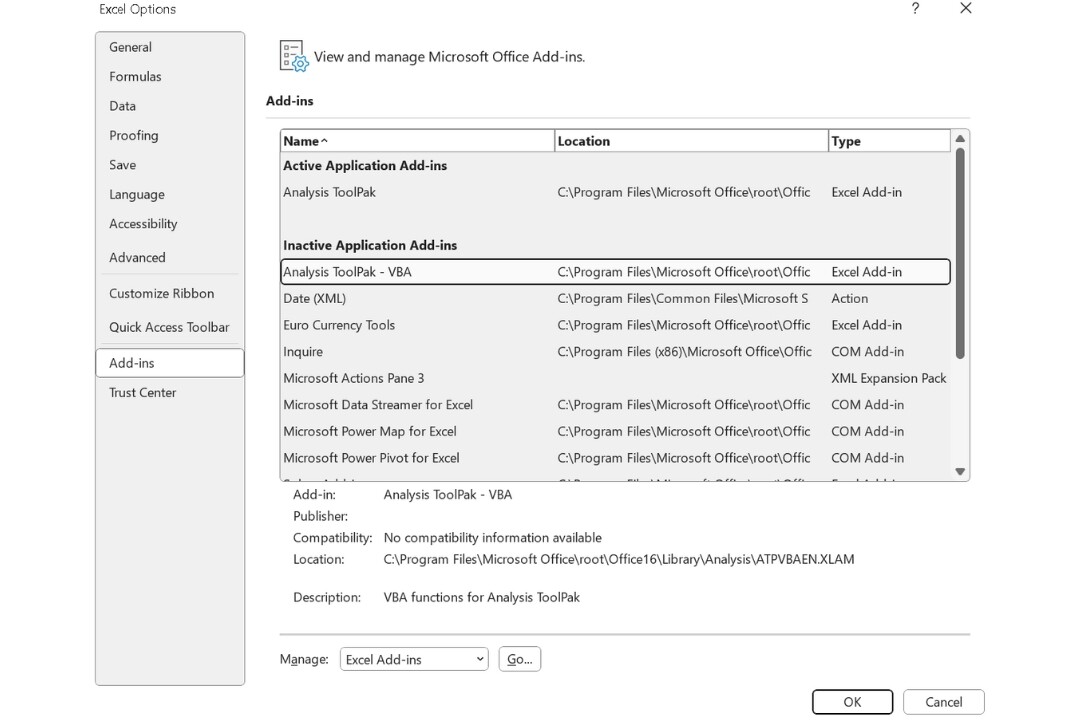
- From the File menu, go to the Options.
- In the Excel Options window, select Add-Ins.
- At the bottom, under Manage, select Excel Add-ins and click Go.
- Access the Add-Ins menu, locate Analysis ToolPak, and activate it by clicking OK.
Step 2: Opt For Histogram
Enter the data you want to analyze in a column, such as test scores or sales figures.
Now, let’s use the Toolpak:
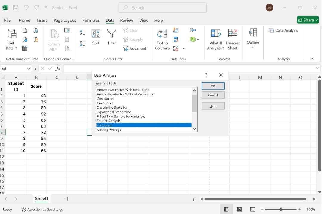
- Go to the Data tab.
- Click Data Analysis in the Analysis group.
- Hit OK after finding and selecting Histogram in the dialog box.
Step 4: Set the Range
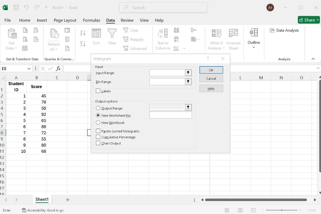
Excel will prompt you to:
- Input Range: Select the data cells (e.g., scores).
- Bin Range: Define the intervals (bins). You can let Excel generate them or manually enter bin limits.
- Choose where to display the frequency table and histogram—either a new sheet or an existing one.
Step 5: Generate the Histogram
After setting the ranges, click OK. Excel will create a frequency table. To turn it into a histogram:
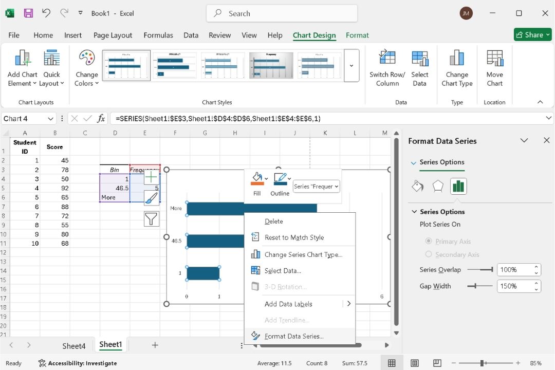
- Select the table.
- Access the Insert tab and click Bar Chart.
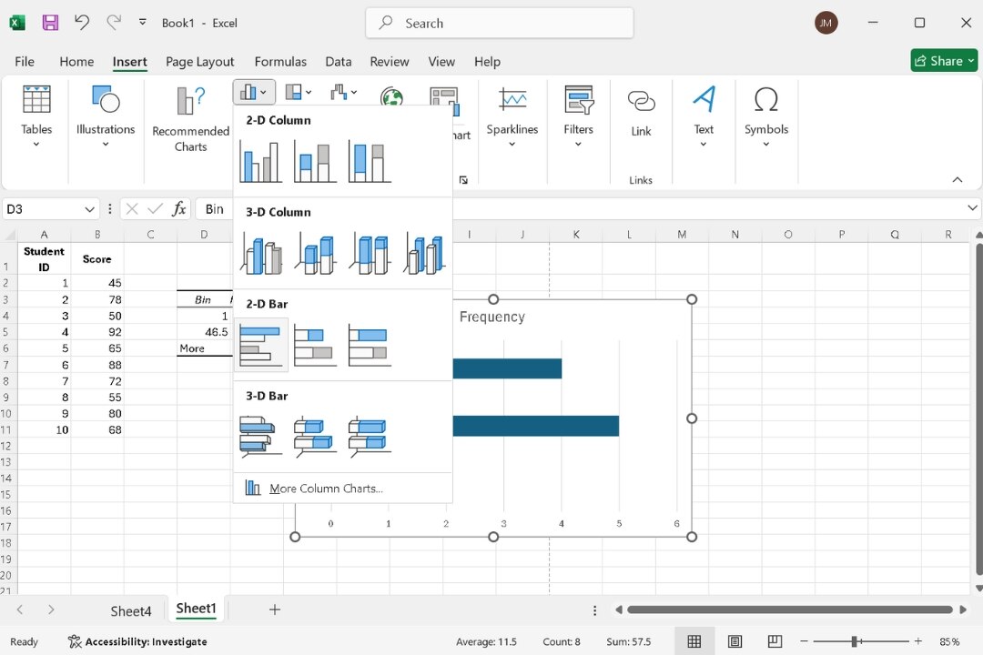
- Right-click the bars and select Format Data Series. Reduce the bar width to 0% so the bars touch each other, forming a histogram.
Step 6: Final Adjustments
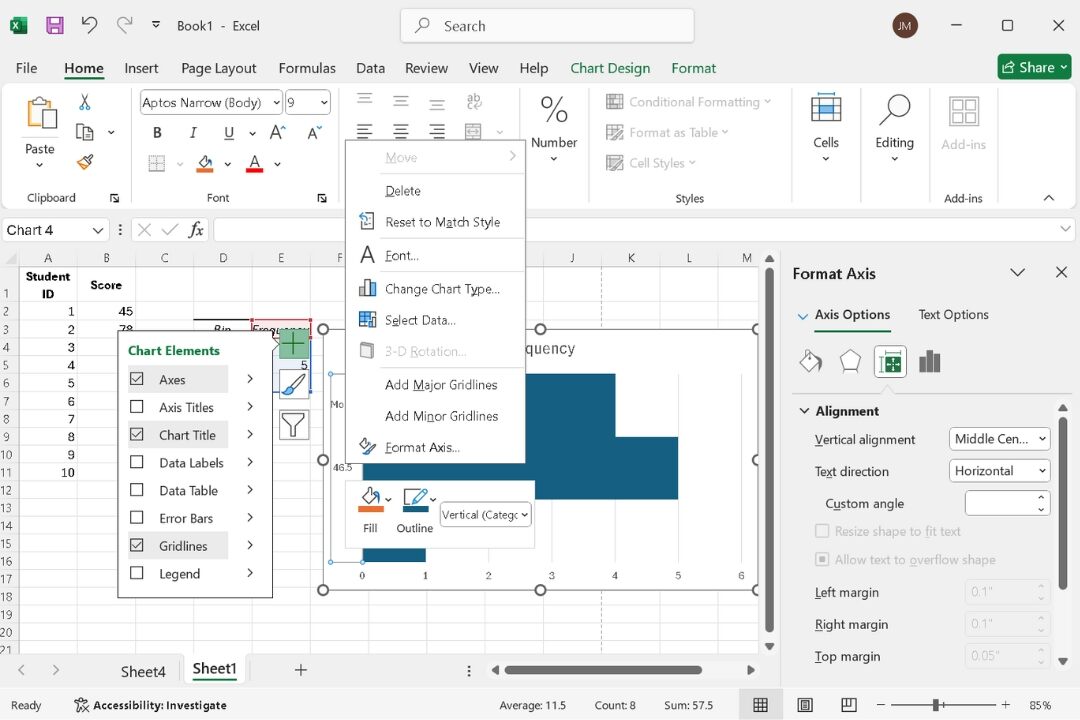
- Revise the chart title, axis labels, and elements to improve their clarity and impact.
- Right-click the x-axis, select Format Axis, and adjust the bin width or number of bins.
- After finalizing, don’t forget to save your Histogram.
