A bar chart is a visual representation of the data in which the bars with different colors are used to show frequencies for each category. The bar length varies as the number for each category varies. Bars are represented horizontally and vertically both according to the needs. The use case for these diagrams is simple, they are used to compare complex data.
In this guide, we are going to learn how to make bar charts in PowerPoint and what difficulties you might face while drawing them. We will also discuss alternative methods to make the process easier.
In this article
How to Make a Basic Bar Chart in Microsoft PowerPoint 2021 ?
The simplest way to make a bar chart diagram is to use the templates in PowerPoint. Here is a step-by-step guide on how to make a bar chart diagram in PowerPoint.
Step 1: Open a template
There are two ways to access the bar chart in PowerPoint, one is through the navigation bar and the second one is the icons given at the center of the new slide.
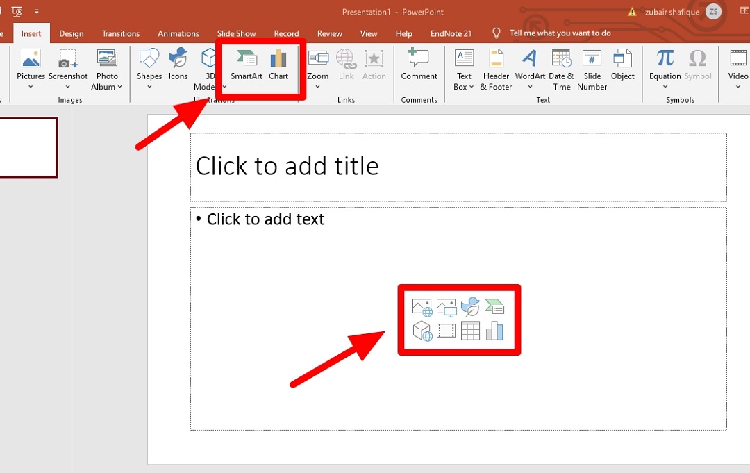
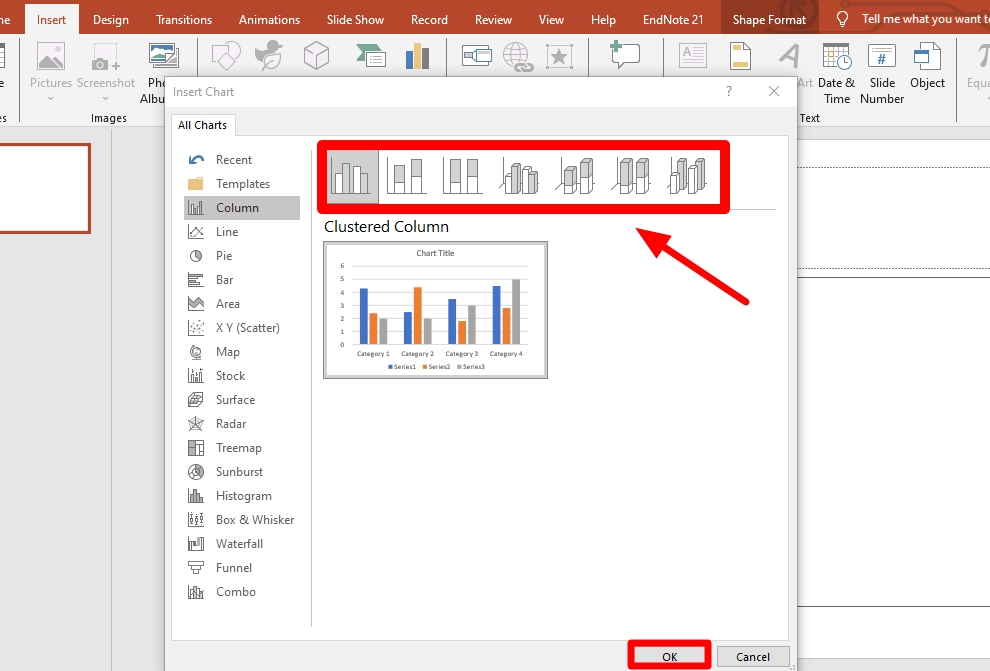
Now, select the design you want for your bar chart.
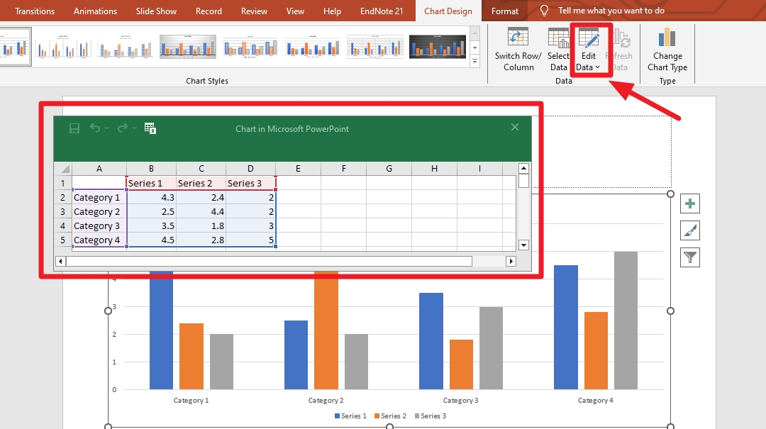
Step 2: Edit the data
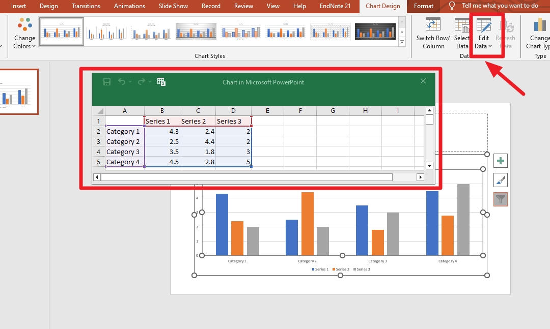
The editing of the data is done through the "Edit Data" icon on the navigation bar.
Step 3: Remove or Add Items
There are different ways to remove or add the data on the chart. A few of them are given below.
From the floating Toolbar You can edit your chart data through the floating toolbar given at the sides of the bar chart.
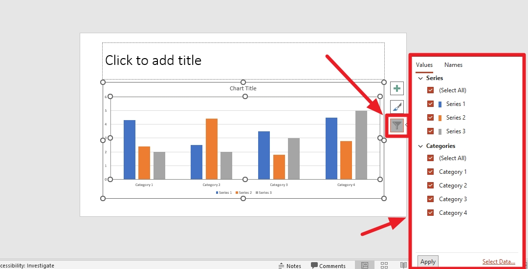
From the Top Navigation Bar Again, the edit data icon is helpful to edit your data in the chart. You have to access it through the top navigation bar.
Step 4: Change Style
There are different methods to change the style, design or color of your bar charts. Here are a few methods to check out.
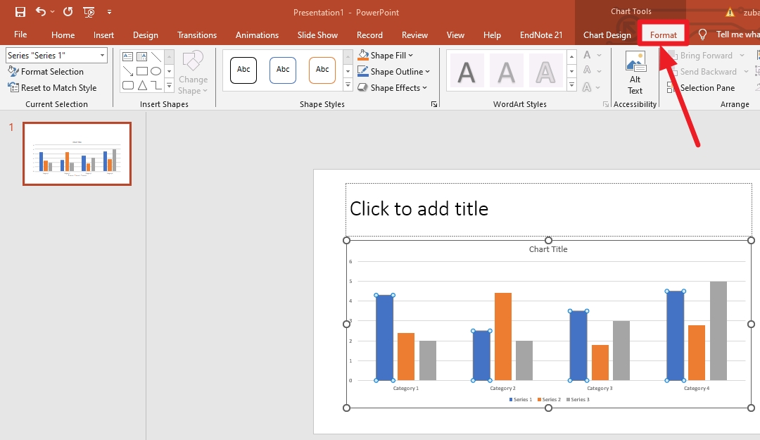
Method 1: Format Menu
The Menu of the chart is formatted from the top navigation bar. Here is how you can do it.
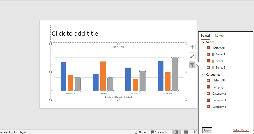
Method 2: Floating Toolbars
The Floating toolbar is also used to change the style and color of the bar chart. You can change colors for the data type and the bars through the floating toolbar.
Method 3: One-Click Style Change
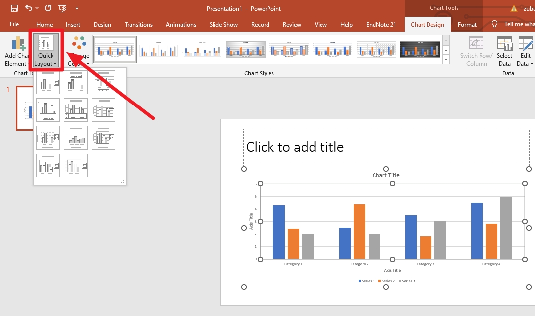
You are allowed to change the styles, colors, designs, or backgrounds in one click if you want. Here is how you can perform each action one by one.
One-Click Layout Change Go to chart design and select a quick layout to see different options for the layout and change it according to your needs.
One-Click Format Change You can quickly change the format of the bars and the style of the diagram. Here is how you can do it.
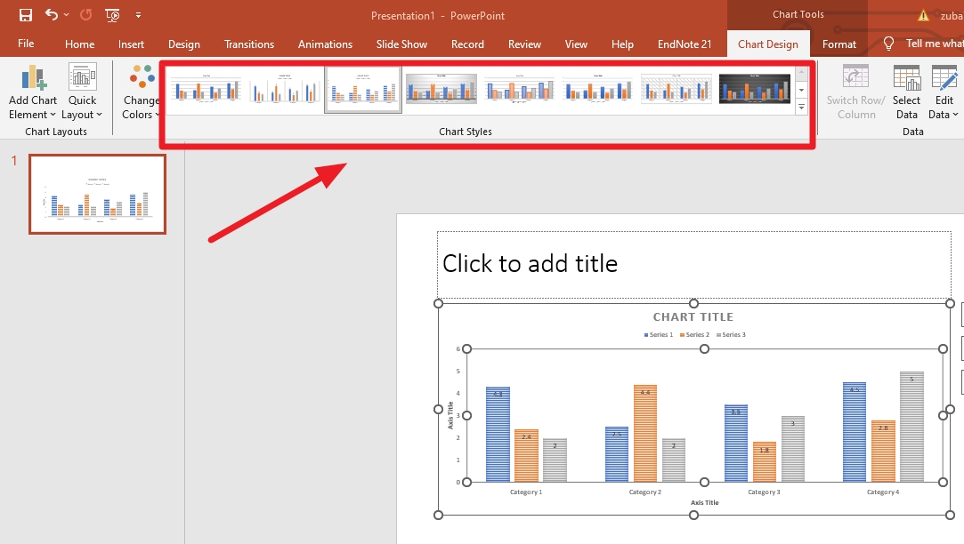
One-Click Color Change Click chart design and then change the color from the navigation bar. You will be given different options to choose from.
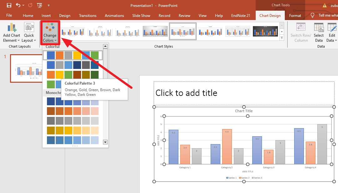
Step 5: Change Chart Type
The chart type for your bar chart also quickly changes in a few clicks. Go to chart designs and click chart type to see multiple options to choose from.
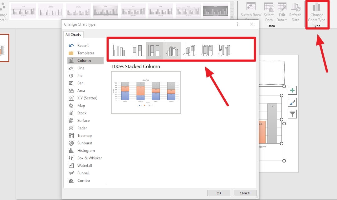
How to Make a Professional Bar Chart in PowerPoint?
Here is a step-by-step guide to creating a professional bar chart diagram on PowerPoint.
Step 1:
Open a slide on your PowerPoint and select a bar chart to appear on the screen.
Step 2:
Edit the data to make your bar chart.
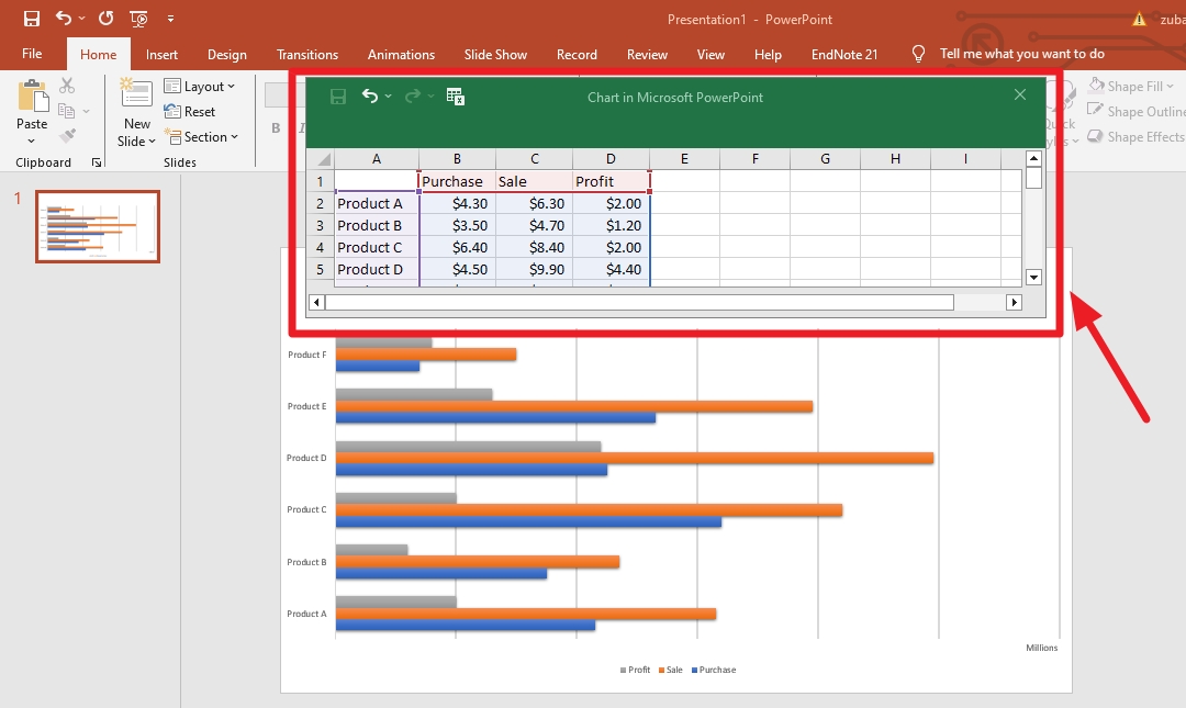
Step 3:
Change the style of the bar chart to make it fit for your design.
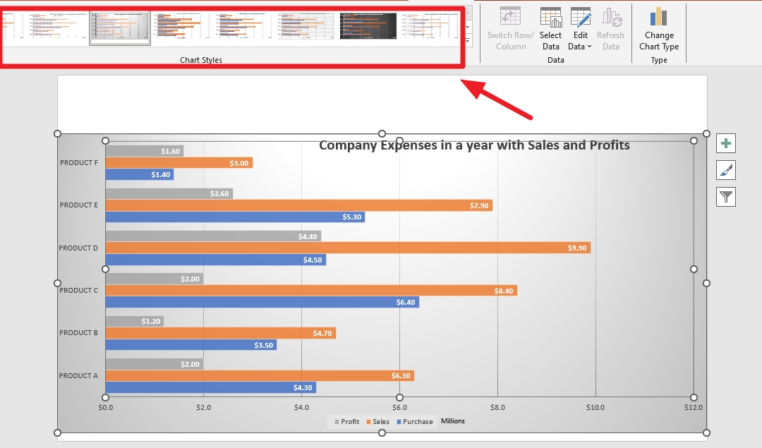
Step 4:
You can arrange this chart in different ways now. To change the design of the chart, you need to click Change chart type.
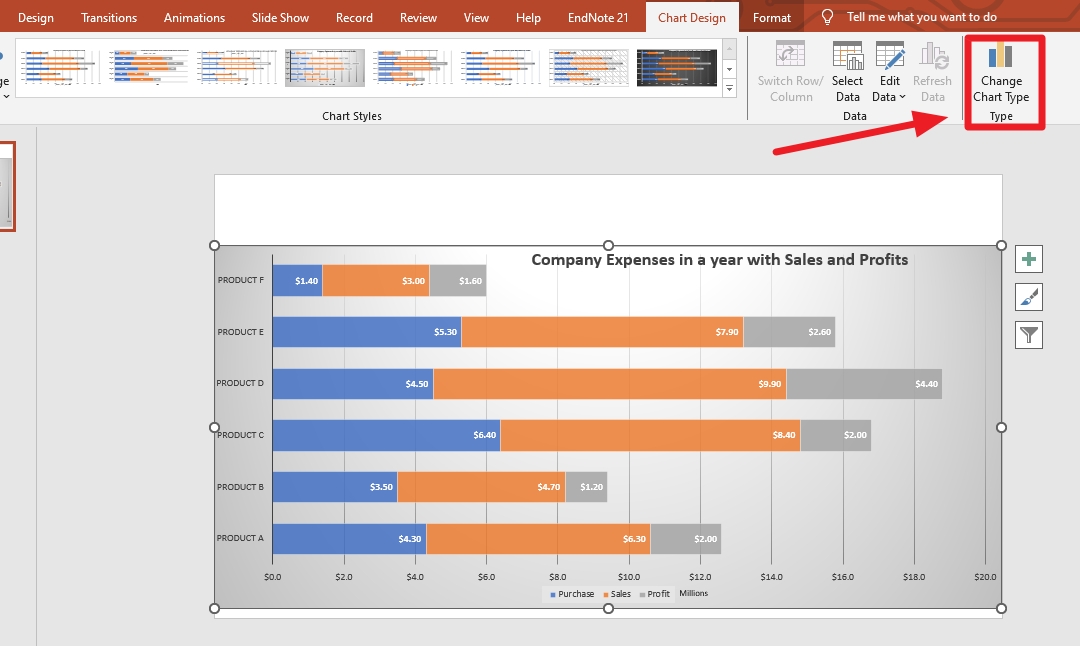
Step 5:
You can change the colors of the bar chart as well.
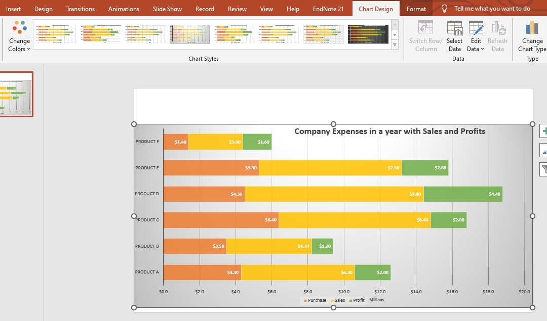
Step 6:
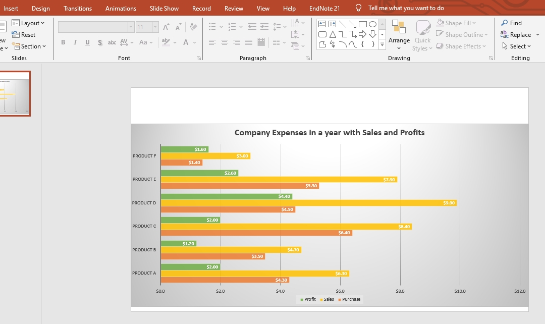
You can bring your data into your diagram as well, if needed, by changing the layout of the diagram.
Step 7:
Now, your bar chart is ready and to be exported. You can change the style colors and everything else with a few clicks.
Best Practices for Making a More Visually Appealing and Effective Diagram/Chart
Here are a few tips to help you achieve better results while creating a bar chart diagram.
- Pick the right tool to start with as you might face some unknown terms you don't understand in the first place.
- Choose the right format to start your bar diagram that suits your design. If you have a few terms, separate bars are preferable.
- The choice of colors is important as well. If you are using a dark background, you can use lighter bars. If there is a lighter background, use bold colors.
- Keep the design simple and clean for a better understanding of the audience.
- Ensure readability and that all the text is crystal clear and prominently seen.
- Provide a clear title, add legend according to the design, and make sure the color schemes differ.
- Use scales appropriately so that the design is favorable to look at. Use the white spaces in the diagram to ensure the design's visibility is pretty clear.
- Use contrast and color combinations wisely. The color combination makes the overall look of the design. Use a combination of light and dark colors to make your design better.
Easily Make a Better One with Edraw.AI
Edraw.AI is a free online visual collaboration app with many AI tools and templates. This powerful AI tool is used to create high-quality designs. It is a perfect alternative to PowerPoint that could be used to create bar charts effectively.
Method 1: Generate a Bar Chart in Edraw.AI
Step 1:
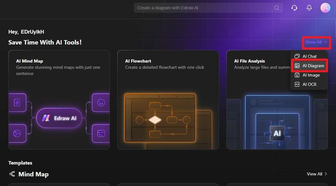
Open a new file and select table/chart.
Step 2:
Select the bar chart from the options and write the best prompt possible to create your chart.
Step 3:
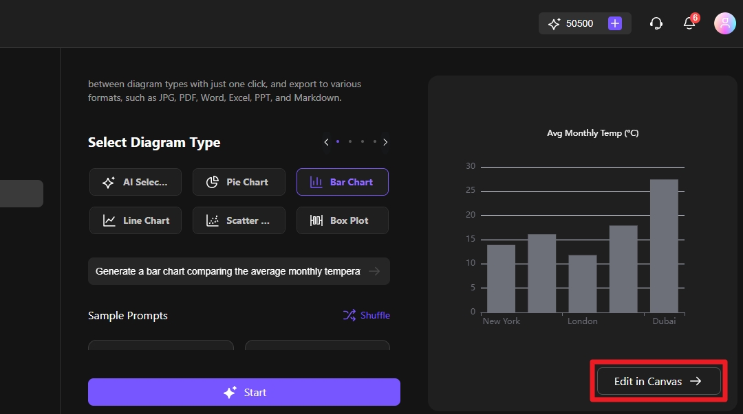
Edit the design if you need any changes. You can change data according to your needs.
Step 4:
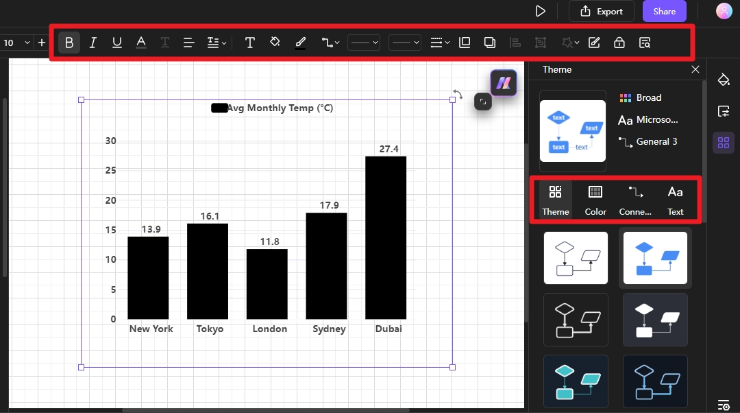
The colors, themes and bar chart lines are changed in a few clicks. Here is how you can do it.
Step 5:
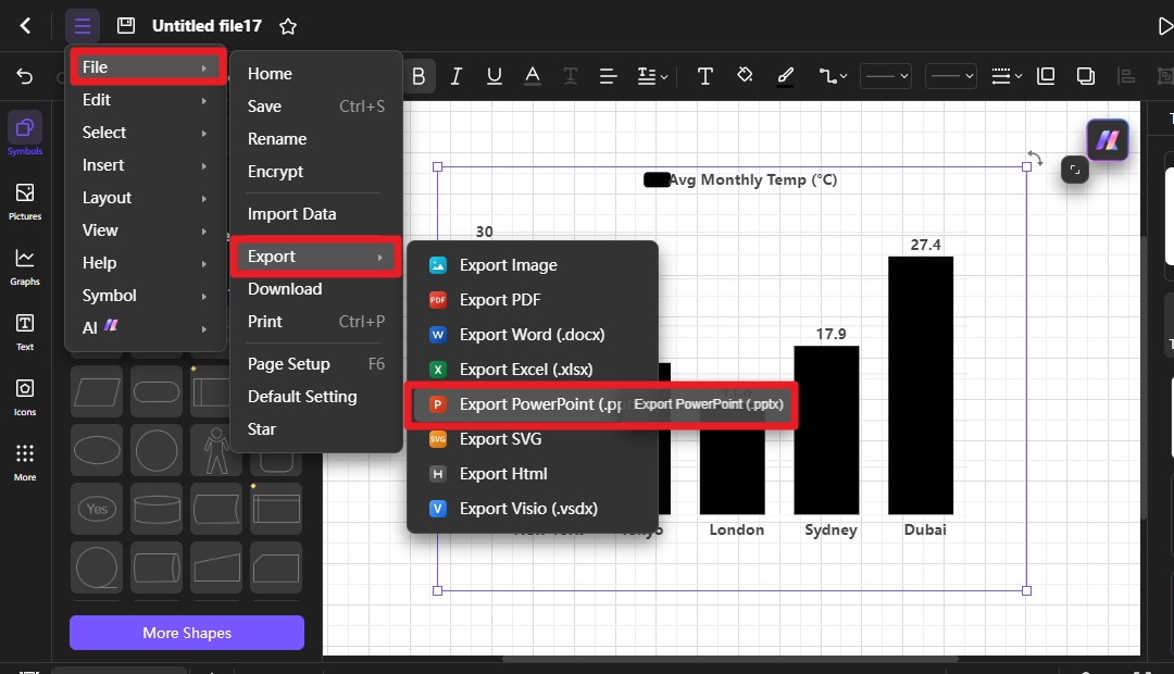
When you make all the adjustments, expert your design to make it available for further use.
Method 2: Create a bar Chart with a Template
The templates are one of the best ways to reduce your workload. There are hundreds of templates available to create catchy bar charts. Here is how you can use the templates.
Step 1:
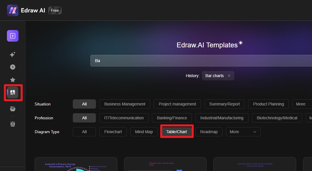
Open Edraw.ai and go to the templates. Find a Table/Chart from the list and click it.
Step 2:
This will open a lot of templates to choose from. Select one of them and open it.
Step 3:
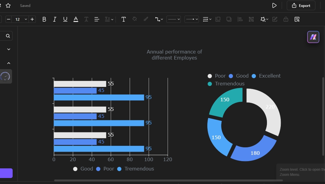
Edit the selected template and make changes to own a design. You can make changes in the designs or even add or remove things to make your design a good fit for you.
Step 4:
Save the design in any format you like after the editing. You can use this design further as well.
Export the Diagram/Chart to PowerPoint
When your design is ready, you can export it in any format. If you want to export a file in ppt or pang format, you need to follow the guidelines.
- Open Edraw.ai and create a new design or open the one you want to export.
- Click the file and save the design in PPT or PNG format.
- Open PowerPoint and click the Insert tab.
- Now browse your ppt exported file from Edraw.ai and place it on the empty slide on PowerPoint.
- The file or design will be available to be edited or used.
Bottom line:
PowerPoint is a fantastic tool when it comes to designing different types of shapes, slides, videos and other media. However, it is a bit tedious to use this tool to make complex diagrams as you need to be an expert to create those diagrams. Simply, you can't make impressive designs if you haven't mastered the tool.
On the other hand, Edraw.ai is a better option as it has ready-to-use templates and features that help you create complex designs in a few clicks. So, it could be the best alternative for PowerPoint.
FAQs
FAQ
-
What is a bar chart?
A bar chart is a kind of chart that elaborates on different properties of the system and compares it with others to help you in different ways. -
Why are bar charts used?
These charts are used in different industries and areas including sales, individual performance comparison over years, type of products making bigger sales or any other industry. -
Can bar charts show trends over time?
Yes, they help to show trends over time making it easier for the business owner to make decisions about their products. -
What software can I use to create a bar chart?
The bar charts are created through different tools and software. The most useful tools include Edraw.ai, PowerPoint, Canva and Google Sheets.


