Designing charts and graphics in Microsoft PowerPoint is something I truly enjoy, not just because it’s my preferred tool but because I’ve spent years mastering it. Now I feel confident using it for any project. However, I understand that as a beginner, navigating a wide range of tools and settings can feel like solving a complex puzzle. It’s easy to feel overwhelmed with so many options available.
In this guide, I’ll walk you through the steps to create a chart or diagram in PowerPoint and show you how to change its look with just a few clicks. Whether preparing a business presentation or working on a school project, this tutorial will make the process easier and faster, allowing you to create polished, professional visuals effortlessly.
In this article
Part 1: How to Create a Simple Chart or Diagram in MS PowerPoint
Using PowerPoint templates is one of the quickest ways of creating a basic matrix diagram–with a few clicks and simple tweaks, you can get it ready to present.
Step 1: Open a Template
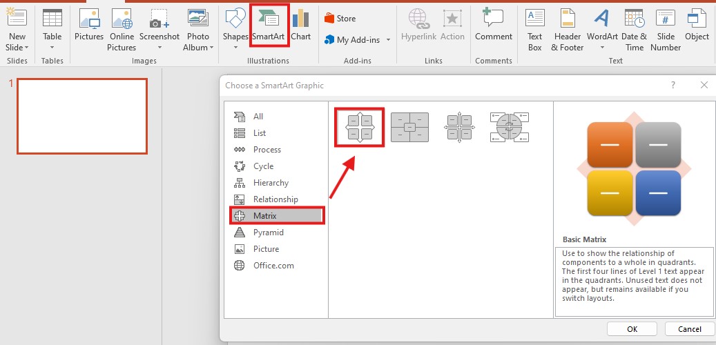
Open PowerPoint, and on the top menu, select Insert. From here, you get two options, SmartArt and Chart. Click on any of these options and select a suitable template.

When you choose a suitable template, PowerPoint draws this template into the slide as a simple diagram.
Step 2: Edit Text/Data
Use the following instructions to edit the text or data in the chart:
- Editing Text: Click any box on the diagram and type in the content you want to add. You can add text in any shape you want, and the text size is adjustable if the shape is different.
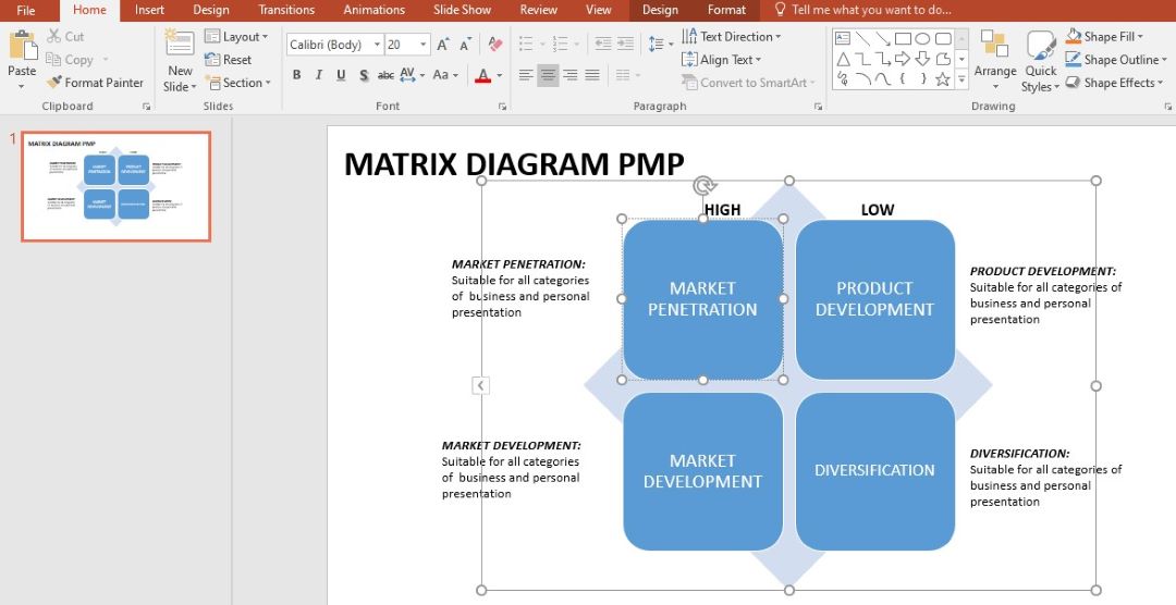
Editing Data in Charts: If you are using a chart, a window of Excel on the right side pops up. Type the data directly on the Excel sheet, and they will automatically appear on the chart.
This makes it easy to format your chart or diagram to include certain content depending on the presentation's content.
Step 3: Remove or Add Shapes
By default, some diagrams or charts contain more or fewer shapes than you require. Fortunately, there is the add or create option, and you can eliminate shapes found in it without any hustle.
Adding a Shape
There are four ways by which you can add shapes to the diagram:
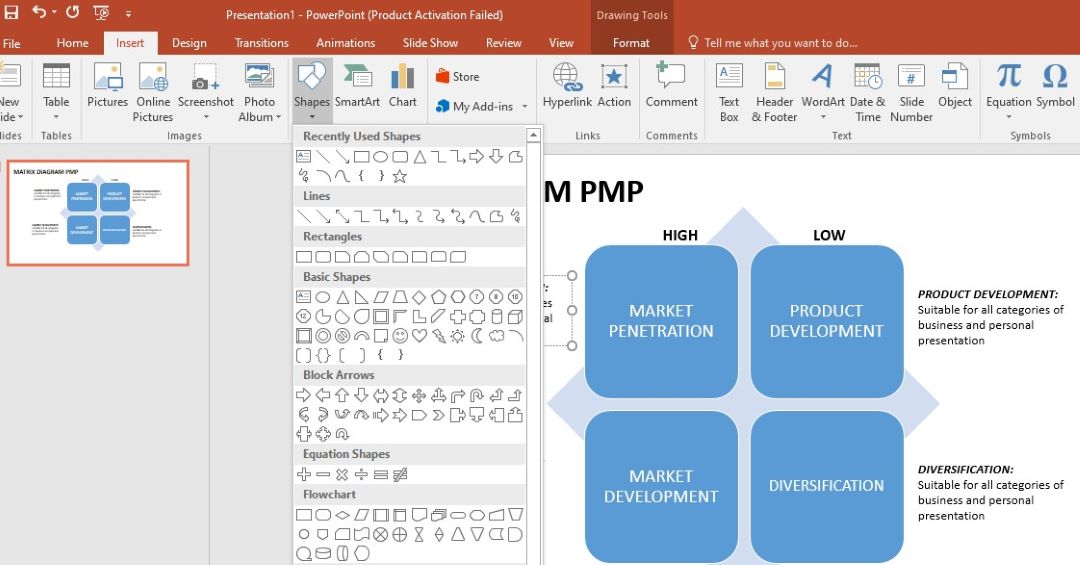
From the Insert Menu: Click on the Insert menu and click Shapes. Make sure you pick the correct shape to use in the diagram.
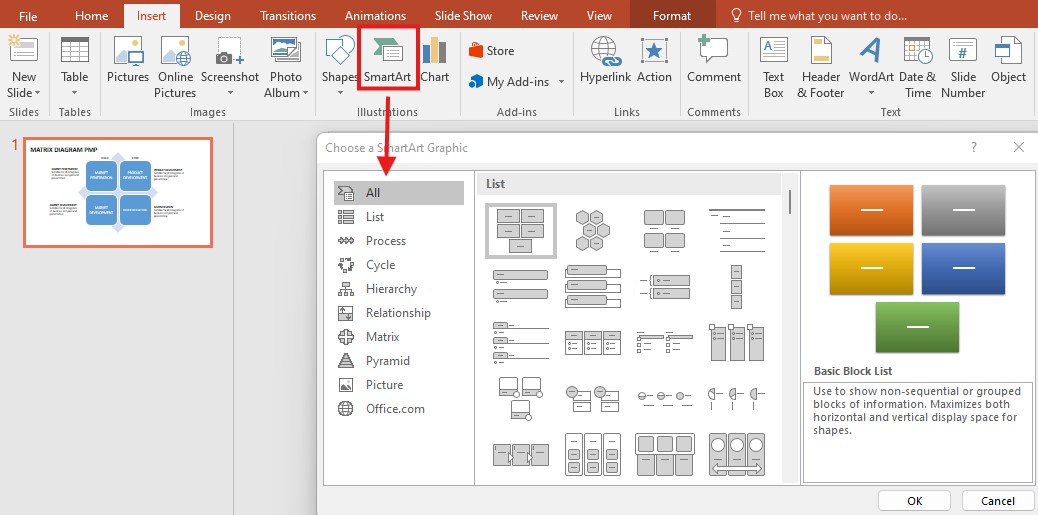
Using SmartArt Tools: If you’re working with a SmartArt diagram, click on the SmartArt tab, and to add shape, select Add Shape, and it prompts you where you want to put the new shape: before, after, above, or below another shape.
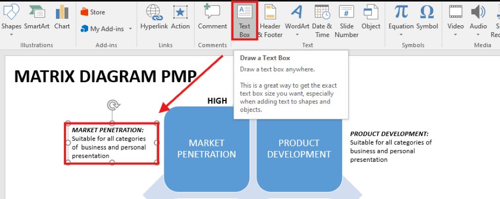
Using Text Boxes: Add a new shape by keying in a new text box under the insert tab and then dragging this into the blank slide.
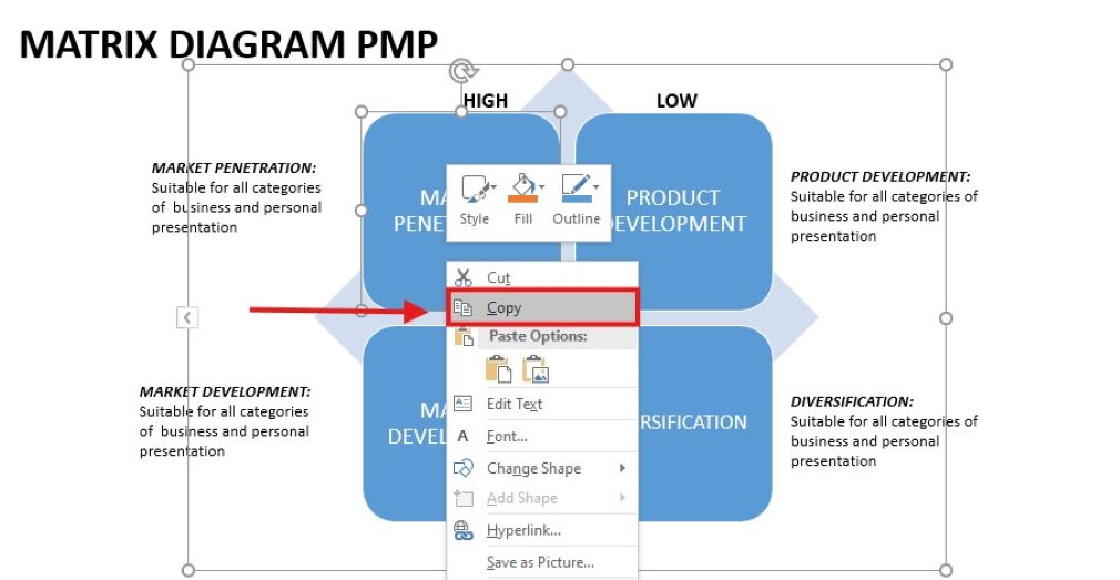
Copy and Paste: Choose one of the shapes, copy it (Control + C), and then paste it (Control + V) to have two of the same shape. You can then alter and change the text inside of it.
Removing a Shape
To delete text inside the shape, go to the inside of the shape and delete everything that is written in it. This will remove the shape.

You can also go to each shape and click delete on your keyboard to get rid of the shape from the diagram.
Step 4: Change Style
You can easily swap the layout, text, and shapes to your set theme when choosing between symmetrical, angular, or oval shapes. Here are three methods for making these changes:
Option 1: Format Menu
Right-click the diagram or chart on the worksheet while your diagram or chart is selected, then choose Format from the list. You can change the shape’s color, borders, and text style from this menu.
It also enables you to change the position of borders, backgrounds' colors, and other settings associated with the diagram's appearance.

Option 2: Floating Toolbar
When choosing a shape or diagram, a small toolbar appears beside it that offers one-click access to the basics, such as text paragraph, language, font size, and color options. You can also use it to change the appearance of some of the parts in the diagram by making a quick change in the color.
Option 3: One-Click Changes
There are also one-click choices for changing the general look of your chart or diagram in PowerPoint. These include:
One-Click Layout Change: Reorient your diagram or chart by 90 degrees with just a mouse click! When deciding on shapes or the data to be arranged, click one time to change the layout.
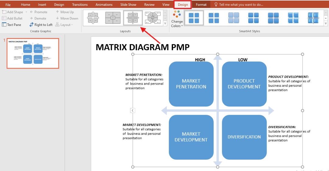
One-Click Style Change: You can completely replace the current look of your diagram or chart by selecting a new style from its Design tab. With a single click, you can toggle to 3D styles and shadows or choose a different border style.
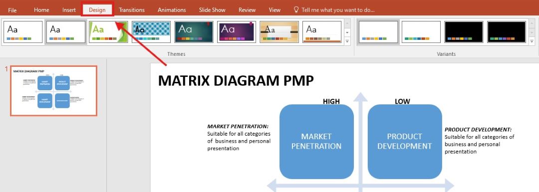
One-Click Color Change: The palette of colors is located in the section Design in the navigation panel at the top of the PowerPoint presentation. Here, you can select a ready-colored design to make the chart more beautiful.
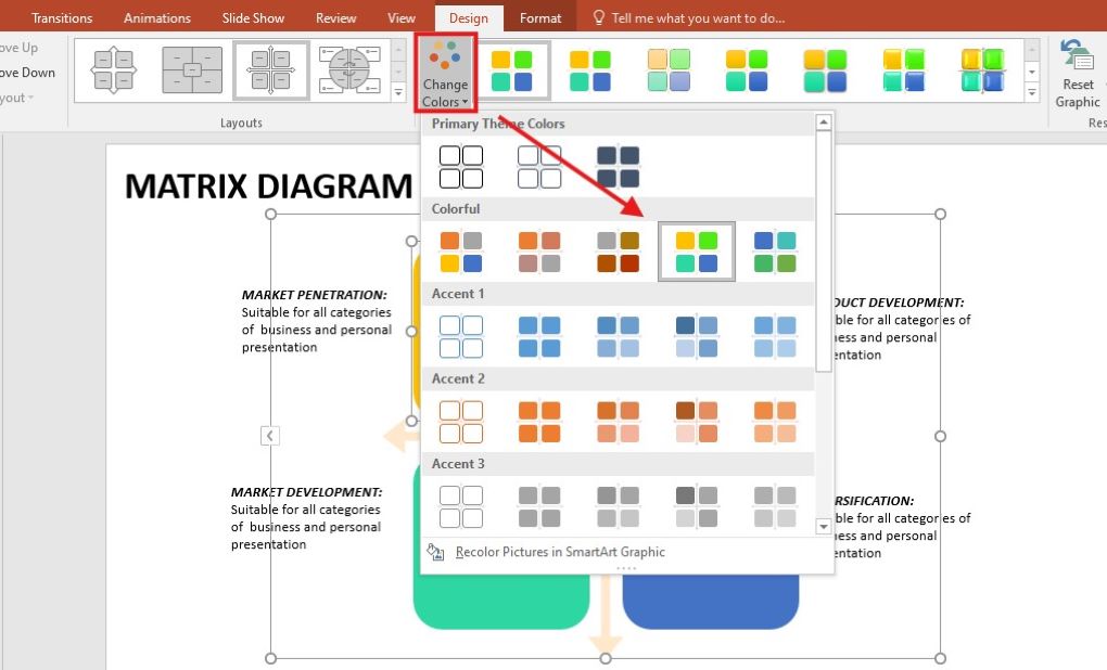
Part 2: How to Make a Matrix Diagram in PowerPoint
PowerPoint offers some advanced features to add a professional look to your diagrams. Follow the steps given below to recreate a diagram like the one below:

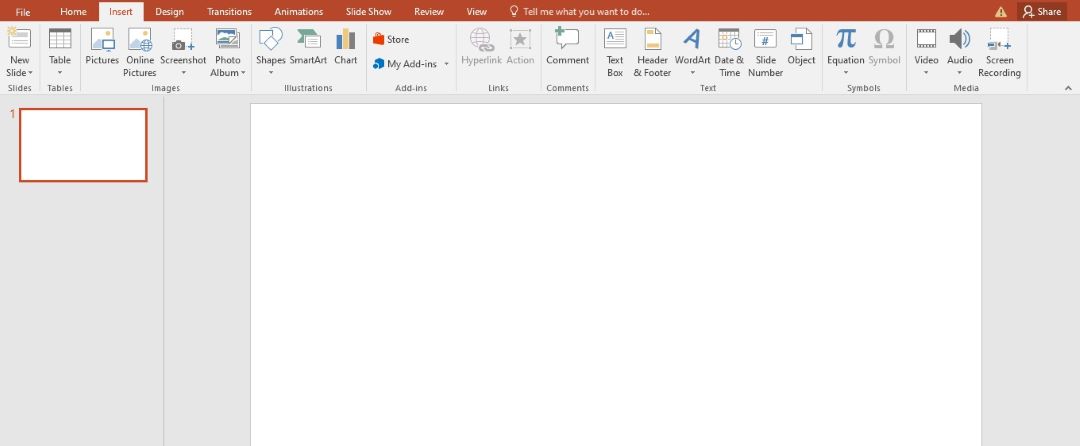
Step 1
Open a PowerPoint presentation and go to Blank Slide.
Step 2
Click Insert from the top navigation and Shapes to add shapes to the slide. After adding a shape, duplicate the images to form new ones.
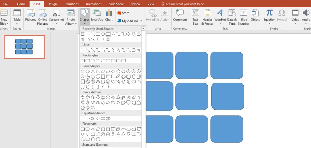
Step 3
Add small inverted triangles towards the top and left of the diagram to make it look more captivating.
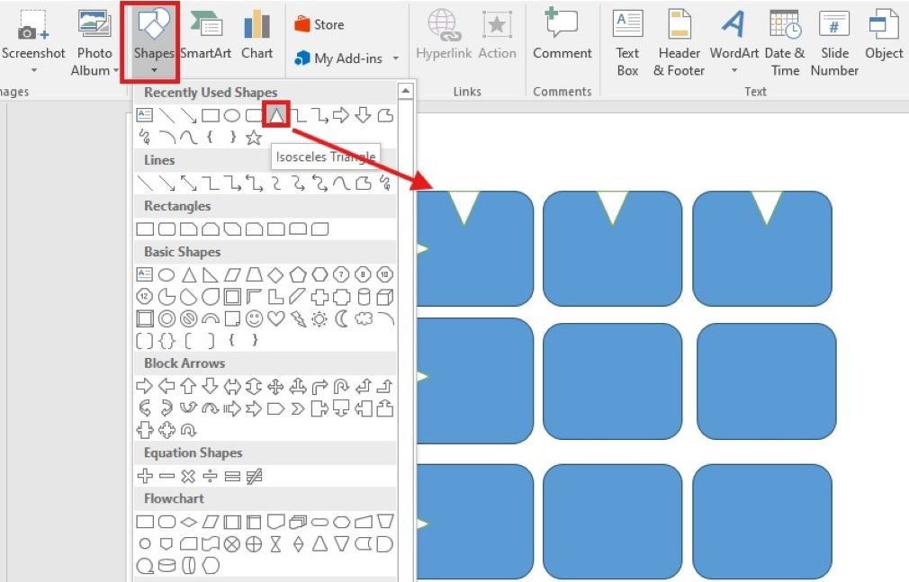
Step 4
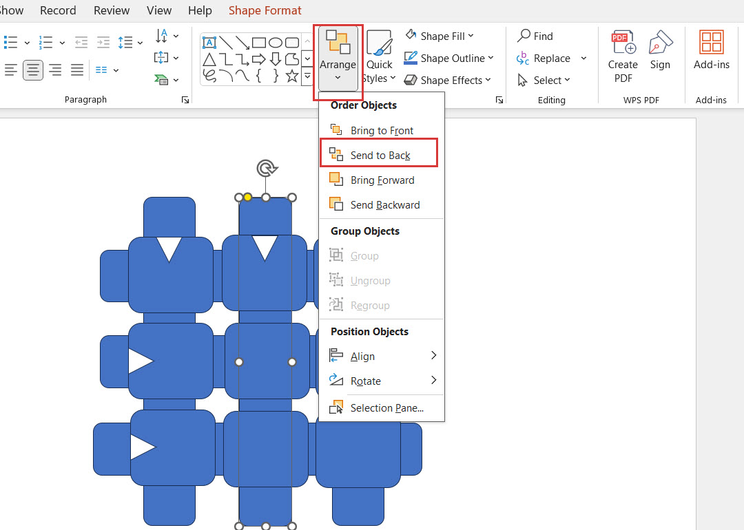
Add elongated rectangles for each row and column and send them to the back. To do this, right-click the mouse and click on the option sent to the back and the image will automatically be sent to the back.
Step 5
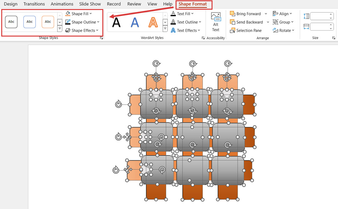
To distinguish the layers and add depth to the diagram, add contrasting colors to the shapes. To do this, click on shapes and select the desired colors from the Shape Format option.
Step 6
When you’re satisfied with the final look of your diagram- the shapes, designs, and layout, start adding text to each box. Double-click on each box and write the text that defines your project.

Step 7
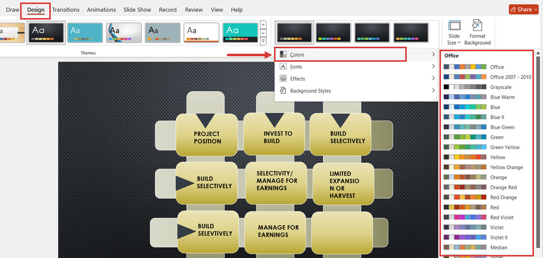
To change the layout and design of your diagram, you can click the Design option and choose the layout of your choice. You can also choose contrasting colors from the dropdown.
Step 8
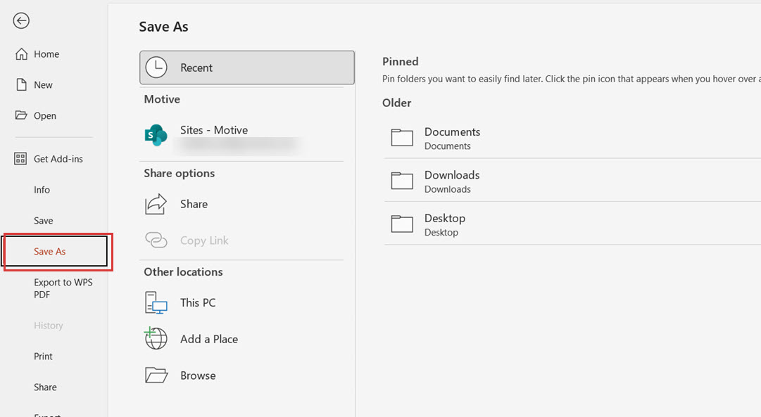
When you’re done adding all the text, save your file by clicking on File > Save As and choose the folder where you want to save it.
Part 3: Tip to Make a Matrix Diagram in PowerPoint
Keep it Simple: Do not insert many words or messages into the diagram or put many things into it. The focus should be on the most crucial data, and its design must be simple to perceive.
Use Consistent Colors: Avoid blending many complementary colors in the graphic design. Choose the right hues to match your brand or theme; however, do not use so many variant colors that confuse the audience.
Add Icons for Clarity: It is also important to use icons when the area is visually busy because icons can act as contrasting and informative markers. That is why it is advised to choose and use all, or at least most, icons associated with the diagram content and be as simplistic as possible.
Optimize Spacing: Create ample white space around your shapes and words. This makes the diagram look beautiful and easy for anyone to read, compared to using the conventional approach.
Utilize 3D and Shadows Sparingly: Generally, 3D effects should be applied where they create the most value; their excessive use turns a diagram into something old-fashioned.
Label Clearly: Label them in clear and precise forms, never use complicated font, and ensure the font size of the word is presentable when used in the presentation.
How to Make a Matrix Diagram with Edraw.AI
As soon as you are through using diagrams in PowerPoint, you can test Edraw.AI, a free and powerful AI tool for professional and free graphic designing and real-time visualization.
It helps you make detailed figures within no time and offers many customization features with which you can make your diagrams more aesthetic.
Step 1
Log in to Edraw.AI via the Wondershare Account or the Social Media account you have registered with.

Step 2
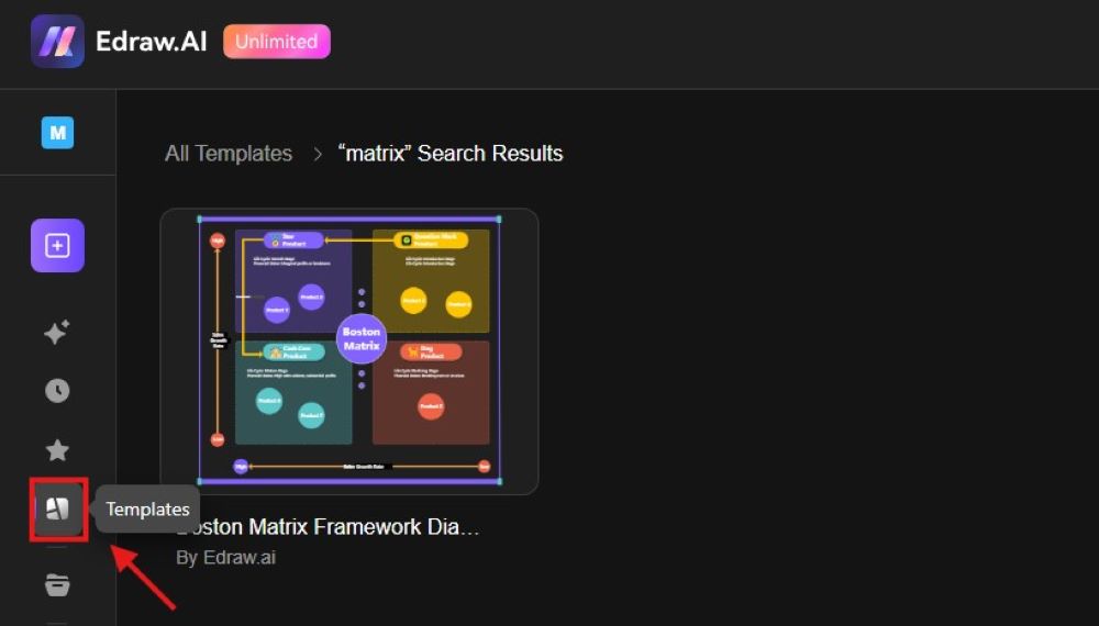
In the left-side menu, navigate to the Templates section to find the required diagram or chart. For instance, type Matrix Diagram and choose a proper template.
Step 3
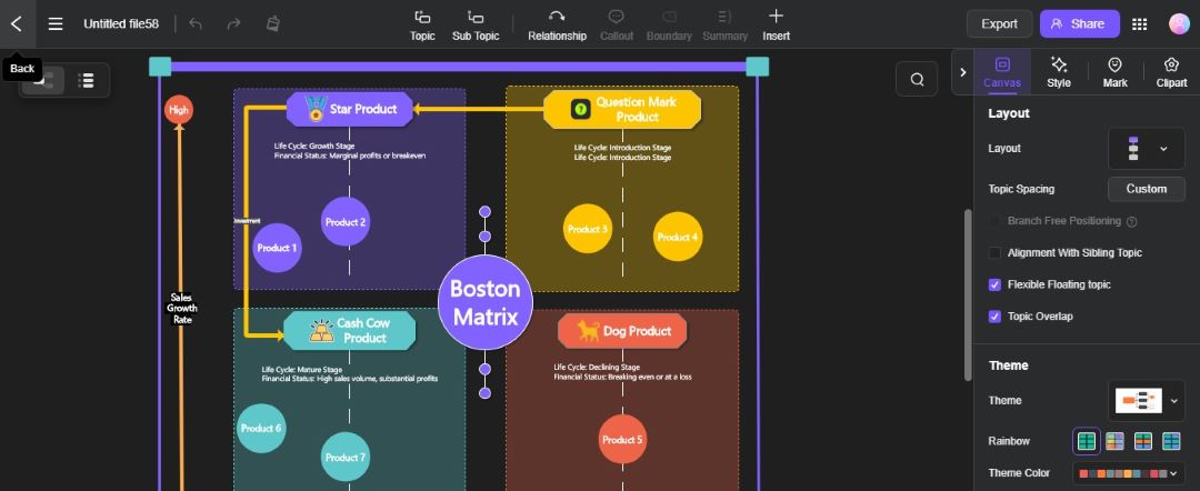
Click Create with Template to open the selected diagram template in the available editor and edit it as you desire.
Step 4
Rewrite the chart text and change the data by clicking certain chart elements. From the style toolbar, access and control how you want the layout and formatting of your message in terms of color.

Step 5
Your diagram is ready. Click on the File option, select Export File, and then choose the PNG format that you can also import into PowerPoint slide and use it for your presentations.
Conclusion
To make more professional diagrams and charts for your presentations, it is wise to use templates in PowerPoint or Edraw.AI. Regarding freestyle and layout, both PowerPoint and Edraw.AI have enough room for that.
Even if PowerPoint relies on templates and customizations, Edraw.AI has an AI system that helps create more complex patterns. This means that with the right tools and proper approach, you can create diagrams that complement your content and stand out.
FAQ
-
How do you make a matrix diagram?
To create a matrix diagram, start by determining the purpose and the specific elements you want to include. Use a grid format to organize the information systematically so that each cell represents a unique aspect of the matrix. You can use tools like PowerPoint, Edraw.AI, or diagramming software to simplify the process. -
Can I create a diagram in PowerPoint?
You can create PowerPoint diagrams using various built-in tools and features. PowerPoint offers shapes, lines, and SmartArt graphics that you can customize to create flowcharts, organizational charts, and other diagrams. Select the desired shapes from the Insert tab and arrange them according to your needs. -
How to make PowerPoint diagrams look good?
To enhance the appearance of your PowerPoint diagrams, focus on using a consistent color scheme and font style throughout your presentation. Your diagrams should be visually balanced and should avoid overcrowding too much text or elements. Use the white space effectively to separate different parts of the diagram, making it easier to read.


