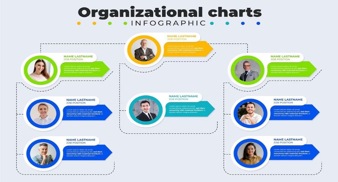
An org chart helps outline roles and responsibilities within an organization. With an org chart, it’s easier for everyone to understand team dynamics.
PowerPoint has the tools to help you create basic org charts. The guide will cover the basics and some advanced techniques, whether you’re working on a small team chart or a larger corporate structure. Read to learn more.
In this article
How To Make a Basic Org Chart in PowerPoint
Creating an org chart in PowerPoint is a great way to present your organization. PowerPoint allows you to showcase the structure of your team or company. The guide will use a template and build one from scratch. Each method has advantages. You can start by using a template:
Step 1: Open a Template
Templates are the quickest and simplest way to create an org chart in PowerPoint. PowerPoint comes with pre-made org chart layouts that you can use right away. Select a template from SmartArt or Chart. Here’s how to access them in three ways:
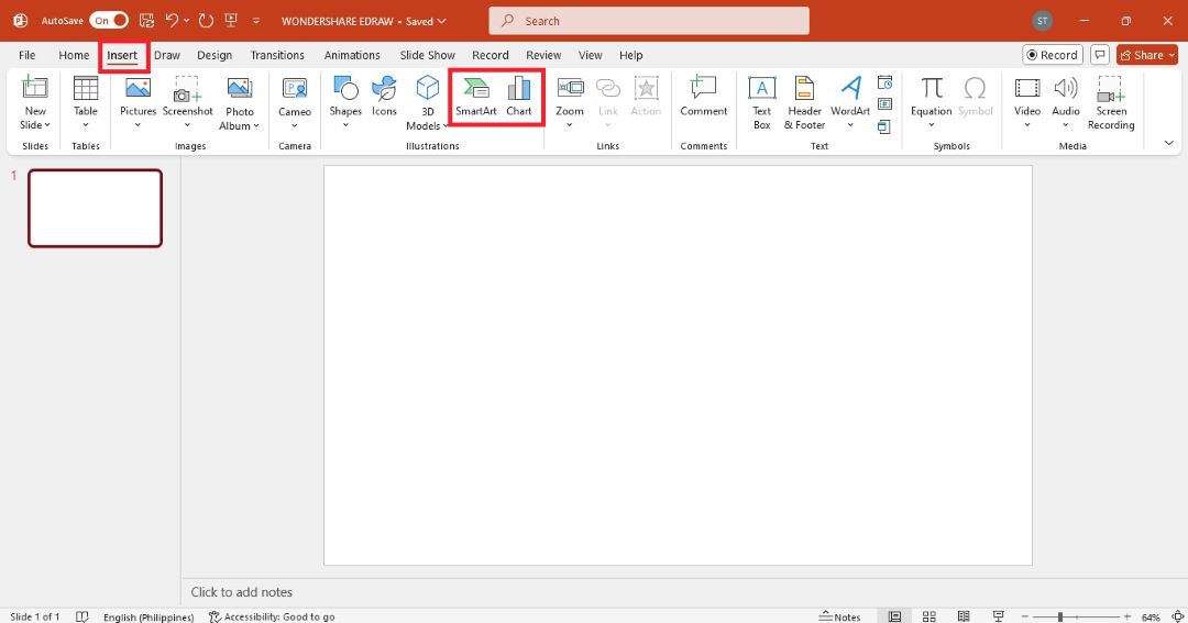
- Launch Microsoft PowerPoint on your computer. Add a new blank slide. Go to the Insert tab in the upper navigation pane, then select SmartArt or Chart from the Illustrations group.
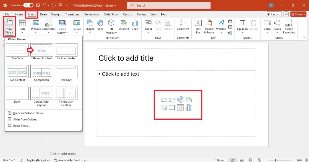
- Add a new PPT slide with the Title and Content layout. You will see the placeholders for the title, chart, SmartArt graphic, and more.
- Select SmartArt, and then go to Hierarchy on the left side of the Choose a SmartArt Graphic pop-up window. Choose a hierarchy PPT template, and then click OK to use it.
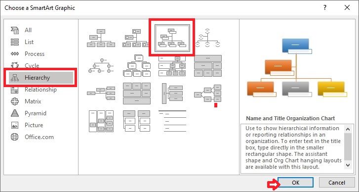
You will see the selected hierarchy PowerPoint template in the slide.
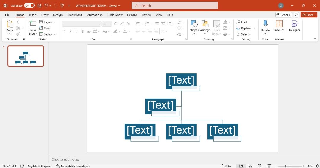
Step 2: Edit Text
Click inside the default text boxes to add and edit names and job titles.
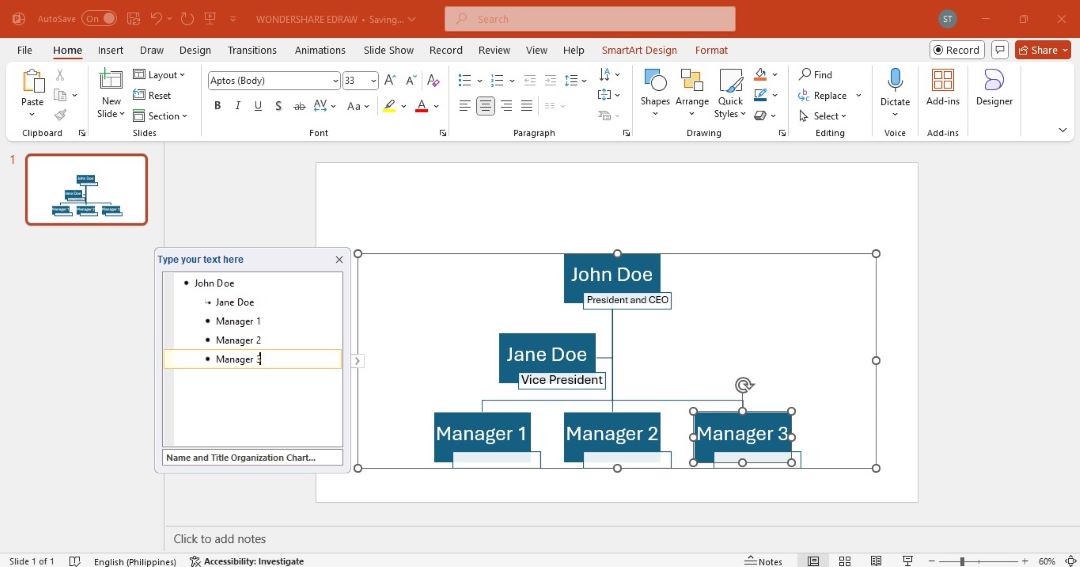
Step 3: Add or Remove Shapes
You can add or remove shapes to the hierarchy template to customize the chart.
Add a Shape
There are four ways to add a shape to the chart template:
- Go to the Insert tab in the upper navigation pane. Select Shapes to open the gallery. Choose a shape and drag it to the right position in the chart.
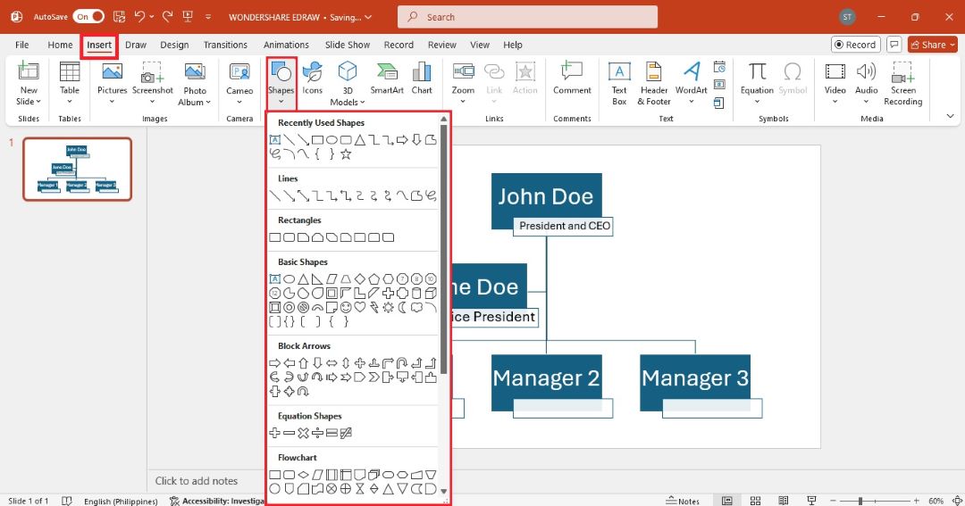
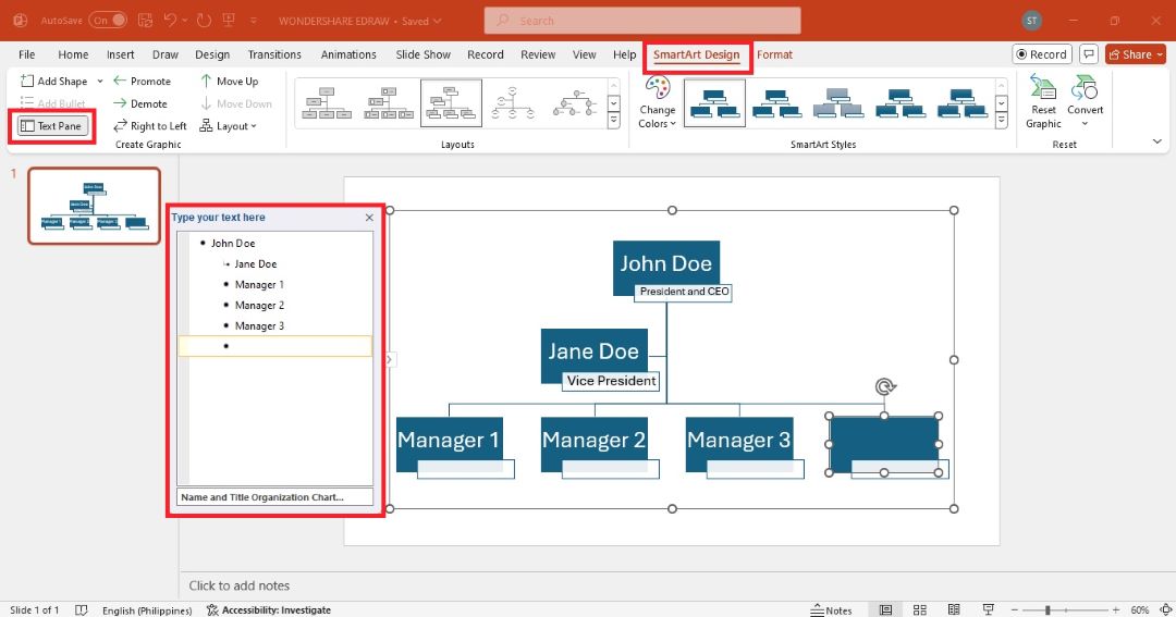
- Select the chart or SmartArt graphic on the slide. Click the shape closest to where you want to add the new one. Next, go to the SmartArt Design tab in the upper navigation pane. Click Add Shape from the top left side and choose where to add the new shape (above, below, or beside the selected one).
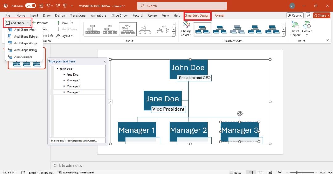
- Click Text Pane from the SmartArt Design tab in the upper left side. Press Enter on your keyboard to add a new shape to the chart.
- Use the copy-and-paste keyboard shortcuts. Press and hold CTRL + C to copy a shape from the chart and CTRL + V to paste.
Remove a Shape
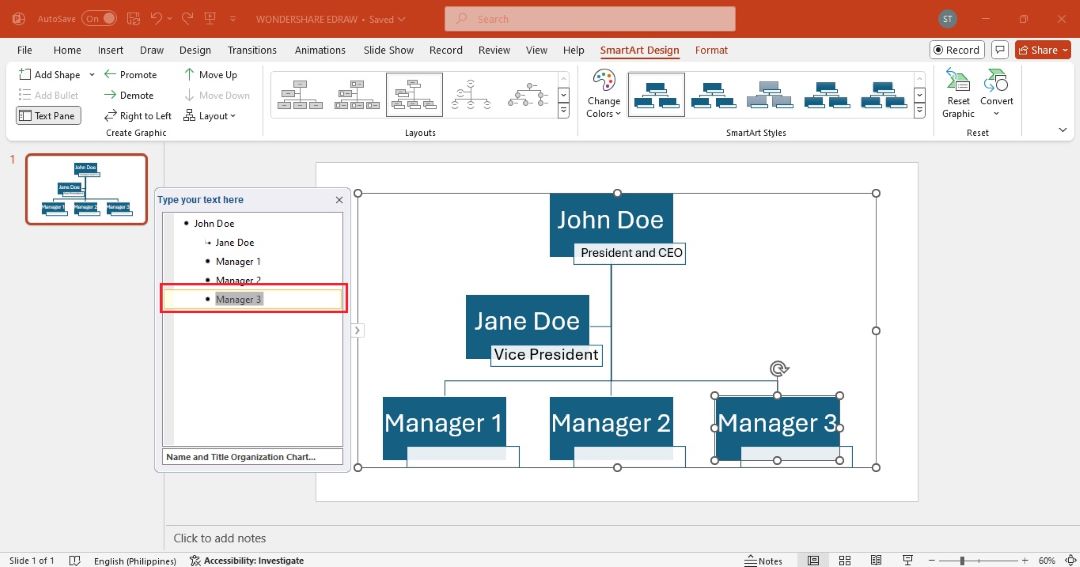
Select the shape you want to remove from the chart, and then press Delete on your keyboard.
You can also highlight the text in the Text Pane and press Delete to remove the text box from the chart.
Step 4: Change Style
Customize the overall appearance of the chart. There are several ways to do this in MS PowerPoint.
Method 1: Format Menu
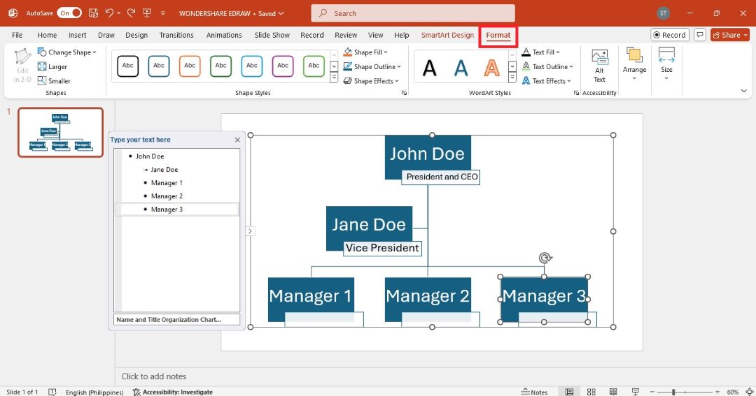
Click the chart in the slide or select a specific shape to apply the changes only to that shape. Go to the Format tab in the upper navigation pane. Customize the org chart using different tools. For instance:
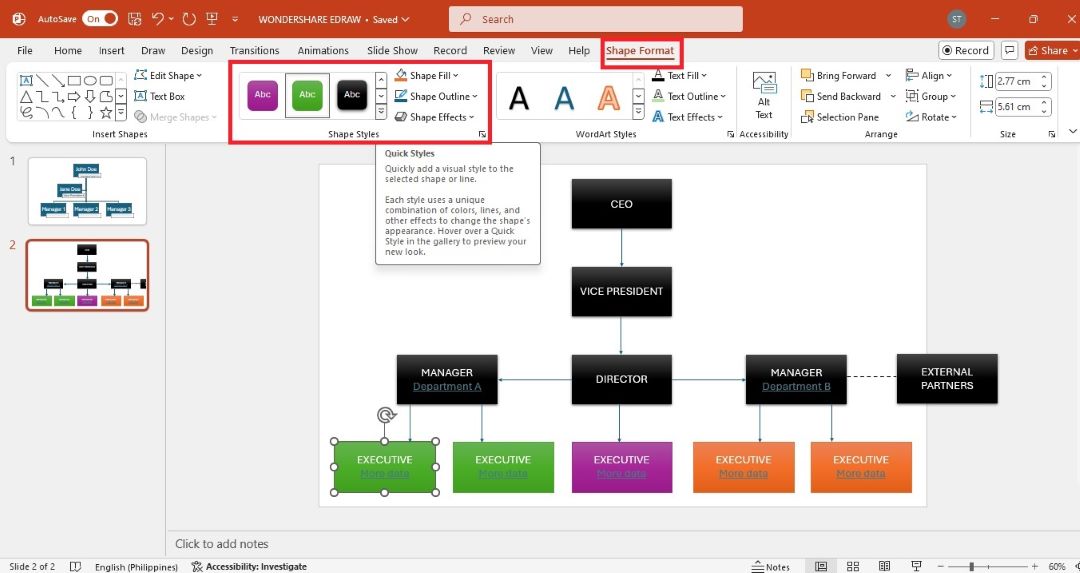
- In the Shape Styles group, choose different shape fills, outlines, and effects.
- Use the Text Fill and Text Outline options to change the color and outline of the text within the chart for better visibility.
- Select individual chart elements (like lines) to access additional formatting options, such as color adjustments.
Method 2: Floating Toolbar
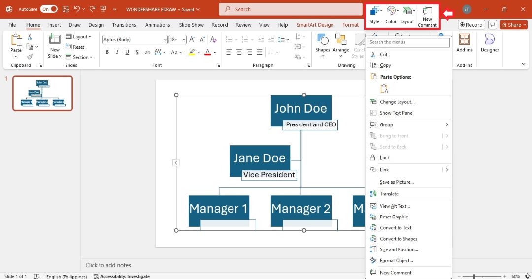
Right-click anywhere in the chart area. Select an option from the floating toolbar to personalize the Style, Color, Layout,S and more.
Method 3: One-Click Change
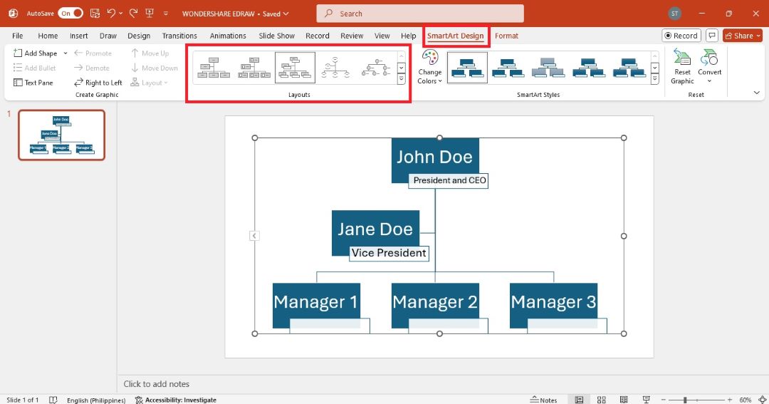
PowerPoint also allows you to quickly transform your charts with just a few clicks. Select the chart on the slide and go to the SmartArt Design tab. Then, follow the steps below:
One-Click Layout Change
Look for the Layouts group. Here, you can choose different chart styles. Hover your cursor over each option, and you’ll see a preview of how your chart will look. Click one of the styles to apply it instantly.
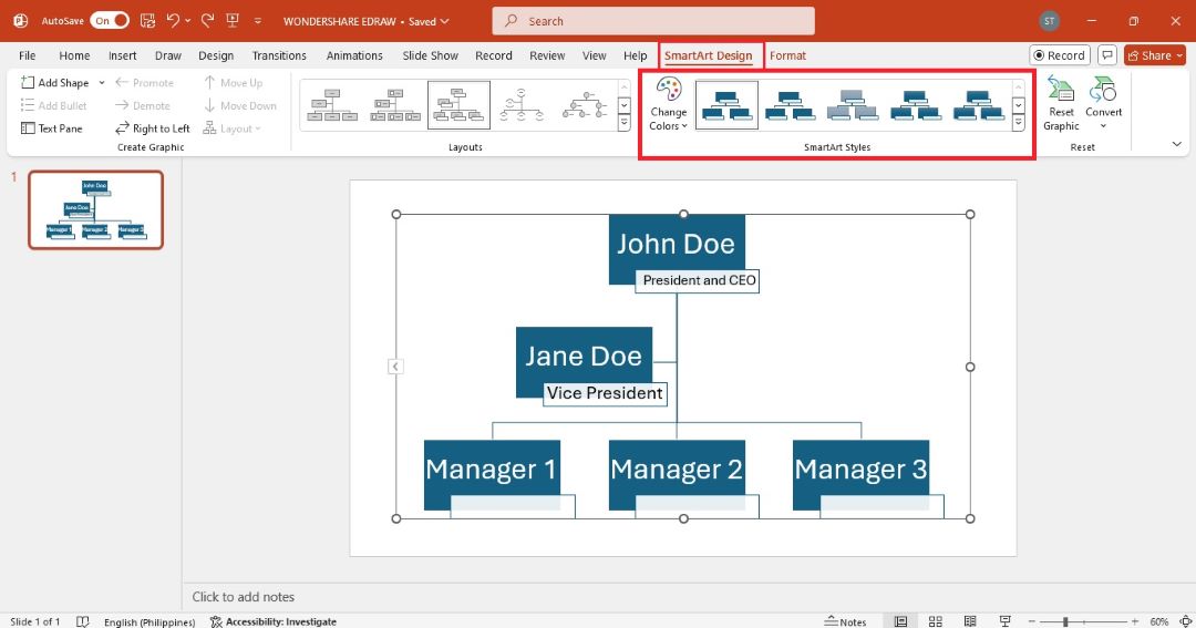
One-Click Style Change
In the SmartArt Styles group, you’ll see various style options that apply different visual effects to your hierarchy chart. Click a style to apply instantly.
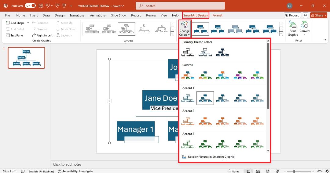
One-Click Color Change
Click the Change Colors dropdown. A menu will appear, displaying various color accents that you can apply to the hierarchy chart. Select the color theme you prefer to apply it instantly.
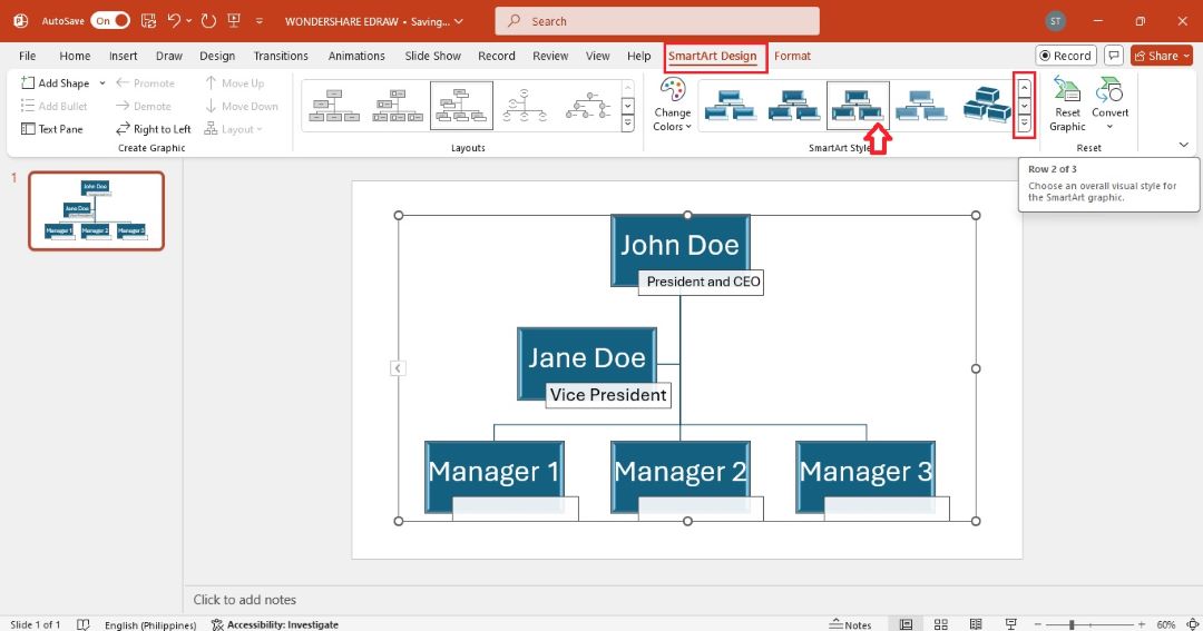
To apply a 3D style on the hierarchy chart, select in on the slide. Then, go to the SmartArt Design tab. Use the up and down arrow on the SmartArt Styles group to open more rows. Choose one of the preset 3D rotation styles.
How To Make a Professional Org Chart in PowerPoint?
If you need a more customized or detailed org chart, building one from scratch gives you complete control over the design, layout, and structure. Here’s how:
Step 1:
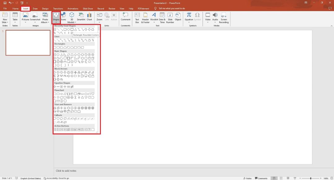
Open a blank PowerPoint slide for full control of the layout. Go to the Insert tab, and then click Shapes. You’ll use shapes like rectangles or circles to represent employees or roles in the chart.
Step 2: Create Top-Level Roles
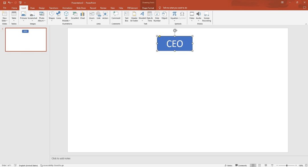
Draw a shape for your top-level executives (e.g., CEO, President). Select a shape from the Shapes menu and click the slide to insert it. Click inside the shape and enter the employee names and titles.
Step 3: Create Top-Level Roles
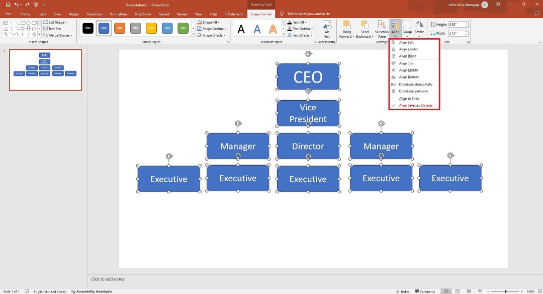
Draw more shapes below for managers, department heads, or other employees. Use the Align and Distribute tools under the Format tab to space and arrange your shapes.
Step 4:
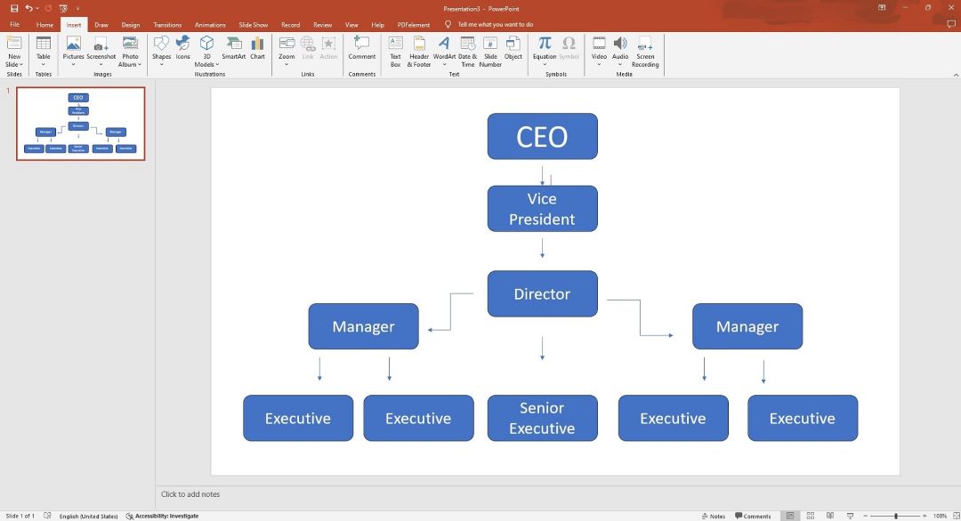
Connect the roles using lines. Go to Insert > Shapes and select a line to draw between two shapes. Click one shape and drag the line to another to visually show the hierarchy.
Step 5:
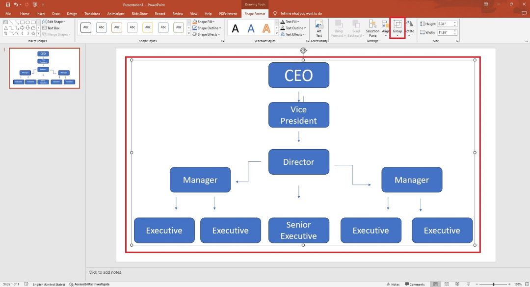
Group all the shapes and lines together. To do so, select all shapes, right-click, and then choose Group from the Arrange group.
Step 6:
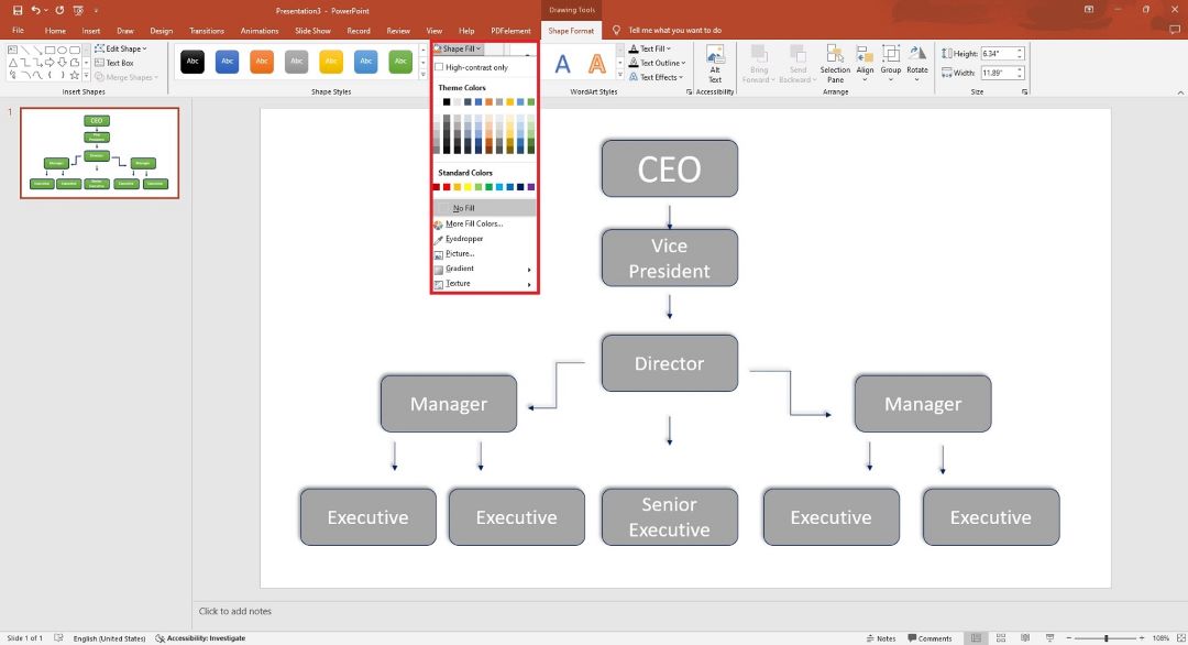
Use the Format tab to change colors, adjust borders, and apply different text styles.
Step 7:
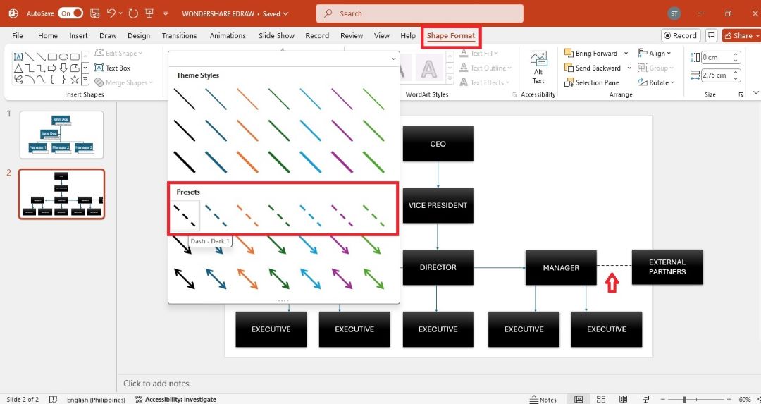
If applicable, include external stakeholders, partners, or advisory roles to show how they relate to the organization. Use dashed lines to represent external relationships.
Step 8:
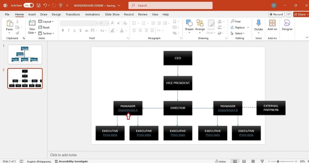
Consider using hyperlinks that lead to detailed information about specific roles or departments.
Step 9:
Use color coding to represent different departments or levels within the organization. Select a shape in the chart, and then go to the Shape Format tab. Choose a style from the Shape Styles group.
Step 10:
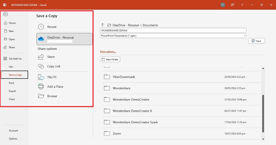
Once completed, review the org chart with key stakeholders to ensure accuracy and clarity. Export it to your computer or share a link for others to edit.
Tips for Making a More Appealing and Effective Org Chart
To make your org chart functional and appealing, follow these tips to enhance its design and impact:
- Convert text to SmartArt: You can convert employee names and titles into an org chart using SmartArt in PowerPoint. Enter your org structure as text, highlight it, and then go to Insert > SmartArt > Hierarchy to convert the text into a structured chart. This method saves time and ensures a clean layout.
- Use consistent colors and fonts: Ensure that your org chart matches your company’s branding by using consistent colors and fonts. Stick to no more than three colors for the entire chart—one for titles, one for roles, and one for background or accents. This will create a professional, cohesive look.
- Maintain a balanced layout: A great org chart is easy to read. Avoid overcrowding the chart with too much information in one section. If necessary, break larger teams into smaller sub-sections to maintain clarity.
- Add photos for a personal touch: including small profile photos next to names can humanize your org chart. It makes it more engaging for viewers. This is useful for presentations or onboarding new employees.
Easily Make a Better Org Chart With Edraw.AI
With AI-powered tools like Edraw.AI, creating an org chart is faster than ever. Edraw.AI can generate a fully customized chart in seconds, giving you an editable chart with low effort. It also has built-in templates if you want to start with a click.
Here’s how to create an org chart using AI prompts and with a template:
Method 1: Generate an Org Chart Using AI
For a more automated approach, Edraw.AI can generate a structured org chart in seconds using text prompts. Here are the steps:
Step 1:
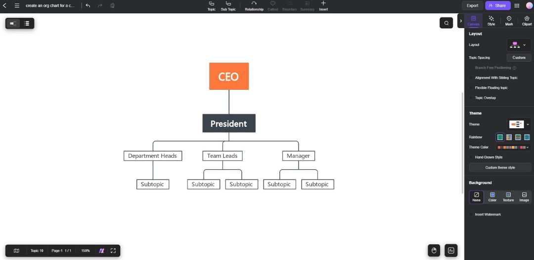
Launch Edraw.AI. Go to Home > AI Mind Map. From the dialogue box, type your prompt. For example, type in “create an org chart for a company with 10 staff”. Click Start afterward.

Step 2:
Wait for Edraw.AI to generate the org chart. Click any role to edit the names, titles, or positions. Customize colors, fonts, and styles to align with your organization’s branding.
Step 3:
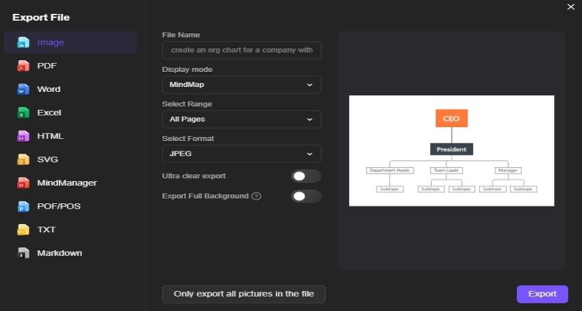
Once the org chart is customized, export it as a PNG or PPT file. Import the org chart into your PowerPoint presentation for a professional and seamless final product.
Method 2: Create an Org Chart Using a Template
Here’s how to use a template in Edraw.AI to create an org chart:
Step 1:
Go to Edraw.AI and sign in using your Wondershare ID or social media credentials. Once logged in, choose the Templates option from the main menu.

Step 2:
Browse through the available org chart templates. Use the search bar or choose the one that best fits your organization’s structure. Click the template to open it in the editor.

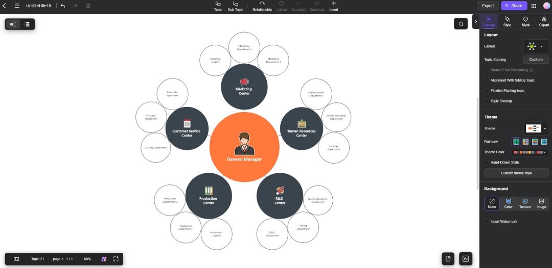
Step 3: Customize the Org Chart Template
Edit the employee names, titles, and hierarchy by clicking the text boxes in the template. Use the add shape button to include new roles or press Delete to remove any unwanted positions. Apply different colors, fonts, and layout styles to match your brand’s visual identity.
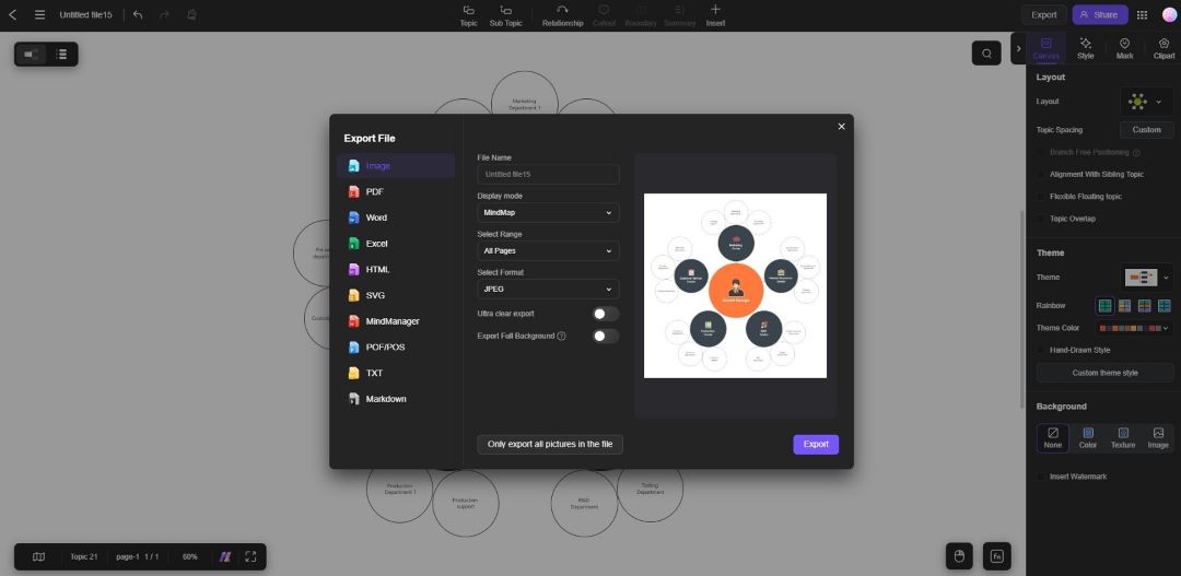
Export the Org Chart to PowerPoint
Once you’re happy with the design, export the chart in PNG or PPT format. Import the chart into PowerPoint, making it a seamless part of your presentation.
Building an org chart in PowerPoint doesn’t have to be complicated. By using SmartArt templates or Edraw.AI’s tools, you can create a well-organized and professional org chart.
Showcase your organizational structure by following the steps above. You can design an org chart that’s both functional and appealing without spending too much time.
FAQ
-
Can I modify the org chart after creating it?
Yes, org charts made in PowerPoint or Edraw.AI are fully editable. You can change text, positions, and styles at any time using the available formatting tools. -
How can I add more hierarchy levels to my org chart?
In PowerPoint, use the Add Shape option under SmartArt Tools > Design to insert more shapes. You can add shapes above, below, or beside existing roles. -
Can I use my company’s colors in the org chart?
Absolutely! Go to the Format tab and use the Shape Fill and Text Fill options to apply your company’s color scheme to the org chart for consistency with your brand identity. -
Can I export my org chart as an image?
Yes, in PowerPoint, you can save your org chart as an image by right-clicking the chart and selecting Save as Picture. Choose a format such as PNG or JPEG. -
How do I share my org chart with others?
You can export your org chart as a PowerPoint slide, image, or PDF. From the File > Export menu, choose your preferred format and share it via email or cloud storage.


