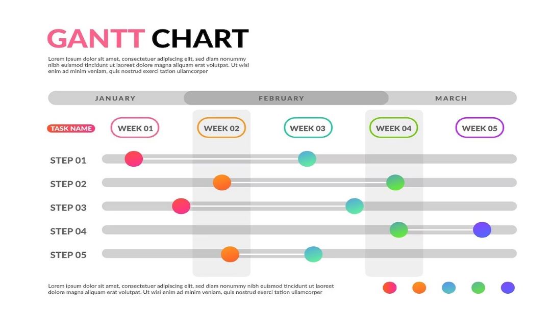
Using Gantt charts is important for many project managers. They help managers visualize timelines, tasks, and progress. Microsoft PowerPoint can also make Gantt charts. However, it might not be the first software you think of when creating one. Yet, it can be effective when used with templates and AI tools.
The article will walk you through various methods of creating a Gantt chart, from basic designs to more advanced, professional setups. Read to learn more.
In this article
How To Make a Basic Gantt Chart in PowerPoint?
Creating a basic Gantt chart in PowerPoint is easier than you might think. The easiest way is to use a template to help you quickly design and customize visual content. Here’s a step-by-step guide.
Step 1: Open a Template
You can access templates for diagrams or charts in SmartArt or Chart. There are two ways to do this:
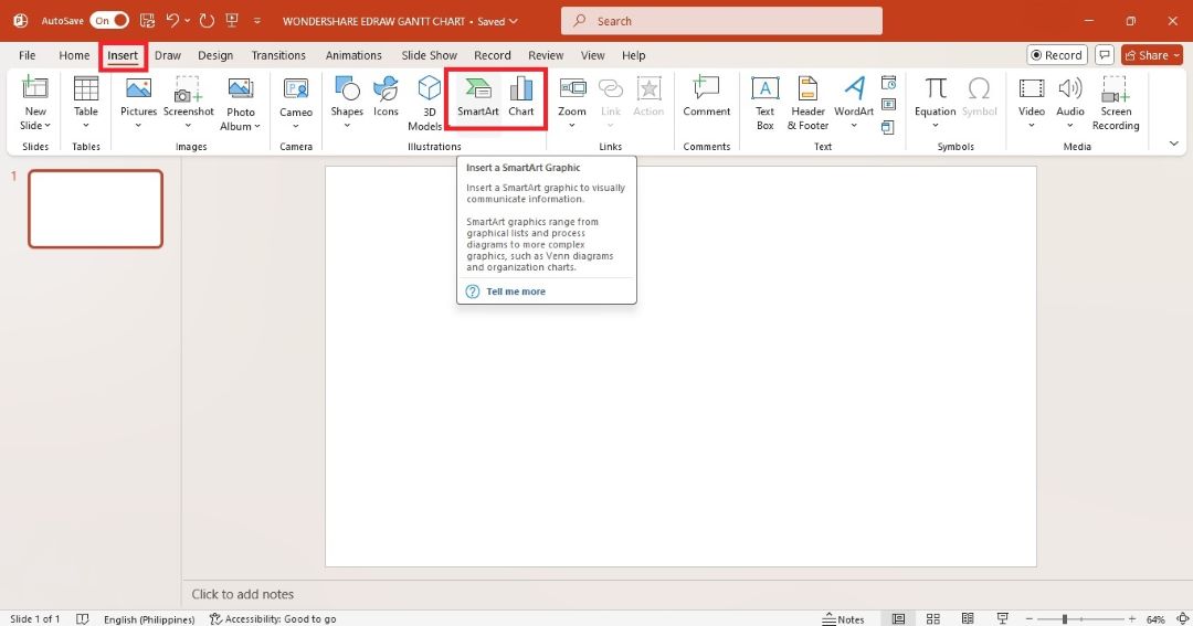
- Go to the Insert tab in the upper navigation pane. Click SmartArt or Chart in the Illustrations group.
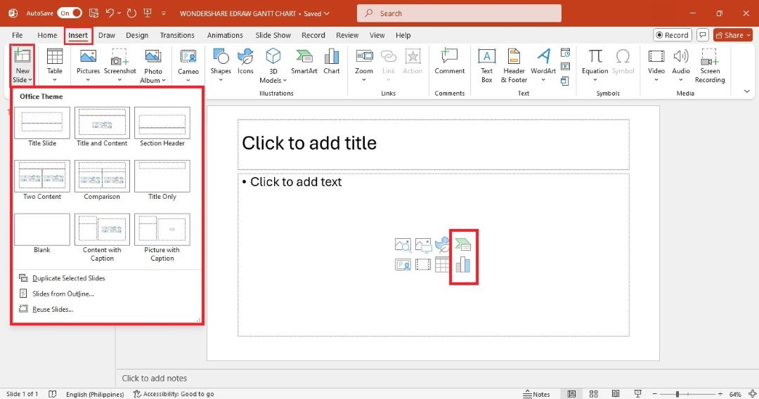
- Go to the Insert tab, and then select the Title and Content layout on the New Slide dropdown menu. Click the Insert a SmartArt Graphic or Insert Chart icons at the center of the slide.
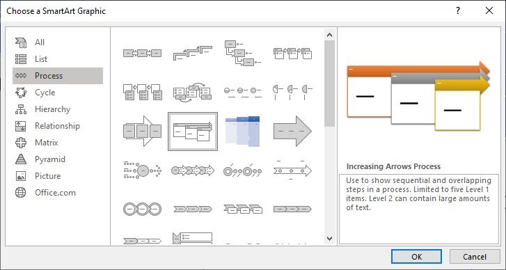
In the Choose a SmartArt Graphic pop-up window, choose the Process category. While PowerPoint doesn’t offer a specific Gantt chart, select a process chart like an Increasing Arrows Process. This template has a structure that can represent the different phases and tasks in your project. Click OK to insert the SmartArt graphic on your slide.
Step 2: Edit Text
Click directly on the shapes to edit the text in a chart template. Replace the placeholder text with your content.
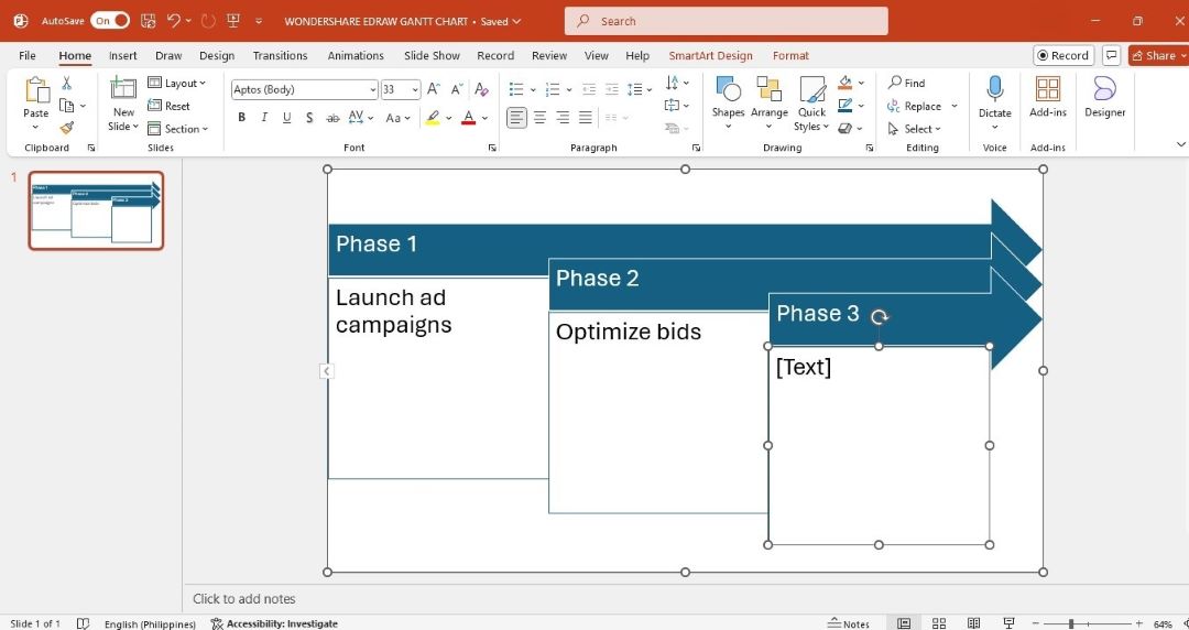
Drag the bars and tasks to adjust the timeline based on your project needs. Extend or shorten tasks to match project durations.
Step 3: Remove or Add Shapes
You can use different shapes to show various tasks in your project. For example, try rectangles for regular tasks, diamonds for milestones, and arrows to show task dependencies. This makes it easier to see what’s happening immediately.
Add a Shape
Here are various ways to add a shape to the Gantt chart:
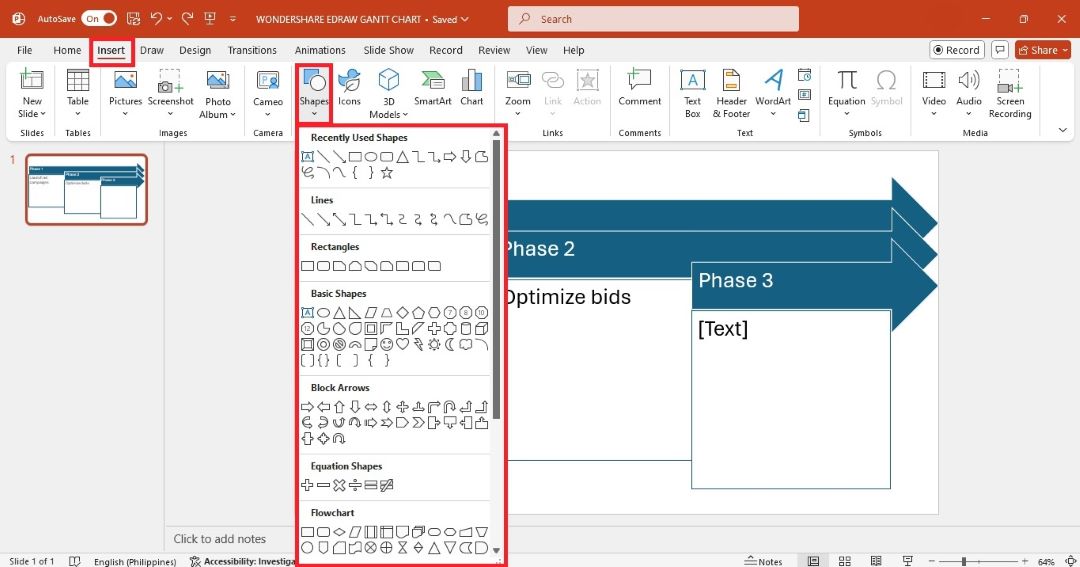
- Go to the Insert tab in the upper navigation pane. Click the Shapes dropdown menu, and then select the shape you need. Draw the shape in the slide using your cursor.
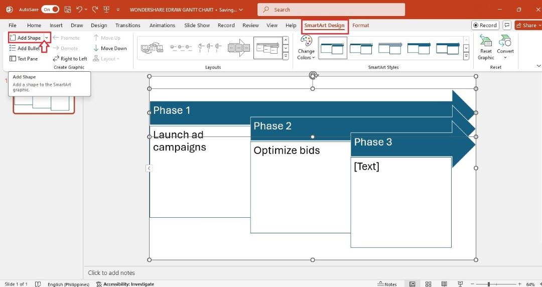
- Click the Gantt chart on the slide. Then, go to the SmartArt Design tab in the top menu. Click Add Shape on the upper left side.
- From the SmartArt Design tab, click Text Pane on the top right side. Add a new line of text in the text pane. The layout of your Gantt chart will automatically adjust to accommodate the added shapes.
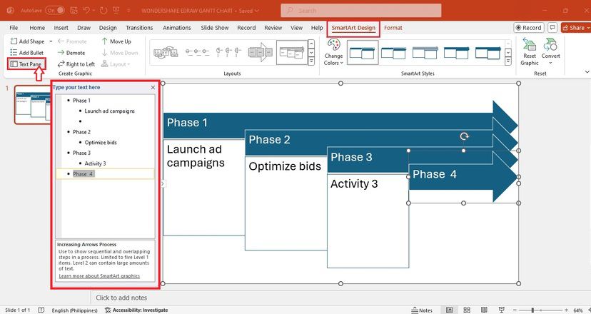
- Select a shape, copy it, and then paste it into a new part of the Gantt chart.
Remove a Shape
Here’s how to remove a shape on your Gantt chart:
- Select and delete the corresponding text from the text pane.

- Select the shape on the slide and press Delete on your keyboard.
Step 4: Change Style
You can change the layout, text, or shape style of your Gantt chart in several ways:
Method 1: Format Menu
Select the entire Gantt chart or a specific shape. Then, go to the Format tab in the upper navigation pane. From here, select an option from the Shape Styles, Shape Fill, and more.
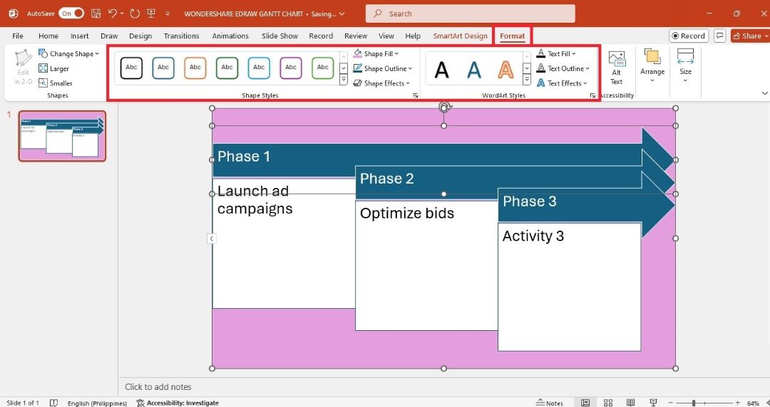
Method 2: Floating Toolbar
Right-click a shape or the entire Gantt chart. Use the options that appear in the floating toolbar, such as Style, Color, and Layout, to customize the Gantt chart.
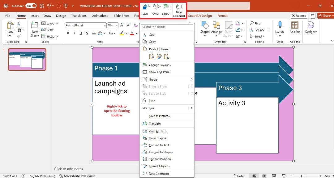
Method 3: One-Click Change
Change the entire diagram’s layout, style, or color from the SmartArt Design tab. You can even apply 3D styles in one click. To do so, select the Gantt chart and follow these steps:
One-Click Layout Change
Select a chart layout from the Layouts group. This will rearrange your Gantt chart with one click.
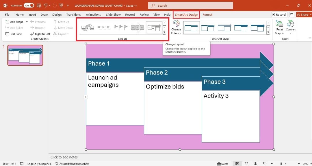
One-Click Style Change
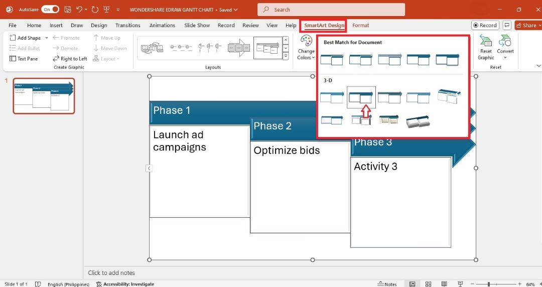
Select and apply the best match preset style from the SmartArt Styles group.
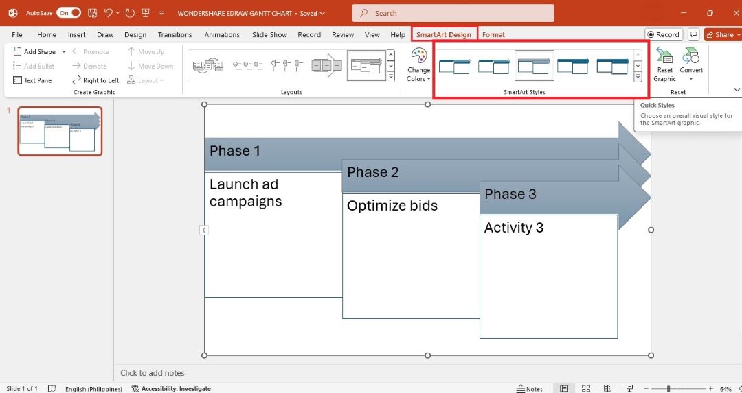
Use the up and down arrow buttons to browse more visual styles. Select and apply a 3D style if you want.
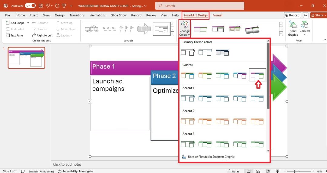
One-Click Color Change
Select a theme color or accent from the Change Colors dropdown menu.
How To Make a Professional Gantt Chart in PowerPoint?
A professional Gantt chart breaks everything down into smaller, clear steps. Follow these steps to create one from scratch in MS PowerPoint:
Step 1:
As before, start with a blank slide. Go to the Insert tab, and then select Table from the top menu. Choose the number of columns and rows based on your project’s tasks and timeline.
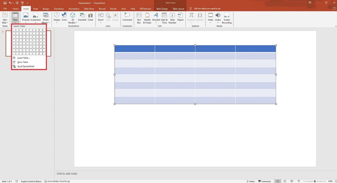
Step 2:
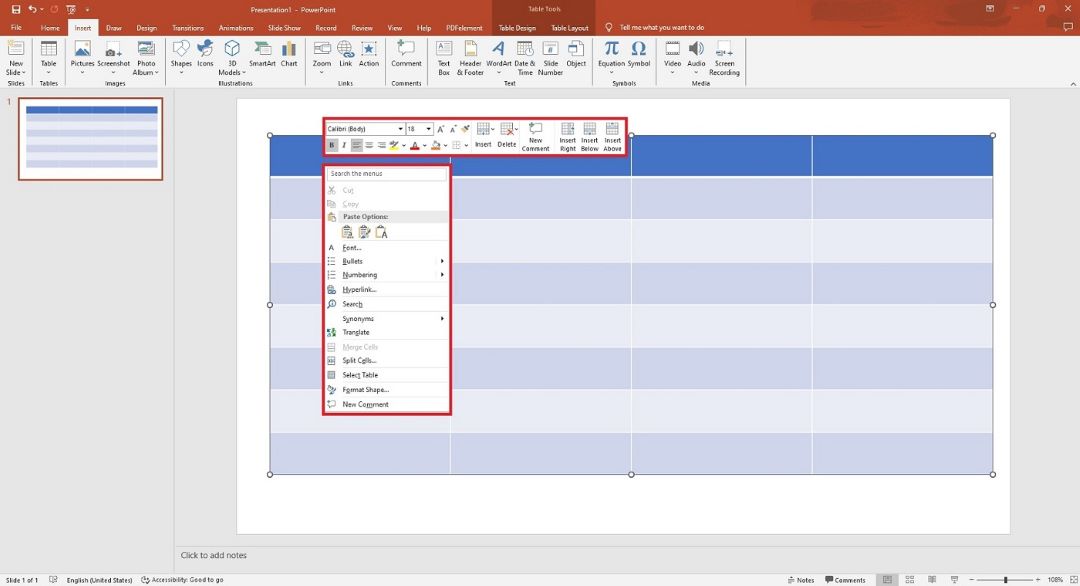
Resize the table to fit your slide by dragging its borders. Ensure it is wide enough to display the time intervals and task names. Right-click the table to show the floating toolbar.
Step 3:
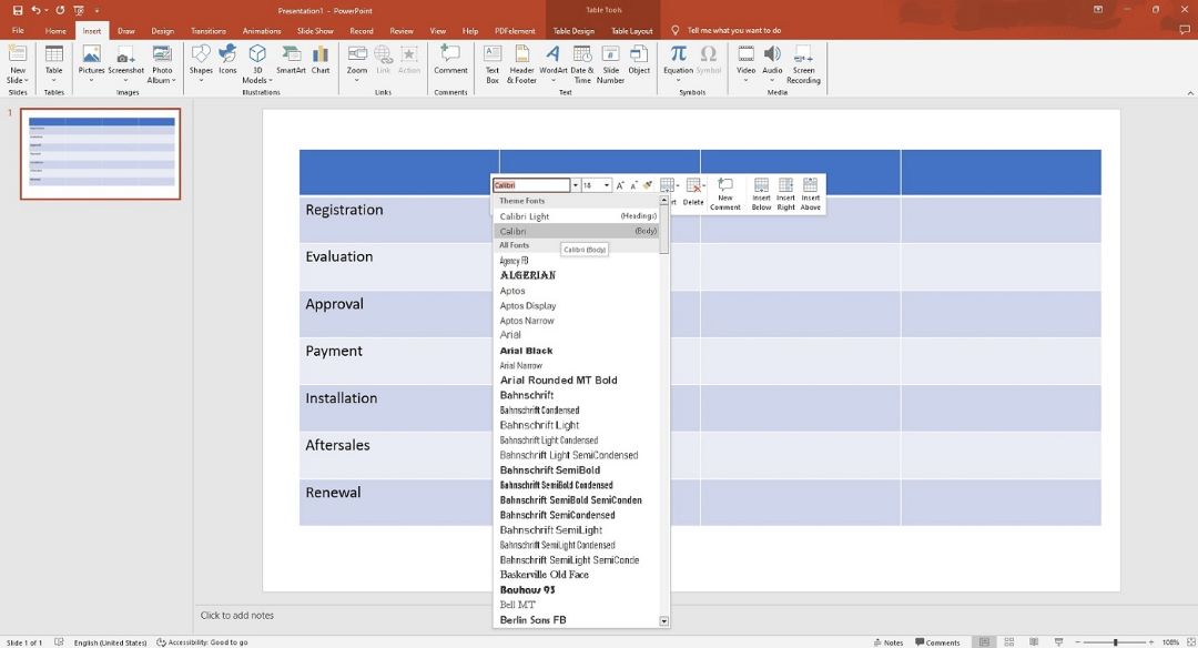
In the leftmost column, input your task names. Double-click inside each cell to edit. Use the toolbar to adjust font style, size, or alignment as needed.
Step 4:
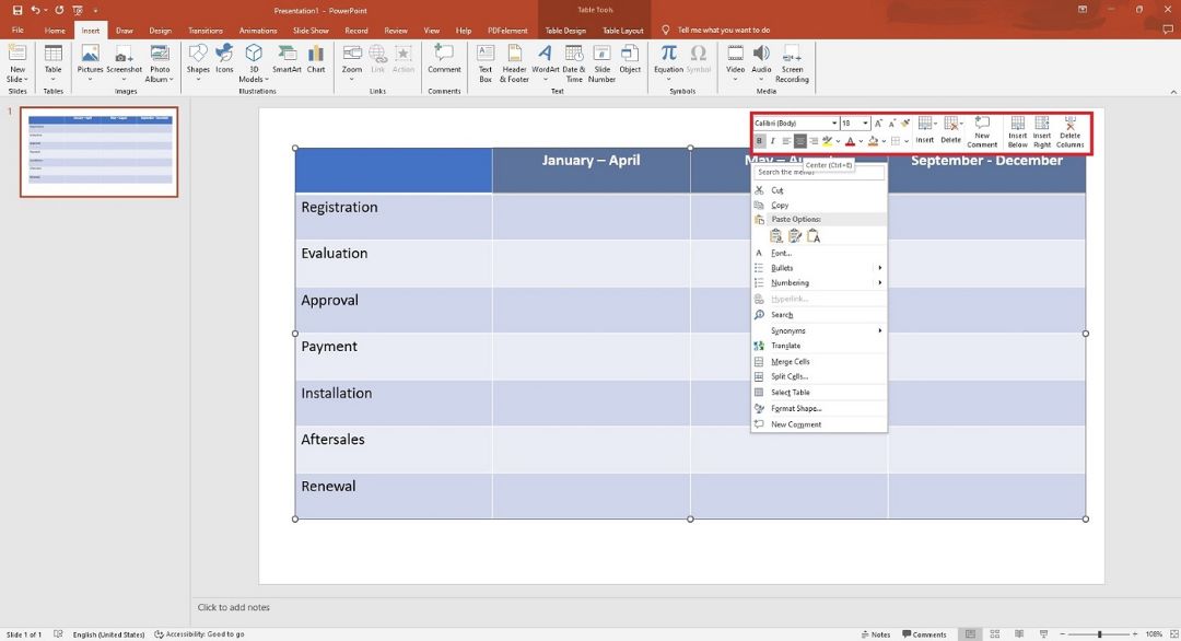
Label the top row with your time intervals (e.g., days, weeks, or months). Use the Align Center and Bold options from the floating toolbar for clarity.
Step 5:
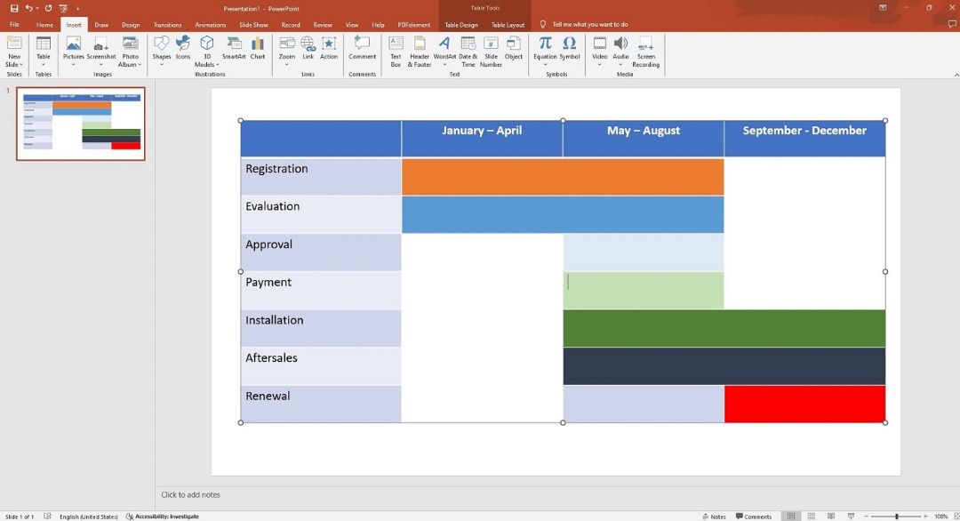
Highlight the cells where each task duration will be shown. Fill these cells by choosing Shape Fill in the floating toolbar. Choose a color to represent the task duration.
Step 6:
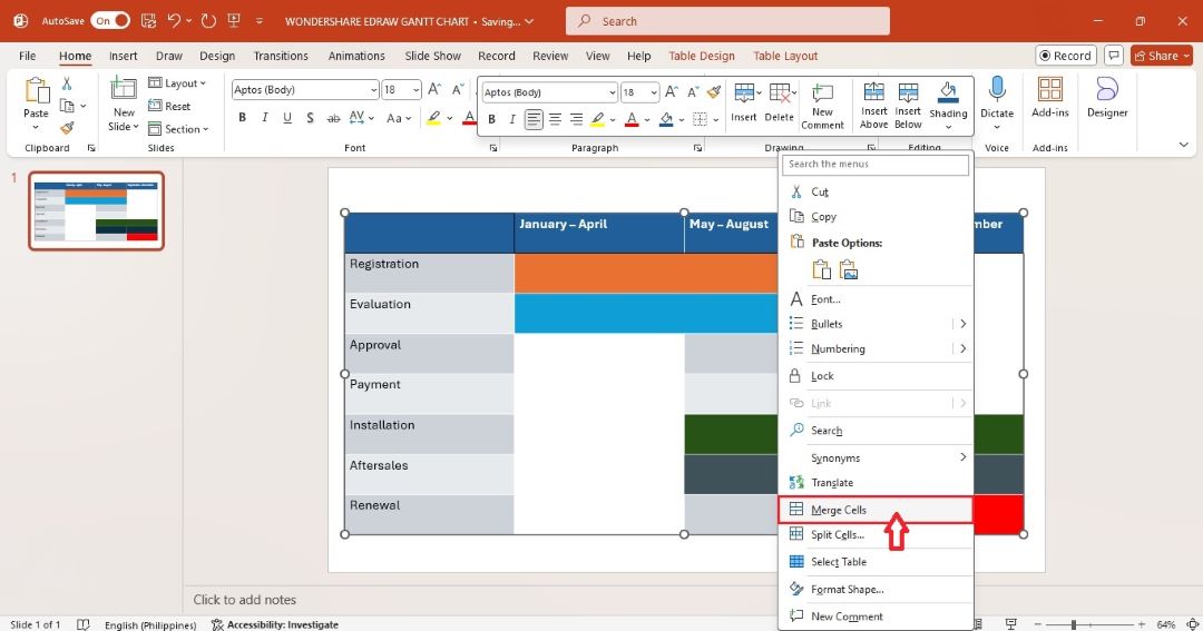
Highlight the cells or rows you want to combine. Right-click and select Merge Cells from the context menu.
Step 7:
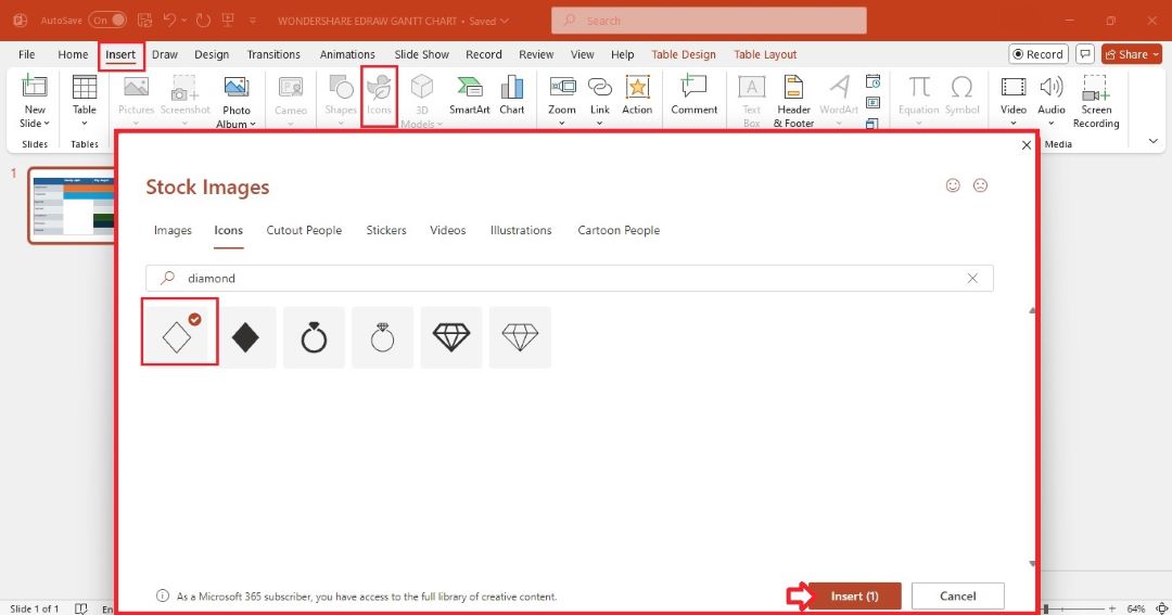
Add milestones using shapes. Go to the Insert tab in the top menu, and then click Icons. Search for a diamond icon in the Stock Images pop-up window, and then click Insert.
Step 8:
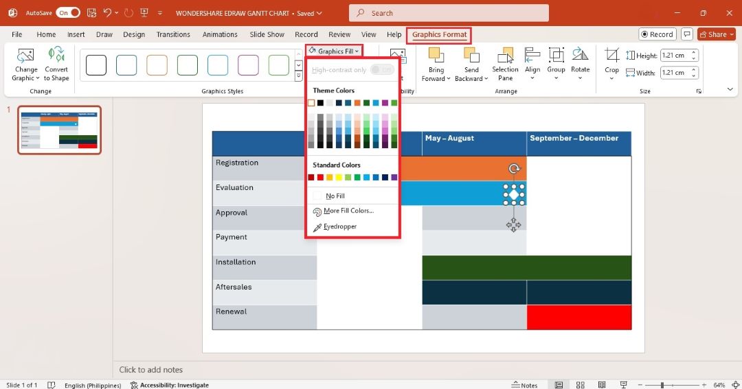
Drag and drop the milestone shape in the Gantt chart. Click the icon and go to the Graphics Format tab at the upper navigation pane. Select a new color from the Graphics Fill dropdown
Step 9:
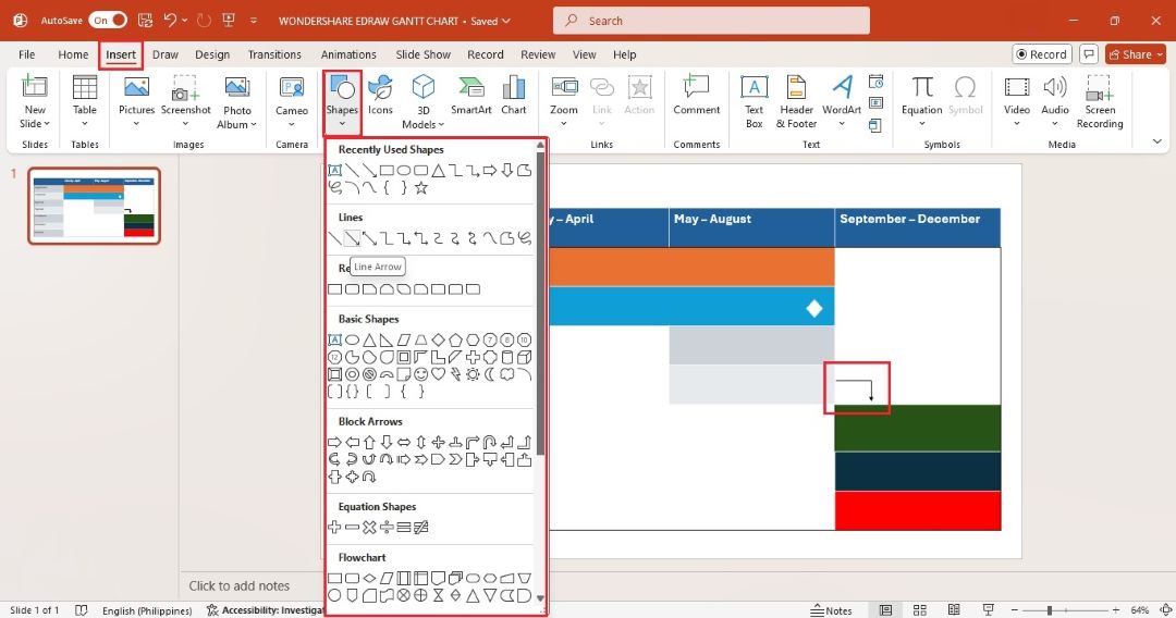
Show task dependencies using arrows. Go to the Insert tab and select an arrow line from the Shapes dropdown menu.
Step 10:
Review and adjust text, style, and layout for consistency. Once ready, go to File > Save a Copy to download it on your computer. Alternatively, share it as a link to others.
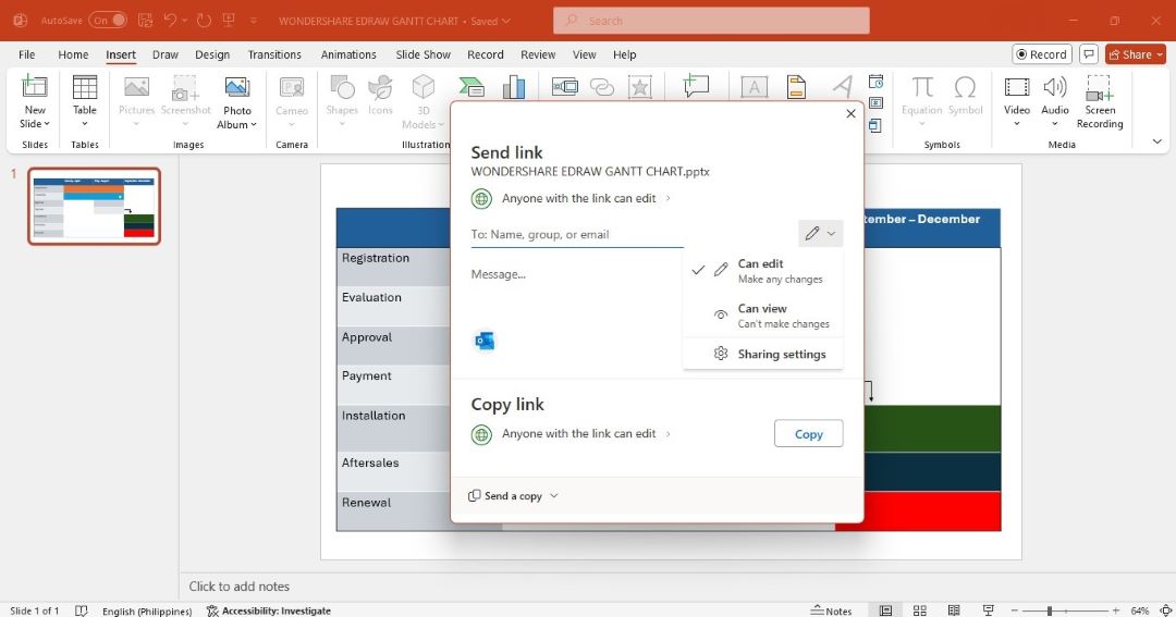
Best Practices for Making a More Appealing Gantt Chart
A visually appealing Gantt chart makes a strong impact on presentations. Here are some best practices to consider:
- Use consistent colors: Choose a color scheme that matches your project’s branding or presentation style. Avoid using too many colors, as this can overwhelm the viewer.
- Keep it simple: Avoid cluttering your Gantt chart with too many details. Only include tasks, milestones, and timelines that are essential to the project.
- Use icons and symbols: Add small icons to represent task categories or milestones. This adds visual interest and helps viewers understand the chart.
- Use contrasting text and background colors: Use contrasting colors for text and background. This is helpful in presentations where legibility is key.
- Label tasks clearly: Make sure each task and milestone are clearly labeled with names and dates. A Gant chart with clear labels is easy to follow. It allows viewers to learn the project timeline with ease.
How to Make a Better Gantt Chart With AI
Edraw.AI is an advanced tool that can create Gantt charts faster than PowerPoint. With its AI-powered features and ready-made templates, you can create Gantt charts in seconds. The section will guide you through two methods to create a Gantt chart using Edraw.AI: making one with AI and using a template.
Method 1: Generate a Gantt Chart in Edraw.AI
Edraw.AI’s AI generator can help you create a Gantt chart from text prompts. Here’s how to do it:
Step 1:
Go to Edraw.AI and sign in with your Wondershare ID or social media credentials. Click Home > AI Diagram.
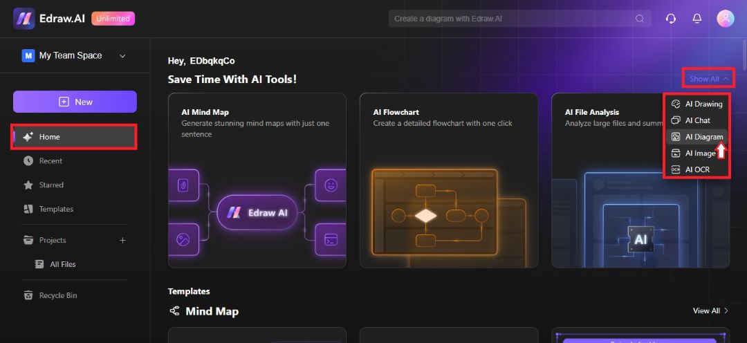
Step 2:
Select Timeline as the diagram type and enter your prompt in the dialogue box. Click Start and wait for Edraw.AI to generate the Gantt chart.
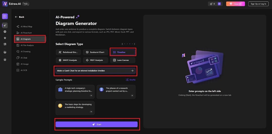
Step 3:
Customize your Gantt chart by changing task names, periods, and colors. For example, go to the right panel and click Background to change the background color.
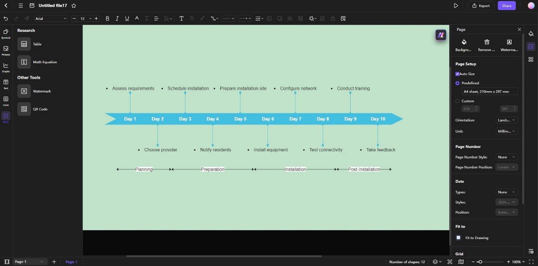
Method 2: Creating a Gantt Chart With a Template
Edraw.AI also provides many templates for those who prefer working with pre-designed layouts. Here’s how to use a template to create a Gantt chart:
Step 1:
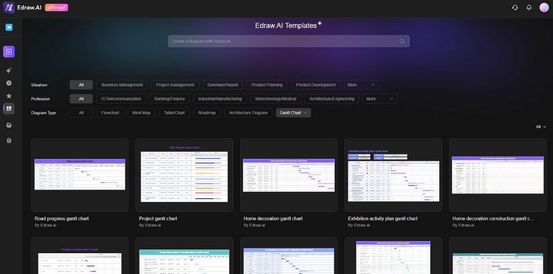
From Edraw.AI’s main window, click Templates. Use the search box to find diagrams, or go to Diagram Type and select Gantt Chart to filter the results below.
Step 2:
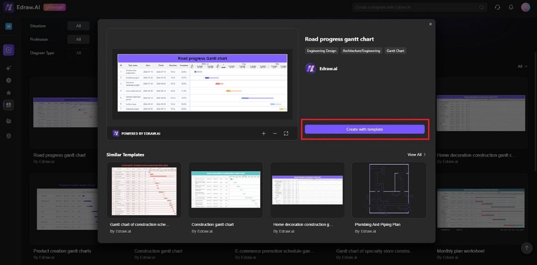
Browse through the available options. Select a template that suits your project. Click the Create with template button to start.
Step 3:
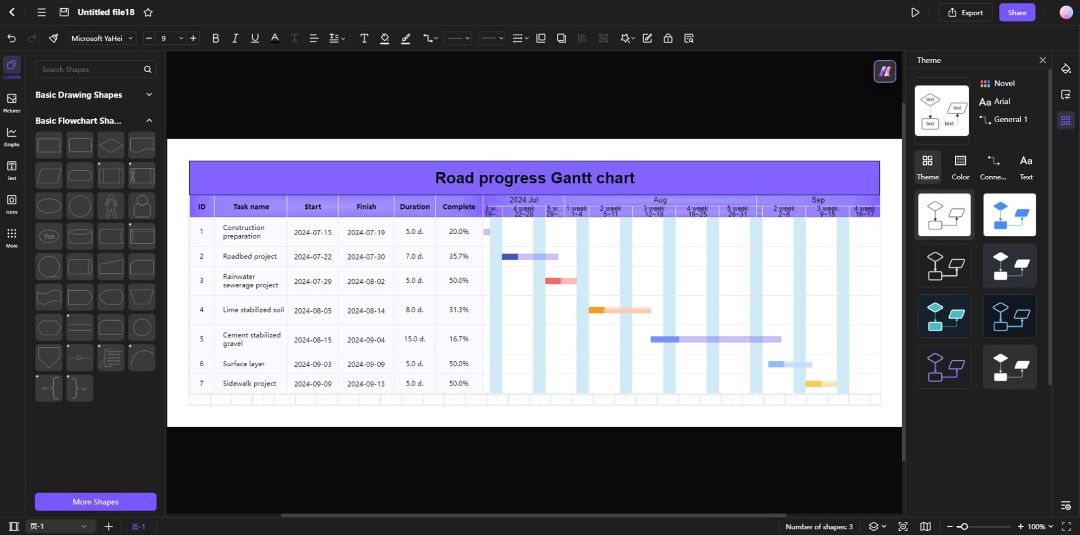
Click each task. Input task names, start dates, and durations. Change the layout, colors, and design of the Gantt chart. Add or remove tasks, milestones, and dependencies as needed.
Export the Gantt Chart as a PowerPoint File
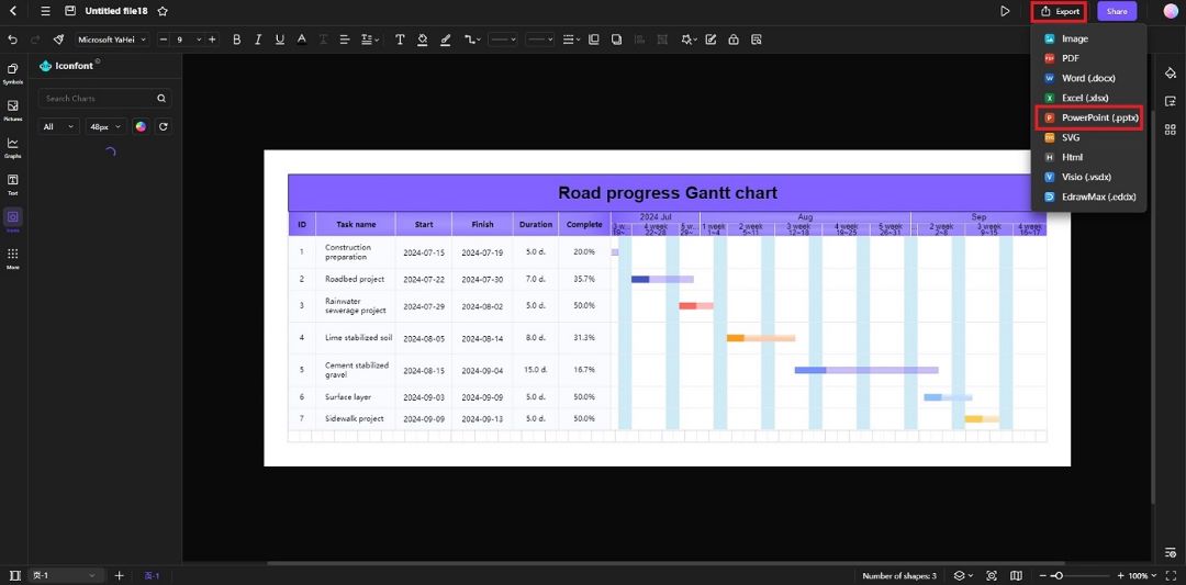
Once you’re satisfied with your Gantt chart, click the Export button. Choose the PowerPoint format and share your work.
Edraw.AI offers a seamless experience for generating and customizing Gantt charts. Its AI features can save time while still giving you the flexibility to adjust the chart to your specific needs. The tool makes it simple to create professional-looking Gantt charts that you can easily export into PowerPoint or other formats.
Creating a Gantt chart in PowerPoint is easier than it may seem, thanks to templates, SmartArt, and AI tools. Follow the steps outlined above to visualize your project’s timeline with ease.
However, if you’re looking for a quick alternative, give tools like Edraw.AI a try. Edraw.AI’s AI-powered features speed up the process of making a Gantt chart. It can save you time and effort without you breaking a sweat.
FAQ
-
Can I import data from Excel into a Gantt chart in PowerPoint?
Yes, you can copy and paste your Excel data into PowerPoint. Use SmartArt or shapes to align the tasks and timelines. It converts the data into a clear Gantt chart format. -
How do I export my Gantt chart from Edraw.AI to PowerPoint?
In Edraw.AI, go to the export menu and choose the PPT format. Once exported, open your PowerPoint file and insert the chart into your presentation slides. -
Can I add animations to my Gantt chart in PowerPoint?
PowerPoint allows you to animate individual shapes or milestones within your Gantt chart. This feature helps add a dynamic touch to your presentations. -
Is there a way to automatically update the Gantt chart in PowerPoint?
PowerPoint does not offer automatic updates to Gantt charts. However, using linked Excel sheets or an external tool like Edraw.AI allows for easier updating. -
Can I create custom templates for Gantt charts in PowerPoint?
Yes, you can design a Gantt chart and save it as a custom template for future use. Create your design, and then save the slide as a template to reuse across projects.


